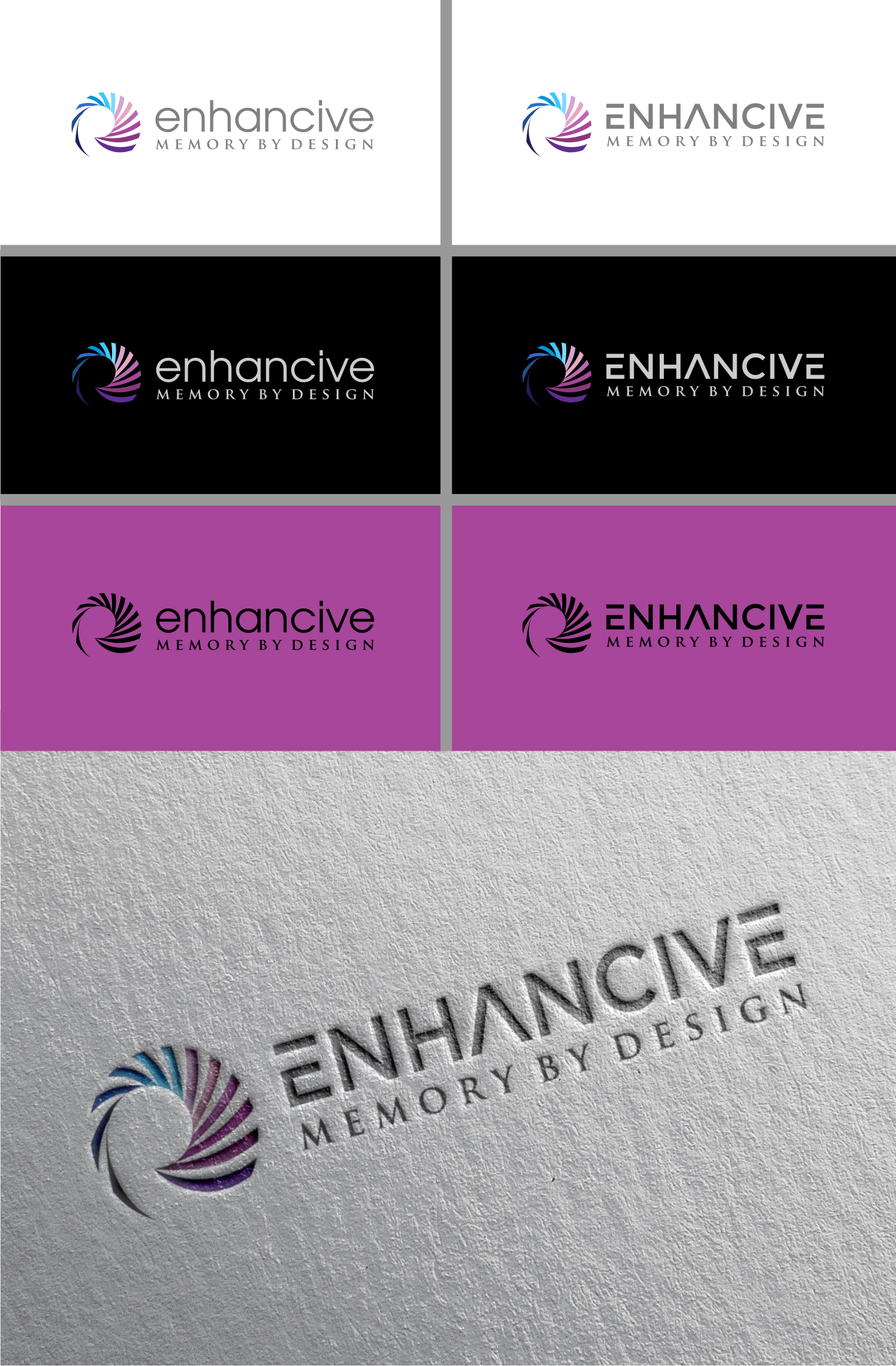
Logo design for a design agency

¿Quieres ganar un trabajo como este?
Este cliente recibió 386 diseños de logo de 118 diseñadores. Eligieron este diseño de logo de byguna como el diseño ganador.
Únete gratis Encuentra trabajos de diseño- Garantía
Resumen de Diseño de Logo
We need a logo design for a new agency based in the Bay Area called Enhancive. The word means intensifying or strengthening a stimulus. We are a consulting agency for sales and marketing teams, so the "stimulus" in our space that is intensified or enhanced is typically a business message, a presentation, a corporate video, a thought leadership paper - anything that sales or marketing people would use when they approach their own customers. Our differentiation is that the strengthening of the stimulus happens based on science, not opinions (and, more specifically, it's neuroscience). The result of strengthening or enhancing a stimulus is that it becomes differentiated from other content assets. So when our customers use assets developed by us, they become differentiated and, as a result of that, memorable. The value proposition of our business (which would be emphasized in the logo) is to "Intensify your message to differentiate from competition and be memorable." The logo can have the text "Enhancive" but it can also be accompanied by a symbol that indicates the notion of intensifying or strengthening something. I tried to have the "i" in Enhancive upside down and it turns into an exclamation sign but I feel like it's been done before, so please don't do that. It is possible that one of the letters inside is "enhanced" in some way, and that in itself then can be used as a separate symbol. We prefer not to have the letters enhanced in a way that is just stylistic, with no meaning (like a higher line for the "h" for instance). The enhancement has to have some sort of meaning, not just style. We also played with the letters becoming progressively thicker as the word unfolds but that approach gives the impression that only 50% of an entity is enhanced and that's not we are saying. In fact, when we work with clients' messages, the enhancement happens in proportions, meaning that not everything in a sequence (like a presentation) needs to be intensified. Sometimes one small segment can be intense enough and potent enough to rescue an otherwise bland sequence. If you read Alice in Wonderland (and especially seen the 2010 movie), we like that color palette and inspiration because the author of the story was a mathematician who also believed in ratios and proportions (that's just a side note for inspiration). One last note: it's possible to have some other treatments for the logo, not just intensifying one of the letters. We are not logo experts, so it was just an idea :) Something else to consider: enhancive is at the intersection of the word "enhance" and "creative." And typically, we say that sellers and marketers cannot be memorable unless they are creative.
Actualizaciones
Designs look the same
Objetivo del mercado(s)
Sophisticated sales and marketing teams who produce content and messaging, mainly in B2B fields and mainly in something related to technology.
Texto del logo
Enhancive
Mira y siente
Cada control deslizante ilustra las características de la marca del cliente y el estilo que debe comunicar el diseño de tu logotipo.
Elegante
Atrevido
Juguetón
Serio
Tradicional
Moderno
Atractivo
Profesional
Femenino
Masculino
Vistoso
Conservador
Económico
De Alta Gama
Requisitos
Debes tener
- Appeal to tech and highly sophisticated audiences who create high-end products themselves or appeal to high-end clients, like architecture firms, wealth management, high-end events, high-end tech
Agradable de tener
- A symbol that is connected to meaning/narrative, such as ratio/proportions, Alice in Wonderland (that has a lot of math in it) or The Simpsons (they were created by math and physics PhDs). I included the brain icon just as an example but it does not have to be used, it's just a reminder that our principles are rooted in science (especially neuroscience)
No debería tener
- It must feel unique, not something it's been done before, like the upside down letters or arrows that look like the Amazon or the FedEx logo