Creative, Fun, Eye catching Signage project showcasing our fabulous services
¿Quieres ganar un trabajo como este?
Este cliente recibió 54 diseños de señalización de 15 diseñadores. Eligieron este diseño de señalética de ArtTank como el diseño ganador.
Únete gratis Encuentra trabajos de diseño- Garantía
-
 A$190
A$190
-
 54 diseños
-
 15 diseñadores
Resumen de Diseño de Señalética
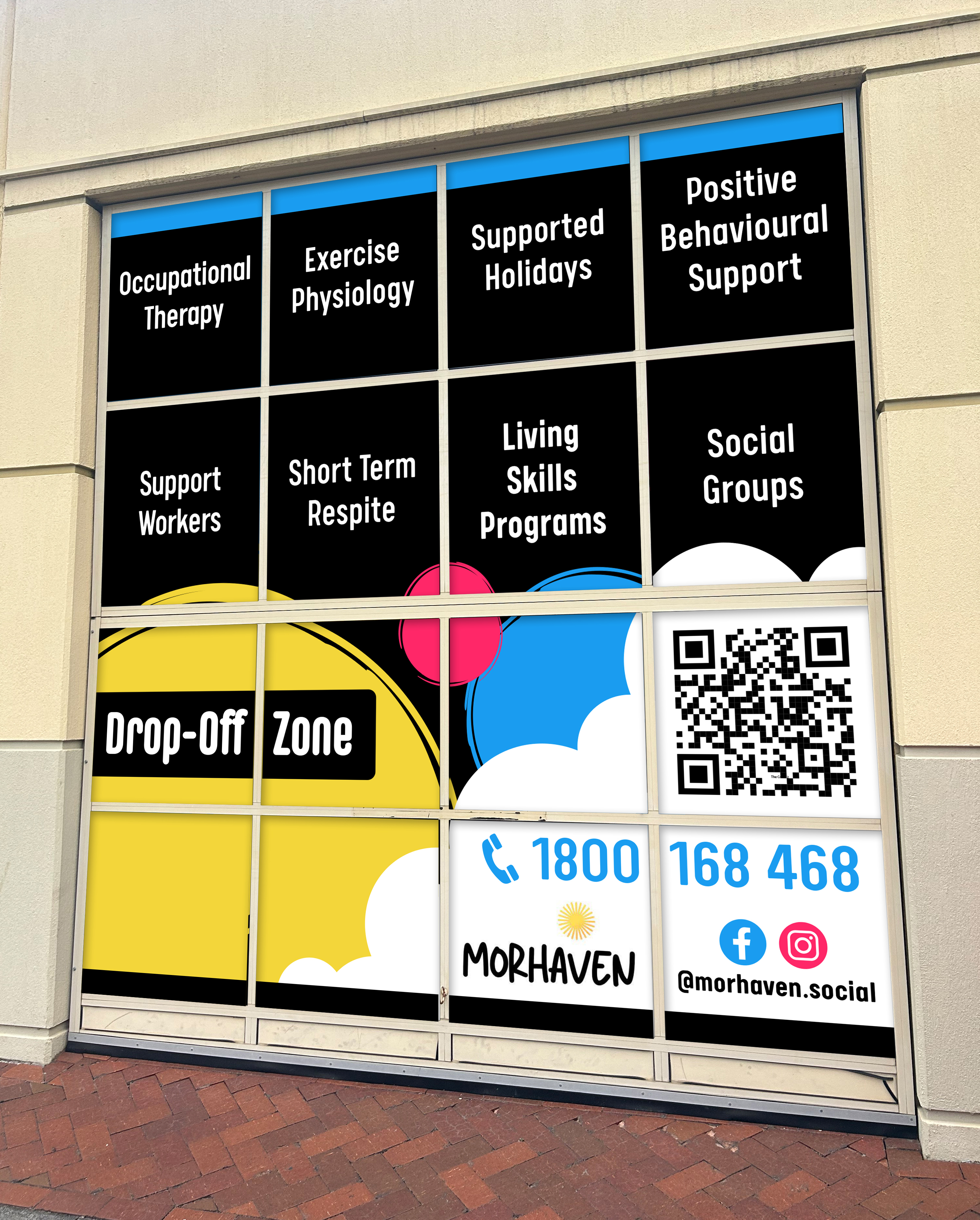
Please take into consideration the garage door is in small squares and submit your design showing this .Check out the image that shows the front of the office with the current sign that is over the front door as well as the glass roller door where we would like the new sign. I would like to see the words for each service in a separate square with a black background where the writing stands out. I would like to see the clouds incorporated into the design so it works with the sign above the door. The goal of this project is to create clear, engaging, and informative signage that showcases our company's services. The signage should be designed to be easily read and understood by a diverse audience, ensuring everyone can access information about the available services. We would like it to have a simple yet strong visual appeal and incorporate visual elements that enhance the attractiveness of the signage and capture attention. The sign will go on the garage door (the image has been attached ). The door is made up of 16 glass squares.
The services we would like advertised is
Support Workers
Social Groups
Living Skills Programs
Supported Holidays
Respite
Occupational Therapy
Exercise Physiology
Positive Behavioural Support
I think we would prefer the words to stand out not images, where the titles are the most obvious thing people see with black backgrounds and pops of our colours.
I have attached some of our flyers to give you an idea of the design we love. We love black backgrounds, a font that is easy to read and jumps out. We don't want to design to be too busy. We would like to to be fun!
The current drop off zone sign stays so we would like something that works in and compliments that
We love our clients with disabilities, they are very special to us, we would like them to be able to see all of the different things we can help them out with.
Actualizaciones
Sick
Objetivo del mercado(s)
Our target market is parents, carers and professionals who assist people with disabilities to find support
Tipo de industria / entidad
Community Services/Disability Supports
Colores
Colores seleccionados por el cliente para ser utilizados en el diseño del logotipo:
Mira y siente
Cada control deslizante ilustra las características de la marca del cliente y el estilo que debe comunicar el diseño de tu logotipo.
Elegante
Atrevido
Juguetón
Serio
Tradicional
Moderno
Atractivo
Profesional
Femenino
Masculino
Vistoso
Conservador
Económico
De Alta Gama
Requisitos
Debes tener
- Clear writing and not busy design that is easy to read when driving past
No debería tener
- Colours that are not our branding colours