

 Refresh
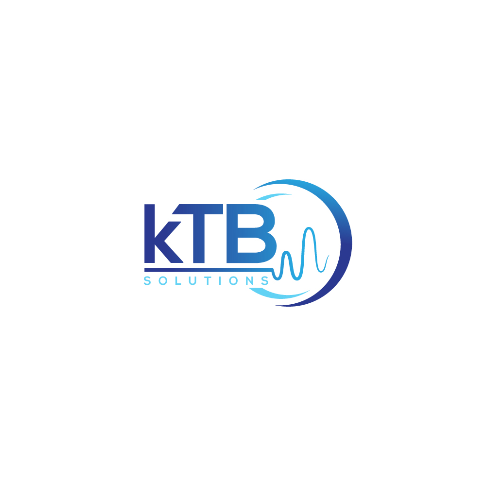
kTB Solutions
¿Quieres ganar un trabajo como este?
Este cliente recibió 14 diseños de logo de 5 diseñadores. Eligieron este diseño de logo de Anekaa como el diseño ganador.
Únete gratis Encuentra trabajos de diseño
- Garantía
-
 US$110
-
 14 diseños
-
 5 diseñadores
Resumen de Diseño de Logo
i would like to create a logo for my startup. We design and manufacture tech products used by other technology companies.
Text:
The company name "kTB Solutions" should be the focal point.
The "k" should be in lowercase, while the "T" and "B" should be in uppercase, as specified.
Use a clean, modern sans-serif font that conveys professionalism and innovation.
Symbol/Icon:
Integrate a stylized waveform or a circuit-like design that subtly references RF technology and noise generation. This could be a simple line with peaks and troughs or a minimalistic energy symbol.
The symbol could be positioned either to the left of the text or integrated with the text itself, such as underlining or flowing through the letters.
Color Scheme:
Use a combination of electric blue and metallic silver or deep gray. The electric blue represents technology and RF signals, while metallic silver or gray conveys reliability and sophistication.
Style:
The overall style should be minimalist yet impactful, with a focus on precision and modernity.
Layout:
Ensure the text and symbol are balanced and cohesive, with the symbol complementing the typography without overpowering it.
Objetivo del mercado(s)
technology companies
Tipo de industria / entidad
technology
Texto del logo
The company name "kTB Solutions" should be the focal point. The "k" should be in lowercase (please check attached photo for the preferred font for the k), while the "T" and "B" should be in uppercase.
Estilos de fuente para usar


Mira y siente
Cada control deslizante ilustra las características de la marca del cliente y el estilo que debe comunicar el diseño de tu logotipo.
Elegante
Atrevido
Juguetón
Serio
Tradicional
Moderno
Atractivo
Profesional
Femenino
Masculino
Vistoso
Conservador
Económico
De Alta Gama
Requisitos
Debes tener
- Ensure the text and symbol are balanced and cohesive, with the symbol complementing the typography without overpowering it.
Agradable de tener
- Integrate a nice symbol
