Lake Isabella RV Park Logo Design Context
¿Quieres ganar un trabajo como este?
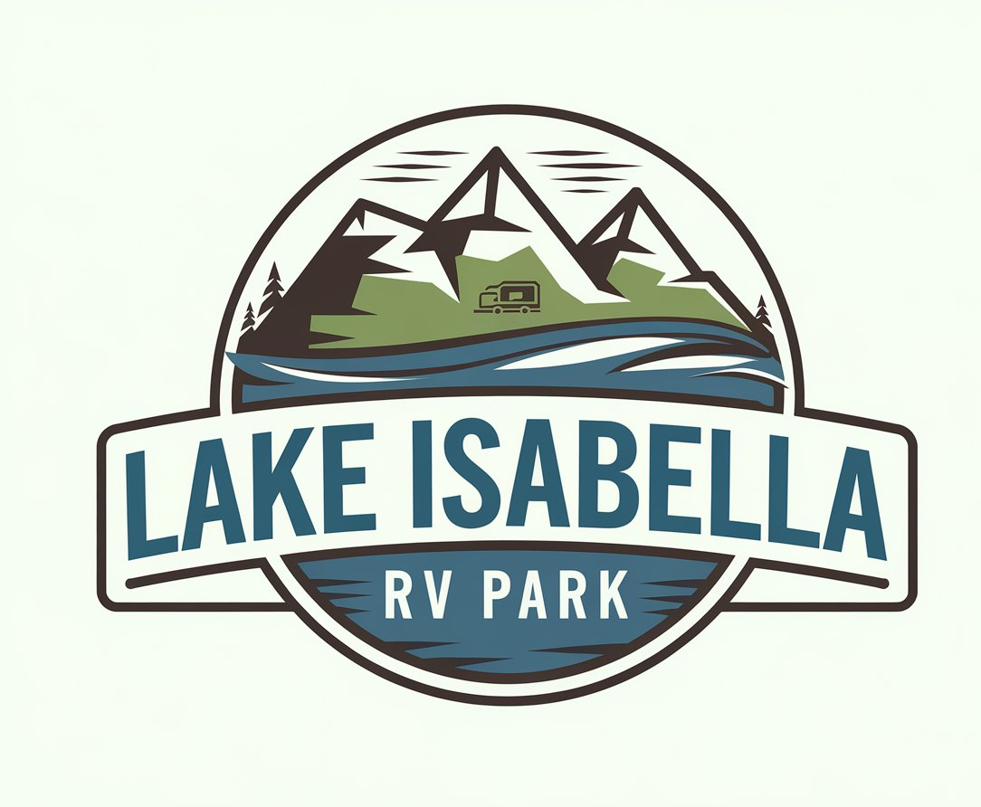
Este cliente recibió 167 diseños de logo de 50 diseñadores. Eligieron este diseño de logo de InkForge Studio como el diseño ganador.
Únete gratis Encuentra trabajos de diseño- Garantía
-
 US$150
-
 167 diseños
-
 50 diseñadores
Resumen de Diseño de Logo
We’re looking for a logo for Lake Isabella RV Park that reflects the natural beauty of its surroundings and the outdoor adventure lifestyle. The design should have a clean, professional, and nature-inspired aesthetic, similar to the reference image provided. We’d like the logo to incorporate elements like mountains, trees, water, or subtle RV-related imagery, creating a balance between strong typography and a structured layout.
For the color palette, please use the following color codes to align with our website’s branding:
Warm Blue (inspired by the lake): #1E88E5
Earthy Green: #388E3C
Neutral Brown: #8D6E63
Accent White (for contrast): #FFFFFF
The typography should be bold and easy to read, featuring the park’s name, Lake Isabella RV Park. Optionally, a tagline such as “Stay, Relax, Explore” or “Your Lakeside Getaway” can be included. The design should ideally feature a centered graphic, such as mountains or the lake, within a cohesive and contained shape like a circle or symmetrical layout. It’s important for the logo to be versatile for both digital and print applications, including signage, brochures, business cards, and merchandise.
A sample image has been included as a reference to guide the style. While we’re inspired by the balance of nature and typography in the reference, we encourage creativity in designing something unique to our park’s identity. We’re excited to see your ideas and how you bring the vision of Lake Isabella RV Park to life!
Objetivo del mercado(s)
Our target market for Lake Isabella RV Park includes RV travelers and enthusiasts seeking scenic, well-maintained parks for short-term or extended stays. This group values amenities like reliable power hookups, peaceful surroundings, and proximity to outdoor activities. Additionally, outdoor enthusiasts and nature lovers are a key audience, drawn to the park’s location for camping, fishing, hiking, and other recreational opportunities. Retirees and snowbirds also represent an important market, as they look for quiet, safe, and community-oriented spaces for long-term or seasonal stays. The park will appeal to weekend getaway travelers and road trip enthusiasts, including couples, families, and groups seeking an affordable and convenient escape close to nature. Budget-conscious travelers, such as families and younger visitors, will also find value in your park as an affordable alternative to hotels. Local residents in need of RV or boat storage are another target audience, benefiting from your storage services for year-round convenience. Finally, event-goers and groups hosting gatherings near Lake Isabella, such as fishing tournaments or RV rallies, are a valuable segment that will appreciate group-friendly facilities and spacious accommodations. By catering to these audiences, the park can highlight its unique blend of natural beauty, affordability, and functionality.
Tipo de industria / entidad
Real Estate RV Park
Texto del logo
Lake Isabella RV Park
Estilos de logo de interés
Logo pictórico / combinado
Un objeto del mundo real (texto opcional)
Estilos de fuente para usar
Mira y siente
Cada control deslizante ilustra las características de la marca del cliente y el estilo que debe comunicar el diseño de tu logotipo.
Elegante
Atrevido
Juguetón
Serio
Tradicional
Moderno
Atractivo
Profesional
Femenino
Masculino
Vistoso
Conservador
Económico
De Alta Gama
Requisitos
Debes tener
- The logo for Lake Isabella RV Park must include nature-inspired imagery such as mountains, water to represent the lake, trees, or other outdoor motifs. It should utilize the following color palette: Warm Blue (#1E88E5), Earthy Green (#388E3C), Neutral Brown (#8D6E63), and Accent White (#FFFFFF). The park's name, Lake Isabella RV Park or Lake Isabella RV Park & Storage, should be prominently displayed with bold, clean, and professional typography that remains readable across all sizes. The design should be balanced and cohesive, preferably contained within a circular or symmetrical shape, and versatile enough for both digital platforms (like websites and social media) and print materials (including business cards, signs, and merchandise). It is important that the logo maintains a polished and modern tone while remaining welcoming. There should also be space for an optional tagline, such as "Stay, Relax, Explore" or "Your Lakeside Getaway," if it fits the design.
No debería tener
- The logo should avoid overly complex designs, as too much detail can make it difficult to scale or read. Cartoonish or exaggerated elements are not appropriate, and colors outside the approved palette, such as bright pinks, yellows, or neon shades, should not be used. The text should not feel cramped or difficult to read, and RV imagery should not overpower the natural or scenic elements of the design, as this is not a commercial truck park. Generic clipart should be avoided in favor of unique and custom design elements. Additionally, the logo should steer clear of industrial or overly harsh themes, as it should feel inviting and aligned with the natural beauty of the park.