Fried Chicken Chain needs a logo.
¿Quieres ganar un trabajo como este?
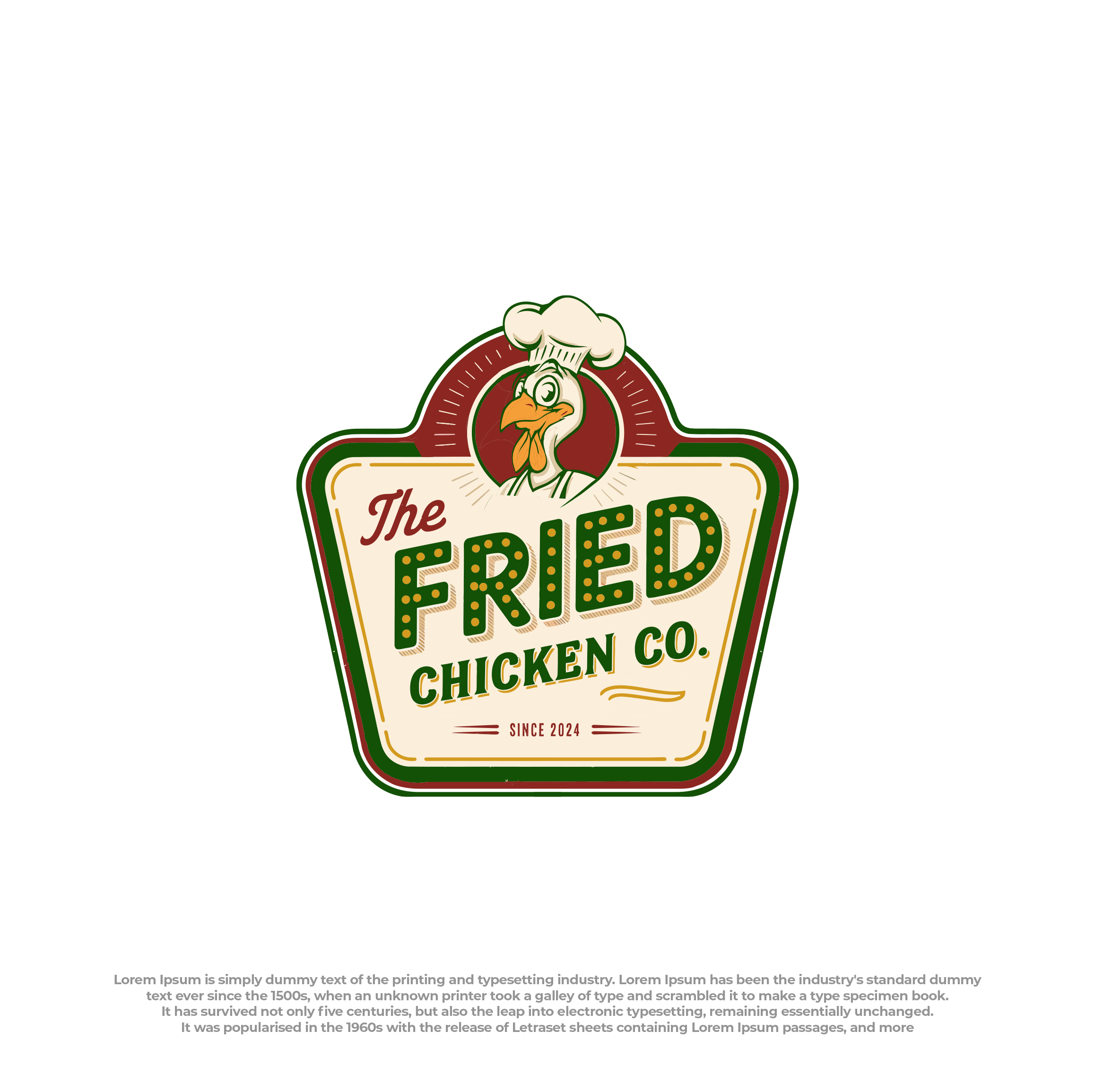
Este cliente recibió 230 diseños de logo de 58 diseñadores. Eligieron este diseño de logo de Peak design como el diseño ganador.
Únete gratis Encuentra trabajos de diseño- Garantía
-
 €160
€160
-
 230 diseños
-
 58 diseñadores
Resumen de Diseño de Logo
Brand Overview
The Fried Chicken Co. - since 2024 is a delivery-first fried chicken brand targeting younger audiences (18–35). Inspired by the nostalgia of retro American diners, the brand blends crispy indulgence, premium quality, and approachability. The logo should be a fun yet professional design that positions the brand in the mid-range premium market, clearly standing apart from competitors. It should appeal to a generation that values bold branding and authentic experiences.
We aim for a logo that exudes authenticity, trust, and timeless appeal while embracing a playful, vintage cartoon-inspired aesthetic.
Key Message
The logo should feel playful and retro, using iconic 1950s/60s American diner aesthetics combined with a cartoon-inspired graphic.
- Make it memorable: A logo that is bold, recognizable, and reflects the fried chicken concept at a glance.
- Appeal to the target audience: Younger, urban customers who are drawn to nostalgia, high quality, and fun branding.
- Stand out in the market: Differentiate from local competitors while maintaining an inviting and premium positioning.
- Ensure versatility: Adaptable for digital (app icons, social media) and physical applications (packaging, signage).
- Positioning: Mid-range, high-quality fried chicken—fun and nostalgic but modern and trustworthy.
Design Direction
We aim for a timeless and premium design that highlights authenticity and trust to create a lasting connection with our audience.
1. Typography:
Use bold, retro diner fonts with a 1950s/60s aesthetic.
Mix clean, sans-serif styles for “The Fried Chicken Co.” with playful script accents (e.g., “Since 2024”).
Ensure readability across small (e.g., delivery app icons) and large formats (e.g., signage).
2. Icon/Imagery:
Include a cartoon character as the central design element, similar to the examples provided:
A quirky mascot-style chicken with exaggerated features (e.g., a chef hat or apron).
Integrate retro diner-style details like a checkerboard pattern, stars, or circular framing to evoke classic diner signage.
Keep it fun but not overly busy—balance simplicity with character.
3. Color Palette:
Warm cream or off-white for the base.
Deep red, muted yellow, and rich blue as primary accents.
Gold or warm highlights for premium quality.
Avoid overly bright or neon tones; maintain a vintage feel.
4. Design Style:
Retro diner nostalgia with a cartoon-inspired character or bold graphic element.
Use subtle textures or shadows for depth and realism.
Prioritize a timeless aesthetic that remains relevant even as the brand evolves.
Objetivo del mercado(s)
While brands like KFC and Belchicken dominate the lower-price segment, The Fried Chicken Co. aims to carve out a niche in the mid-range premium market. The logo should differentiate itself by blending quality cues with a sense of fun and nostalgia.
Tipo de industria / entidad
Hospitaliy - Foo Delivery
Texto del logo
The Fried Chicken Co. - Since 2024
Estilos de logo de interés
Logo con emblema
Logo contenido dentro una forma / figura
Logo con personaje
Logo con ilustración o personaje
Mira y siente
Cada control deslizante ilustra las características de la marca del cliente y el estilo que debe comunicar el diseño de tu logotipo.
Elegante
Atrevido
Juguetón
Serio
Tradicional
Moderno
Atractivo
Profesional
Femenino
Masculino
Vistoso
Conservador
Económico
De Alta Gama
Requisitos
Debes tener
- Retro Diner Style: Bold, nostalgic design inspired by 1950s/60s American diners. Cartoon Mascot: Playful character (e.g., drumstick, chicken bucket, or happy chicken) with bold outlines. Typography: Vintage diner fonts—clear, fun, and premium. Mix bold and script styles if possible. Color Palette: Warm cream/off-white base, with accents of deep red, muted blue, and gold for a premium yet playful vibe. Versatility: Works across delivery apps, social media, packaging, and signage. Must be scalable and recognizable at smaller sizes. Subtext: Incorporate “Since 2024” subtly for authenticity and trustworthiness. Cultural Relevance: Nostalgic but adaptable to appeal to a Belgian audience. Avoid overly American clichés.
No debería tener
- Overly American Clichés: Avoid excessive stars and stripes, Uncle Sam-style imagery, or overly patriotic designs that don’t resonate with Belgian audiences. Busy or Cluttered Design: The logo should be clean and recognizable at a glance—no excessive elements that reduce clarity. Neon or Loud Colors: Avoid overly bright, flashy tones (like neon pinks or greens) that clash with the premium retro diner vibe. Overly Cartoonish Style: The mascot should feel playful but not childish or exaggerated to the point of losing trust or professionalism. Generic Fast Food Imagery: No stock burger, fries, or soda icons that make it look like a generic fast-food chain. Low-Quality Fonts: Avoid overly modern or default fonts that lack the retro aesthetic (e.g., Comic Sans, generic sans-serif). Modern Minimalism: The logo should not look overly sleek, flat, or minimalist—this goes against the bold retro diner aesthetic. Unrelated Icons: Avoid elements that stray from the core fried chicken focus (e.g., pasta, pizza, or seafood visuals). Overuse of Gradients: Keep colors solid or lightly textured, avoiding heavy gradients that make the logo harder to reproduce. Complex Shapes: Avoid overly intricate designs that don’t scale well for small uses like app icons or packaging.