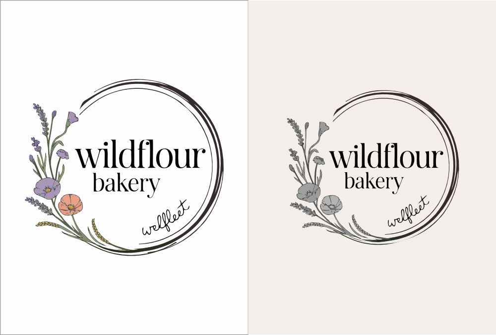
Logo for Wildflour Bakery
¿Quieres ganar un trabajo como este?
Este cliente recibió 233 diseños de logo de 58 diseñadores. Eligieron este diseño de logo de Maya_ como el diseño ganador.
Únete gratis Encuentra trabajos de diseño-
 US$150
-
 233 diseños
-
 58 diseñadores
Resumen de Diseño de Logo
We’re looking for a refreshed logo that embodies a natural, organic feel while maintaining a clean and modern aesthetic. Below is what I have been working on and how I want to improve it
Overall Design & Composition
The logo features a circular frame with a hand-drawn, organic quality. The double-line circle has a slightly imperfect, sketch-like appearance, adding a natural and artisanal touch.
The wildflowers and herbs are arranged asymmetrically along the left and lower edges, forming a wave-like pattern that gives the logo a soft, flowing feel.
The floral elements appear delicate and detailed, drawn in fine linework, enhancing the natural aesthetic.
Typography
The primary text, "wildflour bakery," is in a serif font, giving it a classic, timeless, and slightly rustic feel.
The word "wellfleet" is placed in a curved position along the lower right edge of the circle, in a smaller and simpler serif font, subtly integrating it into the design without overpowering the main name.
Color & Background
The logo is in black and white, making it versatile for various applications.
The background is transparent, allowing for easy color adjustments when applied to different materials or branding needs.
Floral & Herbal Elements
The floral illustrations include lavender, poppies, wheat, and other wildflowers—all of which contribute to a natural, organic, and slightly vintage look.
The placement of the flowers and herbs follows a gentle curve along the frame, reinforcing the wave-like motion and giving the design a sense of movement.
Potential Adjustments or Refinements
If working with a designer, you might want to explore:
Frame Refinement: Keeping the organic, hand-drawn feel while adjusting line thickness for better clarity at different sizes.
Typography Adjustments: Testing alternative serif fonts for a balance between elegance and readability.
Floral Detail & Placement: Fine-tuning the floral elements to enhance balance while maintaining an airy, flowing arrangement.
Scalability & Adaptability: Ensuring the logo maintains clarity when resized for different uses, such as social media, packaging, and merchandise.
Attached is my old logo, a mock up of what I described above, the flower style I like.
Actualizaciones
Low design quality
Texto del logo
wildflour bakery, wellfleet