Logo-Development for service provider for corporate health management "Health Rockstars"
¿Quieres ganar un trabajo como este?
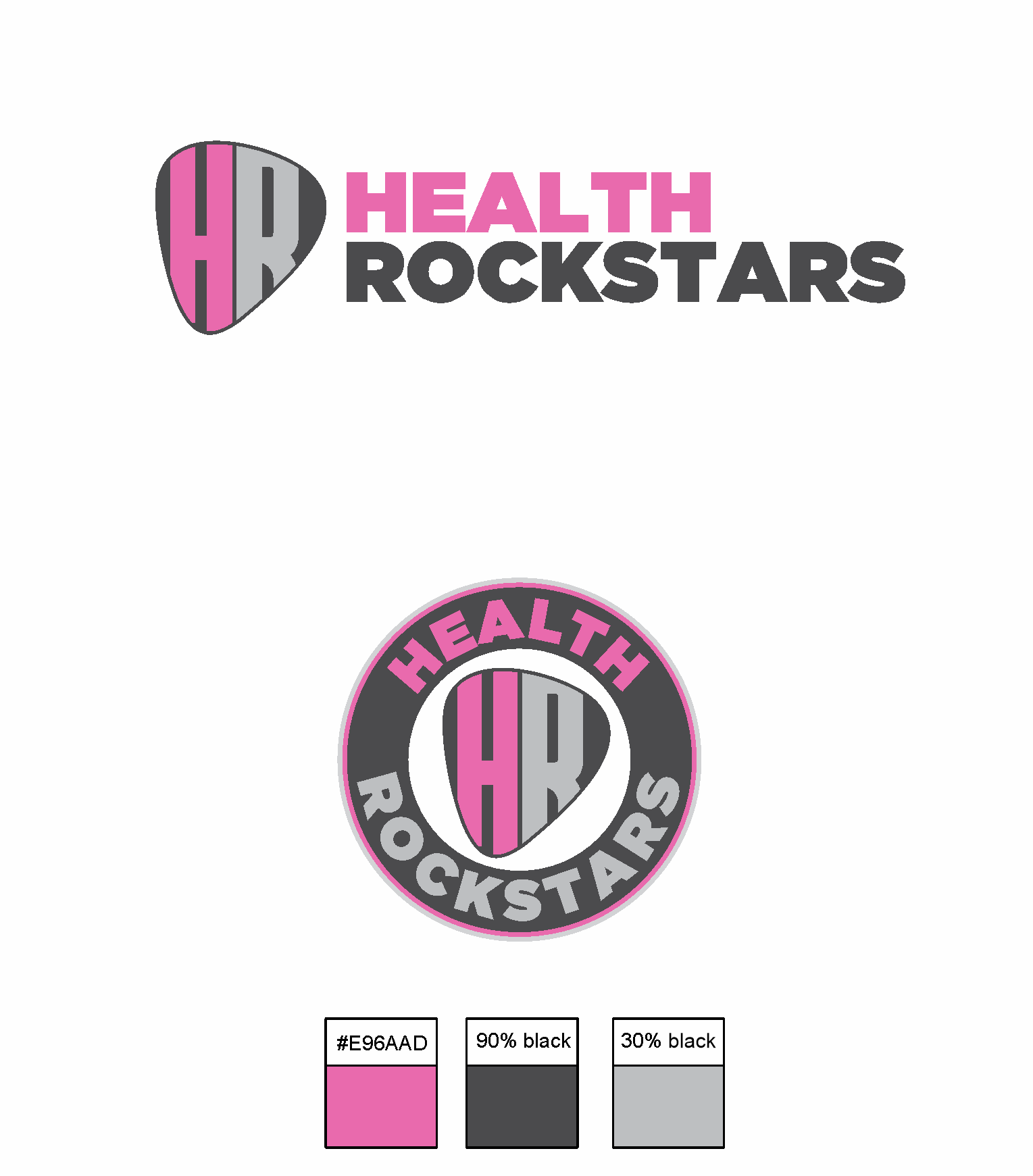
Este cliente recibió 276 diseños de logo de 80 diseñadores. Eligieron este diseño de logo de GRAFITY_dg como el diseño ganador.
Únete gratis Encuentra trabajos de diseño- Garantía
-
 €190
€190
-
 276 diseños
-
 80 diseñadores
Resumen de Diseño de Logo
Health Rockstars (HR) is an innovative service provider aiming to revolutionize Corporate Health Management (BGM) and Corporate Health Promotion (BGF). Unlike competitors who focus on technical aspects, HR emphasizes emotion, engagement, and a strong brand identity, offering a unique experience for both companies and employees.
Vision & Mission HR redefines corporate health by blending traditional measures with team building and personal development, while enhancing employer branding and retention. The brand aims to be so innovative that it inspires the industry to rethink its approach.
Uniqueness & Positioning HR stands out with an emotional brand world that avoids a purely factual approach. The name “Health Rockstars” conveys dynamism and revolution. The brand's visual identity, including the logo and supporting elements, is distinctive and impactful. HR starts as a pilot project in Northern Germany, with plans for expansion through a licensing model.
Business Model & Services HR focuses on two main pillars:
BGF/BGM: Health measures like nutrition, exercise, and mental health through workshops and training.
Healthy Corporate Culture: Experience-oriented formats that link health with team dynamics and personal development.
Brand Building & Design World HR is not just a brand; it’s a movement. The brand's presence is emotionally charged, contrasting with traditional health providers. It combines professional excellence with rebelliousness, aiming to inspire both employees and companies with a new understanding of health management.
Logo & Visual Identity The logo is the cornerstone of HR’s brand world, guiding a dynamic design language across various touchpoints. It needs to be powerful, versatile, and create recognition across all media formats, including print, digital, and events.
Target Audience HR appeals to CEOs, business owners, and HR professionals, offering an engaging and emotional experience rather than just solutions. It also targets employees of participating companies.
Actualizaciones
I’d like to share a few more thoughts to further refine the design direction:
• The idea is to stand out and be different, but not in a rebellious way (not rejecting everything old), rather as a lifestyle—bold, unique, and confident.
• A possible approach: using a plectrum as the "O" in "Rockstars", . The plectrum could serve as a pink accent—perhaps keeping only the plectrum pink to avoid overusing the color. Use reduced black and one or two shades of grey
• The typography is key—it should express energy and individuality.
• Avoid overly cliché rock music aesthetics—it’s more about the feeling of motivation, freedom, passion, and being unapologetically yourself.
• The logo should remain clean and not overloaded.
• A round logo is not mandatory, but still good.—feel free to explore other shapes that align with the concept.
Looking forward to your creative ideas! Let me know if you need any further input.
Added Saturday, 08 March 2025
Spoke wir the Support to Extend the Deadline
Objetivo del mercado(s)
German companies / B2B
Tipo de industria / entidad
company health promotion - so creative, rockstar but not losing seriousness
Texto del logo
Health Rockstars
Estilos de logo de interés
Logo con emblema
Logo contenido dentro una forma / figura
Logo con personaje
Logo con ilustración o personaje
Colores
Colores seleccionados por el cliente para ser utilizados en el diseño del logotipo:
Mira y siente
Cada control deslizante ilustra las características de la marca del cliente y el estilo que debe comunicar el diseño de tu logotipo.
Elegante
Atrevido
Juguetón
Serio
Tradicional
Moderno
Atractivo
Profesional
Femenino
Masculino
Vistoso
Conservador
Económico
De Alta Gama
Requisitos
Debes tener
- Round logo. Combination typo and symbols. Orientated to briefing and logo-powerrpoint. Colours Various Greys, rosa/pink, maybe black. Arrangement of symbols for healthy nutrition, sports/exercise, mental health.