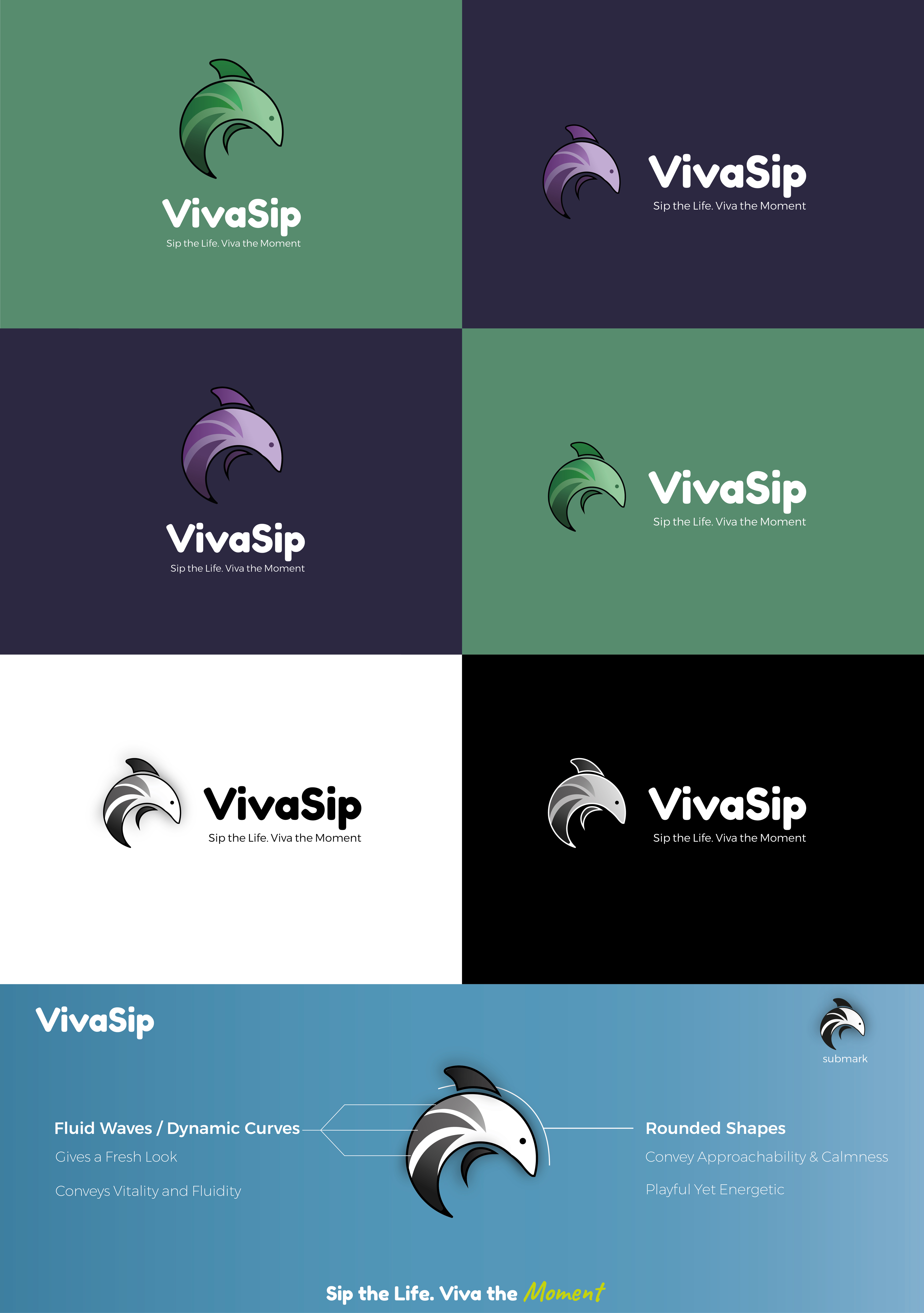
Flavored Water Bottle needs a logo design

¿Quieres ganar un trabajo como este?
Este cliente recibió 87 diseños de logo de 35 diseñadores. Eligieron este diseño de logo de Med Yh como el diseño ganador.
Únete gratis Encuentra trabajos de diseño- Garantía
Resumen de Diseño de Logo
!!! Please avoid overly artificial or generic design elements. We’re looking for something that feels authentic, original, and true to the brand.
there are a few important points to consider:
Possible Misunderstanding
At first glance, customers might assume this is just a standard bottled water product, rather than a unique or innovative water bottle brand. We need to avoid that confusion.
Mountain Design Needs Refinement
The mountain shape could be more distinct and recognizable. Right now, it feels too abstract—refining it to look more like an actual mountain would enhance clarity and impact.
Need for a Strong Brand Figure/Icon
We’d like to introduce a signature figure that represents the VIVASIP brand—something iconic and versatile, similar to the logos from Hydro Flask or Stanley.
This figure should feel creative, premium, and standalone, so we can confidently use it by itself (without text) on some of the bottles and products for a more luxury and collectible feel.
(Mountain was just a example, not really recommended)
--------------------------------------------------------
## **VivaSip Logo Design Requirements**
### **1. Brand Name & Typography**
- **Brand Name:** VivaSip (preferred format, but can be stylized as VIVASIP or Vivasip or vivasip based on design direction).
- The logo should combination of both: **typographic design** AND *iconic symbol**,
- Font should be **modern, legible, and emotionally resonant**, aligning with the brand’s personality.
---
### **2. Logo Concept & Design**
- The logo should evoke feelings of **refreshment, vitality, and emotional connection**.
- Can be based on either a **carefully selected font** or a **simple, recognizable graphic symbol**.
- **Only the brand name** will appear on the bottle with a **clean, minimal icon** (e.g., abstract wave, drop, scent trail)—avoid overused symbols like mountains or suns.
- Optional: Add short inspirational phrases (e.g., *Carpe Diem*) or simple icons (e.g., stars) for lifestyle packaging appeal.
---
### **3. Target Audiences**
Design should resonate across **three core user groups**, with tailored visual accents or packaging for each:
- **Children:** Fun, gentle colors, playful shapes (without being childish).
- **Everyday Adults:** Clean, modern lifestyle aesthetic suitable for work, home, or leisure.
- **Athletes:** Bold, energetic accents to represent performance and vitality.
Note: **Logo remains consistent** across audiences; only **packaging colors or variations** may differ.
---
### **4. Brand Identity & Tone**
- **Core Values:** Health, hydration, enjoyment, and innovation through sensory experiences.
- **Tone of Voice:** Modern, refreshing, and confident—leaning toward minimalist with a touch of playfulness.
- The logo should visually express these values without excessive complexity.
---
### **5. Simplicity & Legibility**
- Keep the design **clean, simple, and versatile**.
- Ensure **clarity at all sizes**, from tiny bottle caps to website banners.
- Avoid unnecessary details or overly complex fonts—**legibility is key**, especially on small surfaces.
---
### **6. Color Palette**
- **Primary Tones:** Fresh hues such as aqua blue, mint green, and soft purples.
- **Accent Colors:** Optional warm tones like coral or orange to add vibrancy and signal flavor.
- Ensure **high contrast** for visibility across various packaging materials (clear, colored, matte, etc.).
---
### **7. Iconography**
- Integrate **water-related symbols**: drops, waves, scent vapors, or abstract forms.
- Prefer **abstract, fluid, or geometric shapes** that convey movement, purity, or aroma.
- Avoid clichés—iconography should feel **fresh, stylish, and brand-appropriate**.
---
### **8. Versatility**
- Design must scale and adapt well across platforms: bottles, marketing materials, digital screens.
- It should look great in **full color, monochrome, grayscale**, and on both light and dark backgrounds.
---
### **9. Typography**
- Choose fonts that match the brand personality:
- **Modern, sleek** fonts for a premium, lifestyle vibe.
- Slightly **playful or soft-rounded fonts** may appeal to families and children.
- Avoid fonts that are **too decorative or complex**, especially for small-scale applications.
---
### **10. Distinctiveness & Timelessness**
- The logo must be **unique, memorable**, and **easily distinguishable** from competitors.
- Avoid short-term design trends—aim for a look that’s **timeless and adaptable** over years.
---
### **11. Emotional Connection**
- The logo should evoke a **sense of freshness, health, and positivity** at a glance.
- Use **color psychology, elegant shapes, and simplicity** to make consumers *feel* the benefits of hydration just by seeing the logo.
---
### **12. Optional Slogan**
**“Sip the Life. Viva the Moment.”**
This slogan can be used on select packaging or in campaigns to enhance emotional branding.
Actualizaciones
Need a couple of days before selecting a winner
Objetivo del mercado(s)
Children, Athletes, Adults
Texto del logo
VIVASIP
Mira y siente
Cada control deslizante ilustra las características de la marca del cliente y el estilo que debe comunicar el diseño de tu logotipo.
Elegante
Atrevido
Juguetón
Serio
Tradicional
Moderno
Atractivo
Profesional
Femenino
Masculino
Vistoso
Conservador
Económico
De Alta Gama
Requisitos
Debes tener
- The logo should combination of both: **typographic design** AND *iconic symbol**,
No debería tener
- Please avoid overly artificial or generic design elements