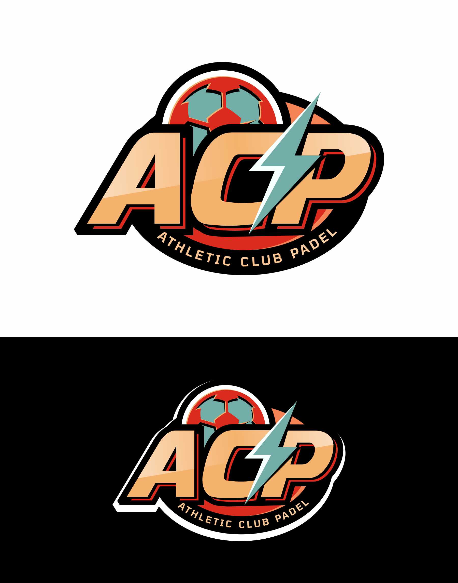
Athletic Club Padel Brand Logo
¿Quieres ganar un trabajo como este?
Este cliente recibió 127 diseños de logo de 49 diseñadores. Eligieron este diseño de logo de debdesign como el diseño ganador.
Únete gratis Encuentra trabajos de diseño- Garantía
-
 €200
€200
-
 127 diseños
-
 49 diseñadores
Resumen de Diseño de Logo
🎯 ACP Logo Design Brief
Brand Name: ACP (Athletic Club Padel)
Tagline / Full Name: ATHLETIC CLUB PADEL
⸻
📍About the Brand
ACP is a performance wear brand built for the modern Padel player who carries the attitude and legacy of classic 90s and 00s football culture. We draw inspiration from iconic football moments and the legendary players of that era. ACP represents those who once lived for the game — and now bring that same energy to the Padel court.
We are more than just a brand; ACP is a club — a rebellious, performance-first community of ex-ballers and new legends.
⸻
✏️ Creative Direction
We’re looking for a bold, sporty, and retro-inspired logo that feels like it belongs to a timeless athletic club. The use of a horizontal oval / ellipse is intentional — it brings a classic 90s/00s retro sports vibe that works perfectly across performance wear like shirts, hoodies, jackets, and accessories.
The logo should feel powerful and clean, with strong presence and versatility across embroidery, screenprint, and rubber patch applications.
⸻
🧩 Core Design Requirements
✅ Shape
• The horizontal oval / ellipse is the primary shape we want to explore — it gives the logo a retro-sporty 90s/00s aesthetic that aligns perfectly with the brand’s identity and looks strong on performance wear like shirts, hoodies, and jackets.
• All key elements — ACP, ATHLETIC CLUB PADEL, and the ⚡ lightning bolt — should be placed within or interact clearly with this oval layout.
• For the Lightning Bolt - please make sure to use the same shape lightning bolt as the Icon that's attached (file names: Lightning Shape White & Black). Feel free to create your own high res shape in the same style.
• While the focus should be on delivering strong oval-based designs, we’re open to seeing one or two subtle shape variations only if they maintain the same sporty, classic energy and remain practical for apparel use.
• Ultimately, the oval is the benchmark — other shapes should not distract from or dilute the core direction.
✅ Typography
• Primary font options: Tomorrow Font or Masque Font (semi-bold or bold).
• Please provide versions using both fonts.
• Alternatives must have a sporty, condensed, 90s feel and match the energy of the reference fonts.
✅ Core Elements to Include
1. ACP — as the main focus inside the logo.
2. ATHLETIC CLUB PADEL — full name, secondary placement (e.g. wrapped or stacked).
3. ⚡ Lightning Bolt — should be integrated in a smart way, either within the typography or as a distinct graphic inside the oval.
✅ Color Versions
• Provide versions on white and black backgrounds.
• The design must work well in monochrome, for both digital and physical uses (e.g. embroidery, rubberized badges, labels).
⸻
🧪 Vibe References
• Football crest-inspired, 90s sportswear feel
• Retro yet clean and modernized — think Total 90 kits, Beckham/R9 era energy
• Not over-styled; bold, athletic, instantly recognizable
⸻
💡 Output
• Multiple design variations showing:
• Different bolt placements (in the lettering, as a separator, etc.)
• Different text layouts inside the oval
• Explorations of spacing, linework, and boldness
• Deliverables:
• Vector or Figma files (.AI / .SVG)
• High-res PNGs on white and black backgrounds
• Optional mockups (e.g. shirt, cap, hoodie) are a plus
⸻
Texto del logo
1) ACP in all capitals and below 2) Athletic Club Padel (smaller)