Brand label design for commercial onion sack
¿Quieres ganar un trabajo como este?
Este cliente recibió 18 diseños gráficos de 7 diseñadores. Eligieron este diseño gráfico de StudioD™ como el diseño ganador.
Únete gratis Encuentra trabajos de diseño- Garantía
-
 US$100
-
 18 diseños
-
 7 diseñadores
Resumen de Diseño Gráfico
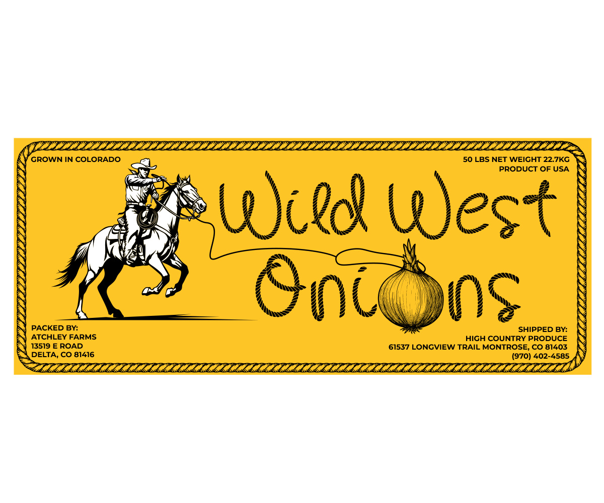
3 color graphic design for 19.5"W x 8"H label used on commercially packed fresh onions (the onion sack is tangerine in color). Copy "WILD WEST ONIONS" (brand). Art - western / cowboy scene. General thought, on the left side of the label, cowboy on horse throwing a lasso or holding a rifle maybe with a large moon behind him (moon could be an onion?) with the text ("WILD WEST ONIONS") written with a rope font across the rest of the label (please make the text large and try to fill as much space top to bottom across the width). Another idea was the cowboy could be throwing a lasso from the left side of the label and the rope he is throwing could spell "WILD WEST ONIONS" across the label. In the oval at the end of the lasso, he could either be lassoing an onion or "GROWN IN COLORADO" could be written inside the lasso loop. Some art examples attached for reference. The label will be on both sides of the onion sack.
There is some information we are required to include on the label (example attached for "BOY O BOY ONIONS". Must say "PRODUCT OF USA / 50 LBS NET WEIGHT 22.7KG / PACKED BY: ATCHLEY FARMS 13519 E ROAD DELTA, CO 81416 / SHIPPED BY HIGH COUNTRY PRODUCE 61537 LONGVIEW TRAIL MONTROSE, CO 81403 (970) 402-4585".
Objetivo del mercado(s)
Product is sold to retail and foodservice produce buyers
Tipo de industria / entidad
Agriculture / produce
Estilos de fuente para usar
Gustan otros estilos de fuente:
- rope lettering / desert rope / cowboy rope
Mira y siente
Cada control deslizante ilustra las características de la marca del cliente y el estilo que debe comunicar el diseño de tu logotipo.
Elegante
Atrevido
Juguetón
Serio
Tradicional
Moderno
Atractivo
Profesional
Femenino
Masculino
Vistoso
Conservador
Económico
De Alta Gama
Requisitos
Debes tener
- Brand name in large font / easily read using the label space well.
No debería tener
- Not overly complicated design. Do not want the label to look cluttered