Update the Bullseye Birdies Logo
¿Quieres ganar un trabajo como este?
Este cliente recibió 253 diseños de logo de 117 diseñadores. Eligieron este diseño de logo de Atec como el diseño ganador.
Únete gratis Encuentra trabajos de diseño- Garantía
-
 A$150
A$150
-
 253 diseños
-
 117 diseñadores
Resumen de Diseño de Logo
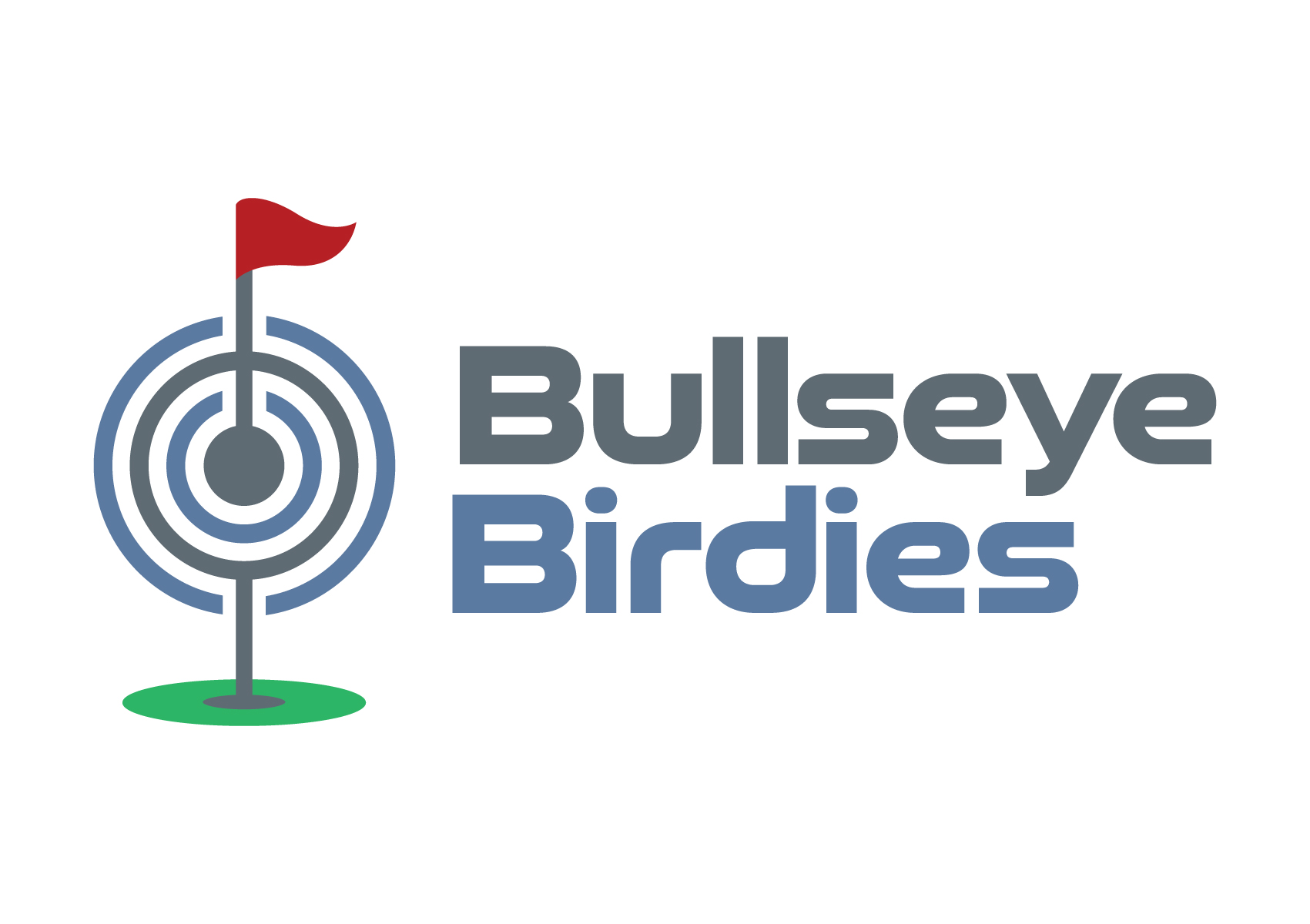
I have a pre-existing logo concept for our new business 'Buslleye Birdies' - a tavern with darts and golf simulators. Please read the brief in full before you commence this project.
We like the current logo concept but are unhappy with the font and a few small elements of the golf/darts icon that sits tp the left of the Bullseye Birdies text.
We are seeking a minor recreation of this logo to make it look more dynamic and available in two visual styles 1. Standard logo with a clear (vector) background that can be applied on white paper, email footers etc.; and 2: a reverse version of the colours with a clear (vector) background so the logo can be applied to our black walls for exterior signage, or dark colour background in advertisements.
*We have a logo graphic sample and a font file example of the new font style we would like to replace the old one with.
Deliverable formats required will be high resolution jpeg, png, pdf, psd and eps files of the regular and reverse logo versions please.
This is an urgent project. Thank you
Objetivo del mercado(s)
Local Geraldton community and visitors who like pubs and playing golf or darts
Tipo de industria / entidad
Hospitality, tourism and sports
Texto del logo
Bullseye Birdies
Estilos de fuente para usar
Gustan otros estilos de fuente:
- Good Timing Regular or Bold (or a similar font that has bold and light options and that can be downloaded for free and used across our business) )
Mira y siente
Cada control deslizante ilustra las características de la marca del cliente y el estilo que debe comunicar el diseño de tu logotipo.
Elegante
Atrevido
Juguetón
Serio
Tradicional
Moderno
Atractivo
Profesional
Femenino
Masculino
Vistoso
Conservador
Económico
De Alta Gama
Requisitos
Debes tener
- 1. Same or better version of the golf pin and dart board icon to the left of the text (I have provided a mock up version attached so would like a slightly better quality image. 2. Change text font to 'Good Timing Regular or Bold' Font (or similar - *if you choose another similar font, it must have some bold and light options that we can download it for use across all our sales, marketing, menus etc.). 3. Keep the current corporate colours (minor font shade changes accepted).
Agradable de tener
- We like the basic look of the logo sample we have provided, just slight improvements + a reversed out version for use on our black walls and website would be great please.
No debería tener
- Must not have any major changes that don't resemble the basic look we have presented. We like the concept, just need a designers touch to bring it to life. Should not have a font that we can not download for free that has bold and light options for use across our marketing and signage.