

 Refresh
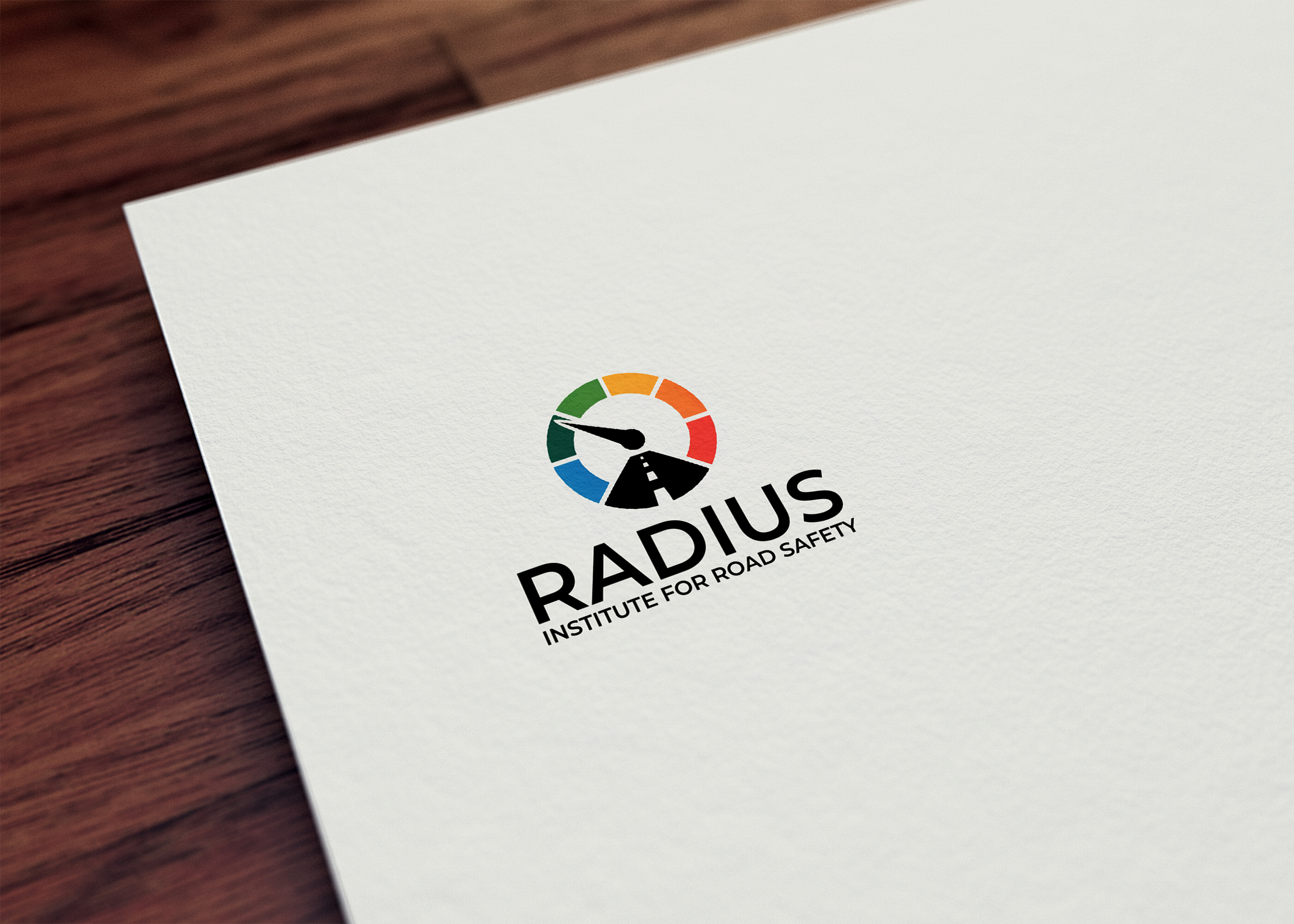
Radius Institute for Road Safety Logo
¿Quieres ganar un trabajo como este?
Este cliente recibió 280 diseños de logo de 106 diseñadores. Eligieron este diseño de logo de Creative_Sophia como el diseño ganador.
Únete gratis Encuentra trabajos de diseño
- Garantía
-
 £110
£110
-
 280 diseños
-
 106 diseñadores
Resumen de Diseño de Logo
Create a logo for a new international non-profit focused on road safety policy called the Radius Institute. We have guaranteed that a winner will be picked and paid.
Before making a submission please read through the description and review the examples attached.
ABOUT US
Business name: Radius Institute for Road Safety
Industry: non-profit, policy, road safety, city infrastructure
Mission: Help local and national governments put in place road safety best practice policies to drastically reduce serious injuries and deaths from road traffic accidents.
TARGET AUDIENCE
- policy makers at the city and national level across various countries including across Africa and Asia.
WHAT WE'RE LOOKING FOR
(1) USE: This logo will be used across all our branding materials, including our website, social media, packaging, and print materials.
(2) QUALITY: A clean, modern, and professional design that will appeal to policy makers (so nothing that screams public advocacy or protest, fairly neutral and simple).
Although we are a non-profit, we’re looking for a polished, professional identity that communicates the same level of quality and expertise as a top-tier international think tank.
We're looking for something that can really solidly beat the attached examples generated by AI coming from a professional designer.
(3) SYMBOL & SHAPE:
Overall strong preference for a circle shape.
Beyond that two broad design theme suggestions:
either:
(A) Something that evokes roads, road safety, radius (of a circle), or radar somehow, but very subtly. For example, a circle with a line from the center to the edge, a symbol that looks a bit like a speedometer, a simple road (maybe if not too cheesy), concentric circles, a crosswalk/zebra crossing pattern, an octagon (stop sign shape), etc. We want this to be evocative of these ideas but not too literal.
or:
(B) Something elegant, simple and abstract using circles (see Canva examples attached)
Note: If the logo includes anything evoking a speedometer needle it should point left as you look at it towards around 10 o clock (indicating a lower driving speed)
(4) VALUES: A logo that communicates trustworthiness, expertise, research rigor, a focus on evidence, professionalism, and practical applied know-how.
(5) Type: The logo should primarily be symbol-based, but work with text in a few different formats: (a) Standalone (just the logo, no text), (b) Logo + "Radius Institute", (c) Logo + "Radius Institute for Road Safety"
(6) Color Scheme: The logo must work well in color and black and white. on both light and dark backgrounds. Our initial color scheme is Blue #274472 (primary color), Amber #FFC857 (slight accents), Gray #D6DCE2 (supporting color), but we are very open to changing this, especially the amber.
(7) STYLE: See Canva examples attached.
Something that looks sleek, modern, and simple. While we want some evocative imagery, we want to avoid anything too obvious, cheesy or blocky that looks like it comes from Canva, Clipart or ChatGPT-generated images.
(8) FONT: Something modern, clean, clear, and professional. Prefer fonts available on Google Fonts or broadly licensed for unrestricted use. Examples we like include Inter, Roboto, Lato, Open Sans, or Montserrat — but we're open to similar professional options.
(9) AVOID: Clip art vibes, overly busy or complex imagery, anything that suggests unsafe driving e.g. speeding or race cars, use of car imagery (since focus will be on various vehicle types)
(10) NOTE ON SPEEDOMETER: If the logo includes anything evoking a speedometer needle it should point left as you look at it towards around 10 o clock (indicating a lower driving speed)
EXAMPLES
Attached are 9 examples from ChatGPT and Canva's AI logo generator.
They are numbered from most liked/favorite (1) to least favorite (9) and the names each contain comments about what we do and don't like in the examples.
Broadly speaking we like the simple, thin line style of a lot of the Canva designs, but the concepts and the clear evocation of something to do with driving or roads in the ChatGPT ideas.
DELIVERABLES:
(I) Logo with and without name next to it
(II) Color and black on white versions
(III) "Please include original layered source files (preferably in .PSD or .XCF format for GIMP compatibility), along with vector formats (.AI, .SVG) and high-resolution raster formats (.PNG, .JPG).”
Objetivo del mercado(s)
Transport policy makers (national and local level) (see project description)
Texto del logo
Radius Institute for Road Safety
Estilos de logo de interés
Logo abstracto
Conceptual / simbólico (texto opcional)



Mira y siente
Cada control deslizante ilustra las características de la marca del cliente y el estilo que debe comunicar el diseño de tu logotipo.
Elegante
Atrevido
Juguetón
Serio
Tradicional
Moderno
Atractivo
Profesional
Femenino
Masculino
Vistoso
Conservador
Económico
De Alta Gama
Requisitos
Debes tener
- (see project description) Simple, elegant design like Canva examples attached. Subtle reference to radius (circle) or roads.
Agradable de tener
- (see project description)
No debería tener
- (see project description) Avoid imagery being too literal.


