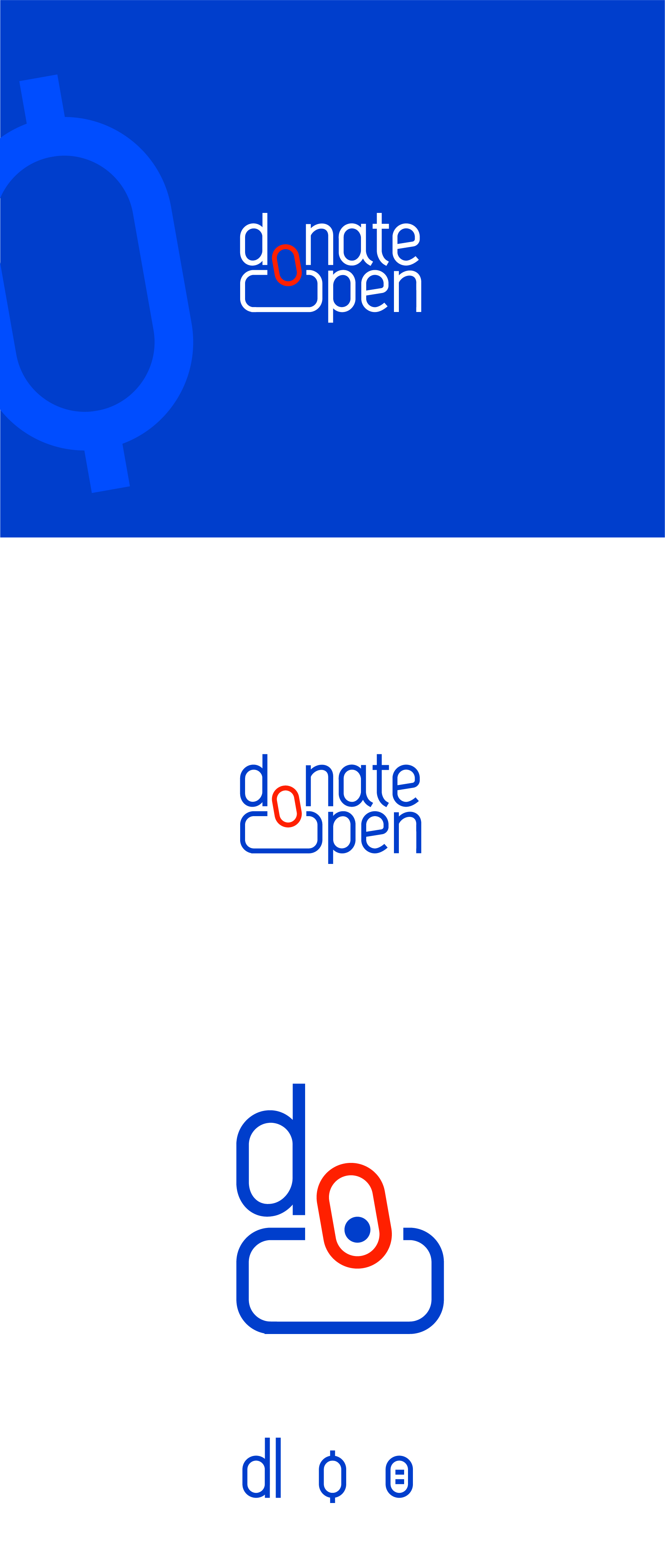
Logo Design for DonateOpen — an innovative IT platform that redefines donations, US market
¿Quieres ganar un trabajo como este?
Este cliente recibió 268 diseños de logo de 116 diseñadores. Eligieron este diseño de logo de deform como el diseño ganador.
Únete gratis Encuentra trabajos de diseño- Garantía
-
 US$180
-
 268 diseños
-
 116 diseñadores
Resumen de Diseño de Logo
DonateOpen is an innovative IT platform that redefines donations and the relationship between creators and donors.
We've given this more thought and come to the conclusion that we're ready to significantly refine our brief. There isn't a specific, official graphic symbol for donations, and it seems our logo really needs to incorporate such a sign.
For example, the dollar sign ($) originated from the abbreviation "Ps" for Spanish pesos (or piastres) back in the day. We're thinking the donation sign could evolve from an abbreviation like "DO."
So, this would be a symbol that conveys:
Donations are the new money.
Money plus.
Target Audience:
Our primary audience is authors of written texts, including writers, screenwriters, journalists, analysts, experts, scientists, poets, and fanfiction authors. We'll expand to include podcasting, streaming, and video content creators in the future.
The logo needs to have universal appeal, resonating with everyone from a scientist to a fanfiction author. Our platform primarily targets intellectuals, curious individuals, and innovators.
Brand Architecture:
DonateOpen isn't just another service; it's a foundational entity. We plan to develop logos and brand identities for future sub-brands, making DonateOpen an umbrella brand.
Required Logo Versions:
- Mark/Icon (to function effectively as a favicon and mobile app icon)
- Mark + Wordmark (this version will combine the graphical mark with the text "DonateOpen" or "DO")
Brand Communication Objectives:
- DonateOpen embodies a modern, cutting-edge persona, operating at the forefront of global technologies. This positioning indicates a brand that is pioneering and innovative. The logo should reflect this progressive stance, conveying dynamism and leadership in its visual expression.
- The overarching brand feeling should be like the brand's personality is early Google, which "winked at humanity" with its irony and friendliness.
- In the writing community, donations are less prevalent than in streaming and video content. DonateOpen aims to make donations and its service fashionable.
- The service is designed to be reliable and substantial; upon launch, it is crucial to stand out from other donation services and clearly differentiate the platform from charity organizations.
Preferred Color Palette & Context:
We prefer clear, moderately expressive, bright tones and deep colors. It's crucial to consider color perception within the product context; for example, ecclesiastical gold is unsuitable due to its strong religious associations.
Colors to Avoid:
Please, avoid black, gloomy, neon, and acidic colors.
Objetivo del mercado(s)
US
Tipo de industria / entidad
fintech
Texto del logo
DonateOpen or DO
Estilos de logo de interés
Logo con emblema
Logo contenido dentro una forma / figura
Logo abstracto
Conceptual / simbólico (texto opcional)
Logo de marca de nombre
Logotipo basado en palabra o nombre (solo texto)
Logo con siglas
Acrónimo o logo tipográfico (solo texto)
Estilos de fuente para usar
Mira y siente
Cada control deslizante ilustra las características de la marca del cliente y el estilo que debe comunicar el diseño de tu logotipo.
Elegante
Atrevido
Juguetón
Serio
Tradicional
Moderno
Atractivo
Profesional
Femenino
Masculino
Vistoso
Conservador
Económico
De Alta Gama
Requisitos
Debes tener
- Inspirational References (Likes). Under Armour: The style inspires trust in product functionality. Upwork: The brand evokes a metaphor of connection and partnership. Patreon: The logo and application are laconic; the expressiveness of the wordmark is appreciated, and the logo does not distract from the content or authors. Tesla: Exemplifies cleanliness and minimalism.
No debería tener
- Anti-References (Dislikes). Boosty: The brand does not desire a reference to speed, energy, or impulse; these elements are considered overused. Open.ai: The brand wishes to avoid gears or overly geometric shapes; these are also considered overused. Typical "donation" service designs: Overly literal images of hearts, hands, or money are to be avoided.