

 Refresh
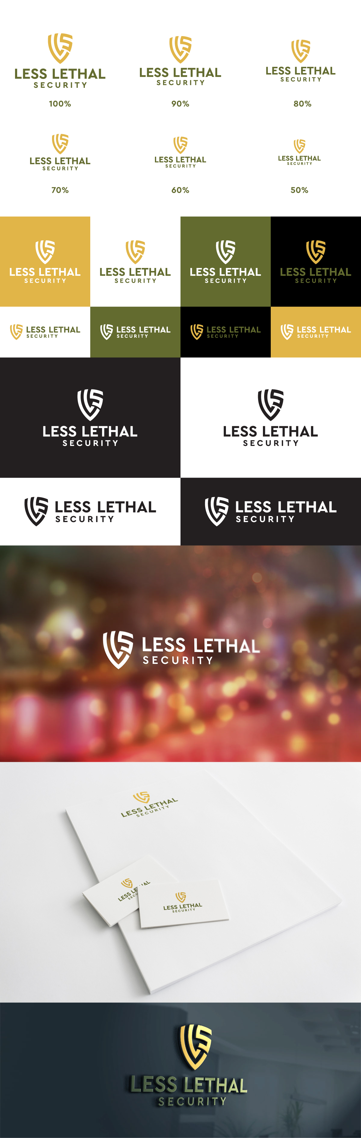
Brand Identity Logo for Less Lethal Security–Woman-Owned, Protecting Lives with Less-Lethal Products
¿Quieres ganar un trabajo como este?
Este cliente recibió 388 diseños de logo de 127 diseñadores. Eligieron este diseño de logo de 439 Creations como el diseño ganador.
Únete gratis Encuentra trabajos de diseño
-
 US$150
-
 388 diseños
-
 127 diseñadores
Resumen de Diseño de Logo
We’re rebranding Less Lethal Security, a woman-owned company focused on protecting lives through non-lethal defense products. Our current logo feels too rigid and masculine for the vision we're building. It includes two background color options; I prefer the white version, as it feels softer and more modern. However, I’m not a fan of the wheat-like border or the bottom banner. The font used in the banner for “Less Lethal Security” is also difficult to read.
One important design element I’d like to preserve is the “LLS” graphic as I do not have a Vector file of it. I only have a Jpg. – This specific graphic carries personal meaning and should remain as-is. Everything else is open for reinterpretation to create a modern, credible brand that appeals to both men and women.
We are in the tactical space, but we also care deeply about community, education, and practical safety. I am open to visual approaches that communicate protection, strength, and balance without being overly aggressive or traditional.
The final design should be:
Vector-ready for easy scaling
Adaptable for merchandise (apparel, signage, packaging)
Clean, bold, and easily recognizable across digital and physical uses
Texto del logo
LLS in the center and Less Lethal Security at the bottom

