Apothecary
¿Quieres ganar un trabajo como este?
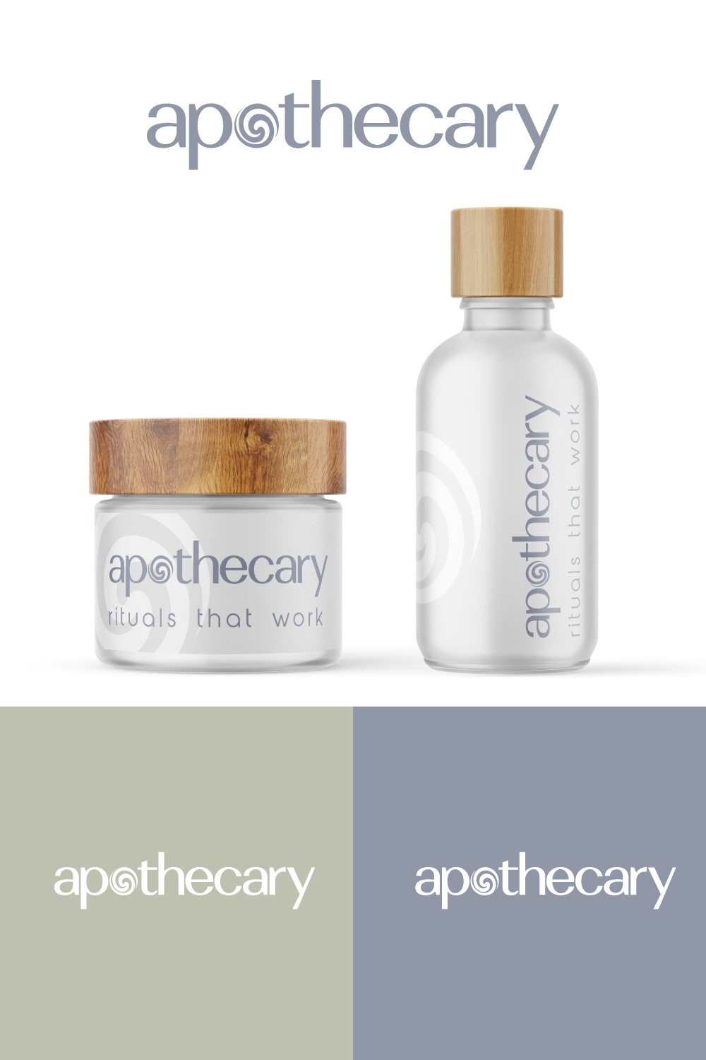
Este cliente recibió 126 diseños de logo de 60 diseñadores. Eligieron este diseño de logo de Sergio Coelho como el diseño ganador.
Únete gratis Encuentra trabajos de diseño-
 US$150
-
 126 diseños
-
 60 diseñadores
Resumen de Diseño de Logo
domain is joinapothecary.com
🌱 Join Apothecary Brand Guide
🧠 Brand Essence
Name Meaning: “Join” evokes community, accessibility, and inclusion. “Apothecary” brings in roots of holistic healing + modern wellness.
Positioning: Soft science meets minimal luxury. An apothecary reimagined for Gen Z and Millennials. Functional, clean, warm.
👥 Target Audience
Age: 22–38
Values: wellness routines, aesthetics, clean living
Shopping habits: Subscriptions, Instagram/TikTok discovery, DTC-friendly
They want:
To feel better without looking like they’re “on medication”
Accessible but premium wellness
Vibe-driven + lifestyle integration
🧩 Brand Voice & Messaging
Tone Example
Calm “Take a breath. This is for you.”
Empowering “You’re not broken. You’re balancing.”
Inclusive “Everyone’s healing looks different.”
Intelligent “Clinically formulated, naturally made.”
✨ Tagline Options
“Soft science. Strong results.”
“Rituals that work.”
“Gentle medicine. Bold you.”
🎨 Visual Identity
Color Palette: Soft Neutrals + Trust Accents
Color Name Hex Use
Cloud White #F9F8F4 Backgrounds, space
Eucalyptus Gray #D3D7D3 Containers, borders
Soft Charcoal #3C3C3C Typography
Nude Sand #E8DDD3 CTA buttons
Sage Green #A4C3A2 Accents, icons
Blush Clay #D7A89E Seasonal promos, UGC frames
📦 Packaging Style
Frosted glass or refillable pouches
Embossed logo in soft charcoal or sage
Rounded label corners, lowercase text
Stickers for refills → “this is what’s working”
Texto del logo
Apothecary