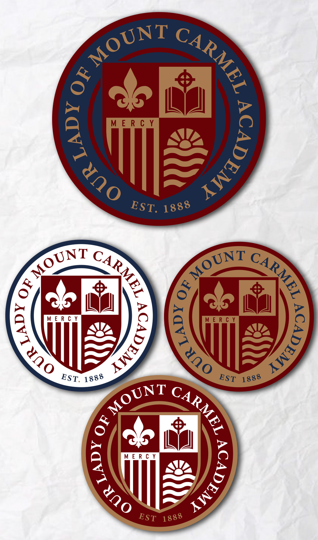
OLMCA School Logo/Crest
¿Quieres ganar un trabajo como este?
Este cliente recibió 101 diseños de logo de 34 diseñadores. Eligieron este diseño de logo de simple mind como el diseño ganador.
Únete gratis Encuentra trabajos de diseño-
 US$110
-
 101 diseños
-
 34 diseñadores
Resumen de Diseño de Logo
We are a Catholic school in Chicago founded in 1888. We need a better brand and would like a crest design.
The school name is long and hard to work with: Our Lady of Mount Carmel Academy. We would probably like to see this around an outer circle. Our font is Garamond, but not a necessity to stick with.
Important identifying symbols could include a cross or a fleur de lis. The fleur de lis is a symbol of Mary (the school is named after) and a cross makes sense, of course, for a Catholic school. The building has a "Celtic cross" on top, but we feel it often does not look like a cross in designs. Additionally, the school was dedicated on the feast day of St. Joseph. He is often symbolized with a lily or a carpenter's square. Of these three, honoring Mary with an appropriate symbol would be most important.
The number 1888 as that is when the school was founded. A field of maroon stripes as that comes from the order of nuns who founded the school (Sisters of Mercy). An example of their shield is attached.
School colors are maroon and gold, but I probably prefer maroon and whites, gray, maybe even navy.
Located in Chicago near the lakefront. Something connecting us to the city of Chicago would be nice or being near the lake. We want to balance tradition and modern/sleek. The school is known for high academic performance. A symbol? There is an open book carved over the front entrance.
We like a neighboring school's logo (Malachy) to use as inspiration (attached). Also included are a few relevant features from the campus and other points of inspiration.