

 Refresh
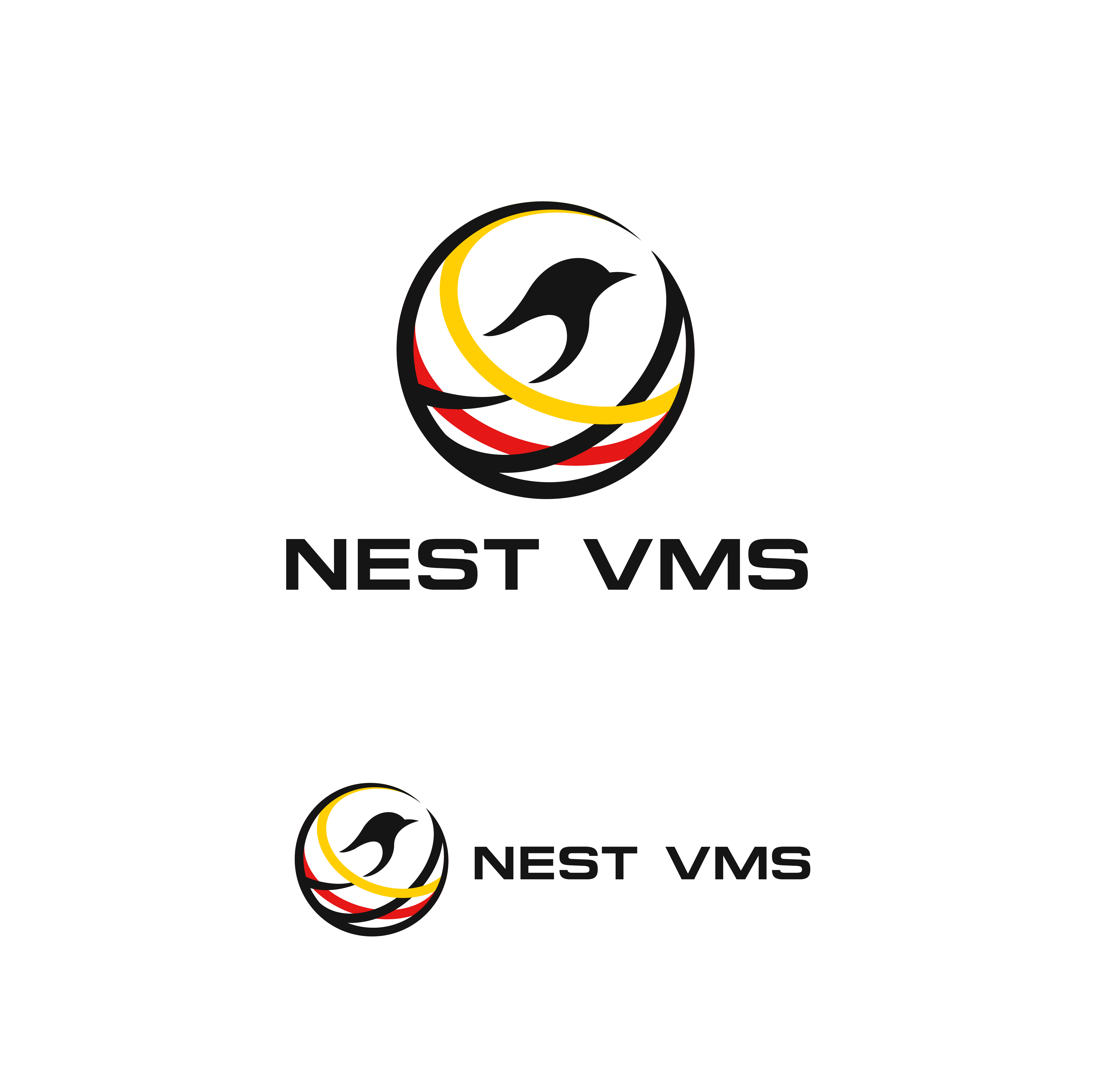
VMS system Logo (the company is Called nest)
¿Quieres ganar un trabajo como este?
Este cliente recibió 167 diseños de logo de 68 diseñadores. Eligieron este diseño de logo de ares_h1 como el diseño ganador.
Únete gratis Encuentra trabajos de diseño
-
 C$150
C$150
-
 167 diseños
-
 68 diseñadores
Resumen de Diseño de Logo
Creative Brief: Abstract Digital Nest Logo
Overview
We are developing a white-labeled Vendor Management System (VMS) branded as Nest, owned by an Indigenous, woman-led business. The logo must communicate:
Trust and innovation (as a technology platform)
Community and connection (aligned with Indigenous values)
Safety and nurturing growth (the symbolism of a nest and bird)
Scalability and professionalism (suitable for North American corporate markets)
Core Concept
Abstract Digital Nest — a modern, circular emblem representing the protective and connected nature of a nest, interpreted through interwoven arcs that also resemble network diagrams or digital pathways.
Negative space subtly suggests a bird or egg, without literal illustration.
Symbolism
Nest = Safety, community, platform foundation
Bird (abstract) = Vision, connection to land/sky, growth
Weaving arcs = Indigenous weaving and beadwork patterns (non-specific, abstracted) + technology network lines
Circle = Wholeness, balance, cyclical growth
Design Guidelines
Form
Circular core
Interwoven arcs or lines forming a “woven digital nest” look
Negative space in center can subtly resemble an egg or bird silhouette
Line Quality
Soft, community-forward style: Slight organic variation, mimicking natural fibers
Sharp, enterprise-tech style: Clean, precise lines with geometric balance
Color Palette
Earth Ochre / Clay Red: Grounding, cultural roots
Sky Blue: Trust, openness, technology
Soft Cream / Warm White: Balance and clarity
Optional Metallic Gold: Premium quality, leadership
Typography
Sans-serif with clean geometry for tech professionalism
Rounded corners or open letter spacing for warmth if leaning community-forward
“nest” in lowercase for approachability; “NEST” in uppercase for corporate tone
Mood Words
Connection
Community
Innovation
Trust
Balance
Growth
Inclusivity
Professionalism
Cultural Guardrails
Avoid Nation-specific patterns, sacred symbols, or clan animals unless approved through consultation.
Keep Indigenous influence inspired by general design principles (weaving, cyclical forms, flowing lines), not literal replication of protected designs.
Colors should draw from natural elements but remain modern and digitally adaptable.
Objetivo del mercado(s)
review the design guidelines in the brief; Core Concept Abstract Digital Nest — a modern, circular emblem representing the protective and connected nature of a nest, interpreted through interwoven arcs that also resemble network diagrams or digital pathways. Negative space subtly suggests a bird or egg, without literal illustration. Symbolism Nest = Safety, community, platform foundation Bird (abstract) = Vision, connection to land/sky, growth Weaving arcs = Indigenous weaving and beadwork patterns (non-specific, abstracted) + technology network lines Circle = Wholeness, balance, cyclical growth
Tipo de industria / entidad
Staffing
Texto del logo
Nest or NEST
Estilos de logo de interés
Logo con emblema
Logo contenido dentro una forma / figura



Logo pictórico / combinado
Un objeto del mundo real (texto opcional)



Logo con personaje
Logo con ilustración o personaje
Estilos de fuente para usar
Gustan otros estilos de fuente:
- Proxima Nova or Avenir or Next Avenir Next Rounded and Montserrat
Colores
Colores seleccionados por el cliente para ser utilizados en el diseño del logotipo:
Mira y siente
Cada control deslizante ilustra las características de la marca del cliente y el estilo que debe comunicar el diseño de tu logotipo.
Elegante
Atrevido
Juguetón
Serio
Tradicional
Moderno
Atractivo
Profesional
Femenino
Masculino
Vistoso
Conservador
Económico
De Alta Gama
Requisitos
Debes tener
- Design Guidelines Form Circular core Interwoven arcs or lines forming a “woven digital nest” look Negative space in center can subtly resemble an egg or bird silhouette Line Quality Soft, community-forward style: Slight organic variation, mimicking natural fibers Sharp, enterprise-tech style: Clean, precise lines with geometric balance Color Palette Earth Ochre / Clay Red: Grounding, cultural roots Sky Blue: Trust, openness, technology Soft Cream / Warm White: Balance and clarity Optional Metallic Gold: Premium quality, leadership Typography Sans-serif with clean geometry for tech professionalism Rounded corners or open letter spacing for warmth if leaning community-forward “nest” in lowercase for approachability; “NEST” in uppercase for corporate tone
No debería tener
- any appropriation toward one specific indigenous group
