Train Switchyard themed minimalist Tech Company Logo
¿Quieres ganar un trabajo como este?
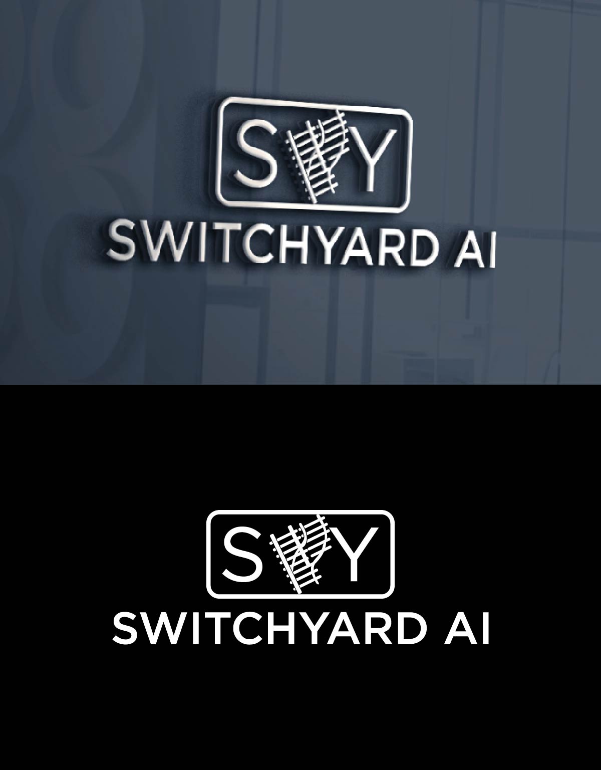
Este cliente recibió 164 diseños de logo de 58 diseñadores. Eligieron este diseño de logo de fly design como el diseño ganador.
Únete gratis Encuentra trabajos de diseño- Garantía
-
 US$300
-
 164 diseños
-
 58 diseñadores
Resumen de Diseño de Logo
Switchyard AI — Logo Direction
==============================
Core idea
---------
An aerial view of a railroad switchyard: tracks converge, diverge, and re-route. The mark should feel like a minimal, almost hand-drawn schematic—industrial, honest, and a bit imperfect—while conveying AI-driven orchestration (directing data/docs to the right place, right time). Avoid anything overly glossy or corporate.
Symbol (primary mark)
---------------------
- Form: A simple hub-and-tracks motif: 1–2 main “rails” enter, 3–5 rails peel off via soft turnouts. Think of a switch (turnout) diagram seen from above.
- Line treatment:
- Double-line rails with occasional, very sparse ties (e.g., a short cross-tick every 3rd–4th gap). Keep it abstract—no heavy detail.
- Hand-drawn feel: slightly irregular line weight and micro-wobble; arcs that aren’t perfectly circular; not all lines straight.
- AI cue (subtle): At the switching node, a small dot or ring can imply a decision point. Avoid brains/neurons/circuit clichés.
- Negative space: Let white space carry the complexity—no filled masses.
Wordmark
--------
- Name: “Switchyard”
- Tone: Industrial-modern, not sterile. Consider a humanist or workhorse grotesk with a touch of warmth.
- Options (open-source friendly): Space Grotesk, Inter, IBM Plex Sans, General Sans.
- Treatment:
- Slight letterspacing for breath; keep stroke weight moderate.
Style & finish
--------------
- Minimalist, analog texture: Imagine graphite on vellum—clean but human.
- Edge discipline: Crisp vectors, but allow organic line variance (custom stroke profile or roughen by 1–2%).
- No gradients, no gloss. If texture is used, keep it very light grain at brand system level, not baked into the core SVG.
Color
-----
- Primary: Rail Charcoal (#1F1F1F) or Graphite (#2A2A2A).
- Accent (choose one):
- Colors are undecided.
- Usage: Mostly mono (black/white); deploy accent sparingly (e.g., the switching node or one outbound track).
- Accessibility: Ensure 4.5:1 contrast for text lockups.
Composition & lockups
---------------------
- Primary lockup: Symbol left, wordmark right, aligned midline.
- Stacked: Symbol above, wordmark below for square formats.
- Monogram/Icon: Cropped “S–Y switch” junction or just the switch node + two diverging rails for favicons/app icons.
What to avoid
-------------
- Brains, EKG waves, hearts, stethoscopes, robot heads.
- Corporate gradients, glassy 3D, overly perfect geometry.
- Dense rail detail (sleepers every few pixels) or literal trains.
- The Red Cross or medical cross symbolism.
Deliverables
------------
- Master vector (SVG) with stroke-based version and outlined fallback.
- 1-color (black), reverse (white), and 1-color + accent variants.
- Horizontal + stacked lockups; 32px and 16px icon tests for legibility.
- Simple pattern tile derived from the track motif for backgrounds.
- PDF mini-spec with clearspace, minimum size, and color values.
Quick sketch brief (for first comps)
------------------------------------
1. Draw a single inbound double-line rail that curves softly into a switch node (small circle).
2. From the node, create three diverging rails: one gentle curve, one near-straight, one subtly irregular—proving “not all lines need to be straight.”
3. Add very sparse ties (tiny cross-ticks) on the inbound and the highlighted outbound only.
4. Set “SWITCHYARD ” to the right in Space Grotesk (slight tracking), with “AI” one weight lighter.
5. Render primary in Graphite on white; make a second version where the node or the chosen route uses some color options.
Objetivo del mercado(s)
Healthcare systems
Tipo de industria / entidad
Healthcare
Texto del logo
Switchyard AI
Estilos de logo de interés
Logo pictórico / combinado
Un objeto del mundo real (texto opcional)
Logo abstracto
Conceptual / simbólico (texto opcional)
Colores
Diseñador para elegir solo colores en escala de grises para usar en el diseño.
Mira y siente
Cada control deslizante ilustra las características de la marca del cliente y el estilo que debe comunicar el diseño de tu logotipo.
Elegante
Atrevido
Juguetón
Serio
Tradicional
Moderno
Atractivo
Profesional
Femenino
Masculino
Vistoso
Conservador
Económico
De Alta Gama
Requisitos
Agradable de tener
- Railroad switchyard imagery