Business Logo Upgrade - Knight Industrial Brake and Clutch Co. -
¿Quieres ganar un trabajo como este?
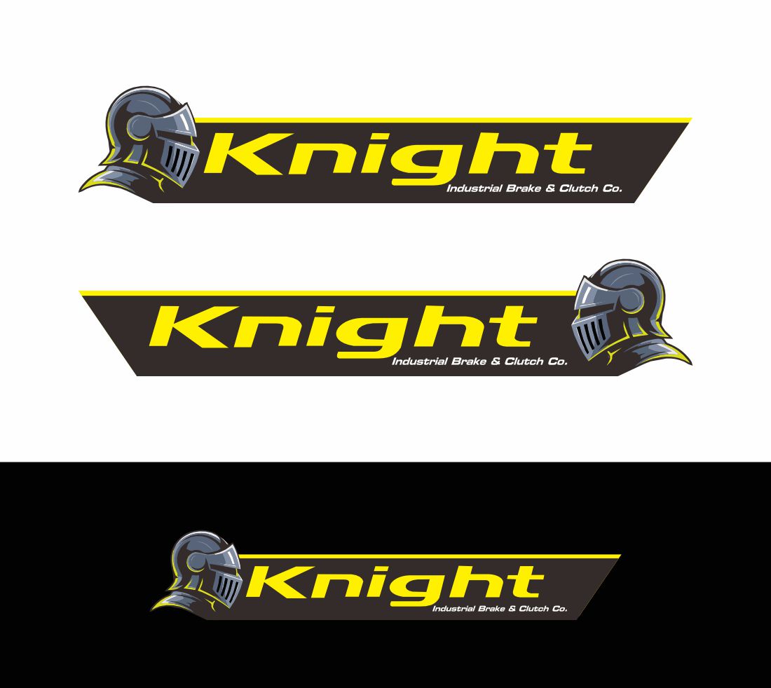
Este cliente recibió 105 diseños de logo de 45 diseñadores. Eligieron este diseño de logo de Bibi Studio como el diseño ganador.
Únete gratis Encuentra trabajos de diseño-
 A$150
A$150
-
 105 diseños
-
 45 diseñadores
Resumen de Diseño de Logo
Originally the business logo was a knight on a horse with a jousting stick. Version two became a knight chess piece.
We would like to return to the Knight in amour - but this time helmet only. The knight armor represents the strength and resilience of our products, but also us as we watch over our customers as protectors and the last line of defense their brakes
The text and colours we do NOT want to change as this is our brand that is very recognizable. I have created a knight helmet, but something is not quite right. We want the knight helmet to be simple, so it looks good from a business card size all the way up to being on the side of a large truck or pickup/ute
It needs to stand out on the side of a white truck and not blend in on the side of a black vehicle either.
The Fluro yellow in the text along with some Fluro orange are required as these are our corporate colours.
I have uploaded our old logo and new logo that is not quite right - the helmet needs to face into the name -
We would also like a video of our knight helmet spinning horizontally 360 degrees to use for social media. Black background - sparling helmet with wording from logo bellow
Tipo de industria / entidad
Industrial brakes and clutches
Texto del logo
Knight Industrial Brake and Clutch Co. (not to be changed)
Colores
Colores seleccionados por el cliente para ser utilizados en el diseño del logotipo:
Mira y siente
Cada control deslizante ilustra las características de la marca del cliente y el estilo que debe comunicar el diseño de tu logotipo.
Elegante
Atrevido
Juguetón
Serio
Tradicional
Moderno
Atractivo
Profesional
Femenino
Masculino
Vistoso
Conservador
Económico
De Alta Gama
Requisitos
No debería tener
- Dont not change the Text in the logo