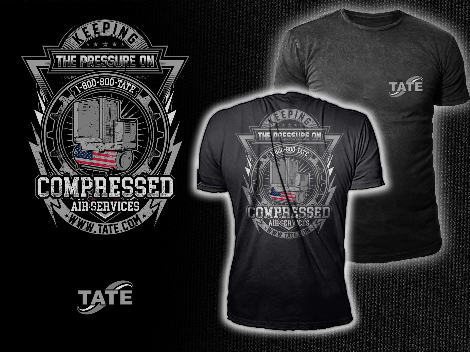
Tate Compressor T-shit Desing - "Keeping The Pressure On"
¿Quieres ganar un trabajo como este?
Este cliente recibió 37 diseños de camiseta de 20 diseñadores. Eligieron este diseño de camiseta de HNS Graphic como el diseño ganador.
Únete gratis Encuentra trabajos de diseño-
 US$190
-
 37 diseños
-
 20 diseñadores
Resumen de Diseño de Camiseta
Bold, rugged, high-impact illustration for a T-shirt
The look should feel industrial, gritty, patriotic, and field-tech approved, with a bold central compressor graphic and strong typography.
Primary Visual Elements
1. Detailed Compressor Illustration
- Industrial air compressor in a high-contrast, thick-outline art style
- Prominent TATE branding on the compressor
2. American Flag Integration (Optional but preferred)
- Flag pattern wrapped across the compressor tank, similar to the boiler flag design
- Feel engineered, not cartoony
- Red/white stripes and blue stars applied in a mechanical-styled way
3. Air/Pressure Effects
- Air bursts
- Pressure lines
- Faint speed/movement streaks
- These should mimic the boiler shirt’s dynamic smoke effect but in an “air” style.
4. Supporting Graphic Elements
- EST. 1924 badge or placement
- Grit-textured or distressed styling
- Circular or arched text frame
- Optional stars under the text for balance
Typography & Layout:
- KEEPING THE PRESSURE ON
- Compressed Air Services
- Tate Mechanical Services
- 1-800-800-TATE
- www.TATE.com
Typography should match our current shirt line:
- Industrial block lettering
- Serif or slab-serif similar to your existing merch
- Slightly distressed edges to match the gritty feel
Color Palette - Stay on Tate brand:
- Tate Navy (#003A70)
- Tate Green (#43B02A)
- White and black for contrast
- Red/white/blue for the flag integration
- Minimal gradients — mostly flat ink for screen printing
Shirt Recommendation
- Black shirt (best contrast)
- Alternate options: Navy or Charcoal
Estilos de fuente para usar
Mira y siente
Cada control deslizante ilustra las características de la marca del cliente y el estilo que debe comunicar el diseño de tu logotipo.