Premium Personal Brand — Facebook Banner (Used Across All Platforms)
¿Quieres ganar un trabajo como este?
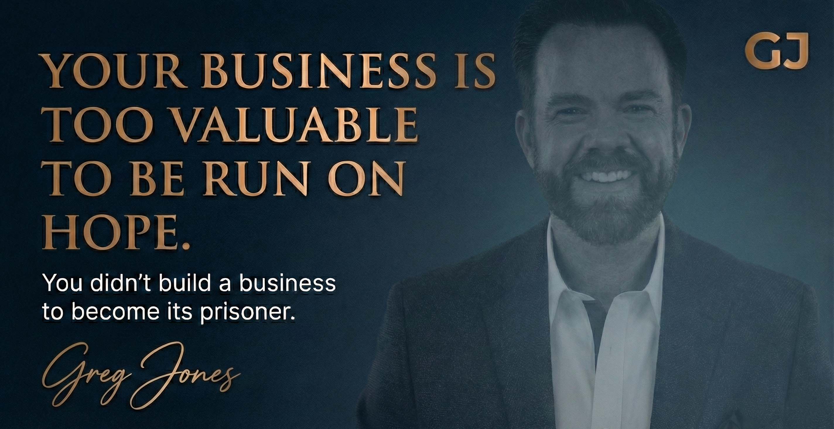
Este cliente recibió 107 diseños de Facebook de 50 diseñadores. Eligieron este diseño de Facebook de Vinayak S como el diseño ganador.
Únete gratis Encuentra trabajos de diseño- Garantía
-
 US$290
-
 107 diseños
-
 50 diseñadores
Resumen de Diseño de Facebook
Task description
Update — Additional Color Direction
In addition to the dark charcoal/slate direction already described, I'm also interested in seeing variants with:
Dark navy blue — Deep, authoritative, intelligence-community feel. Same textured/matte treatment, not flat or bright.
Warm charcoal with steel blue accent — Keep the dark base but introduce a subtle steel blue gradient, accent line, or tonal shift. Sophisticated, modern, adds dimension without adding color noise.
Both should maintain the same premium, restrained, architectural feel described in the original brief. No bright blues, no corporate PowerPoint energy — think midnight, think depth, think weight.
Everything else in the brief remains the same.
I am building a premium personal brand as an executive advisor to founders ($5M+ revenue).
This contest is Facebook-banner–focused, but the design must represent a visual system that will be reused across:
- LinkedIn
- YouTube
I- nstagram
- X (Twitter)
- Website hero sections and other brand touchpoints
Think of the Facebook banner as the primary expression of the brand — not a one-off graphic.
This project is about discovering a high-end visual style and brand feel, not decoration.
What to design
Please submit one cohesive visual system, shown primarily as:
- Facebook banner (primary focus)
The same design language should clearly translate to all platforms listed above.
Designers are responsible for using the current recommended dimensions for each platform.
Quick clarification on background direction:
Backgrounds should have depth and texture, not flat color fields. Avoid pure white, light grey, or solid black backgrounds. Think matte, architectural materials — stone, graphite, concrete, steel — not blank canvases. Subtle tonal variation is encouraged. Obvious gradients or decorative patterns are not.
Text to use
Primary Headline:
- Your Business Is Too Valuable To Be Run On Hope.
Subheadline:
- You didn’t build a business to become its prisoner.
Name:
Greg Jones
The headline should be the dominant visual element.
Logo note (important)
My personal logo is currently being finalized.
For this contest:
- Use a simple “GJ” monogram placeholder
- Clean, bold, geometric sans-serif
- Do not design a logo
- The winning design must allow an easy logo swap later.
Headshot note (important)
- Please do not include a headshot in the banner design.
- Most platforms display a circular profile image separately.
- The banner should stand on its own using typography, layout, and tone only.
- Design the banner assuming the profile photo will sit nearby, not inside the banner.
Style direction
The design should feel:
- Premium
- Calm
- Confident
- Restrained
- High-trust
- Dark, neutral backgrounds are preferred.
- Fewer elements are better than more.
Think:
- Owner-level advisor
- Private equity / boardroom tone
- Industrial, Modern, Minimalist, Elite, Architectural, not decorative
What to avoid
Please do not submit designs that feel:
- Promotional, hype-driven, or salesy
- Like a coach, guru, or agency
- Bright, colorful, or gradient-heavy
- Busy or over-designed
- Based on stock photos
- No motivational speaker energy.
Reaction test
- If someone sees this banner on Facebook (or later on LinkedIn, YouTube, etc.), the reaction should be:
“That person is serious. I’d trust them with important decisions.”
Final note
- I am not looking for many variations.
- I am looking for one strong visual direction you believe in.
Simple beats clever.
- Restraint beats decoration.
Mira y siente
Cada control deslizante ilustra las características de la marca del cliente y el estilo que debe comunicar el diseño de tu logotipo.