

 Refresh
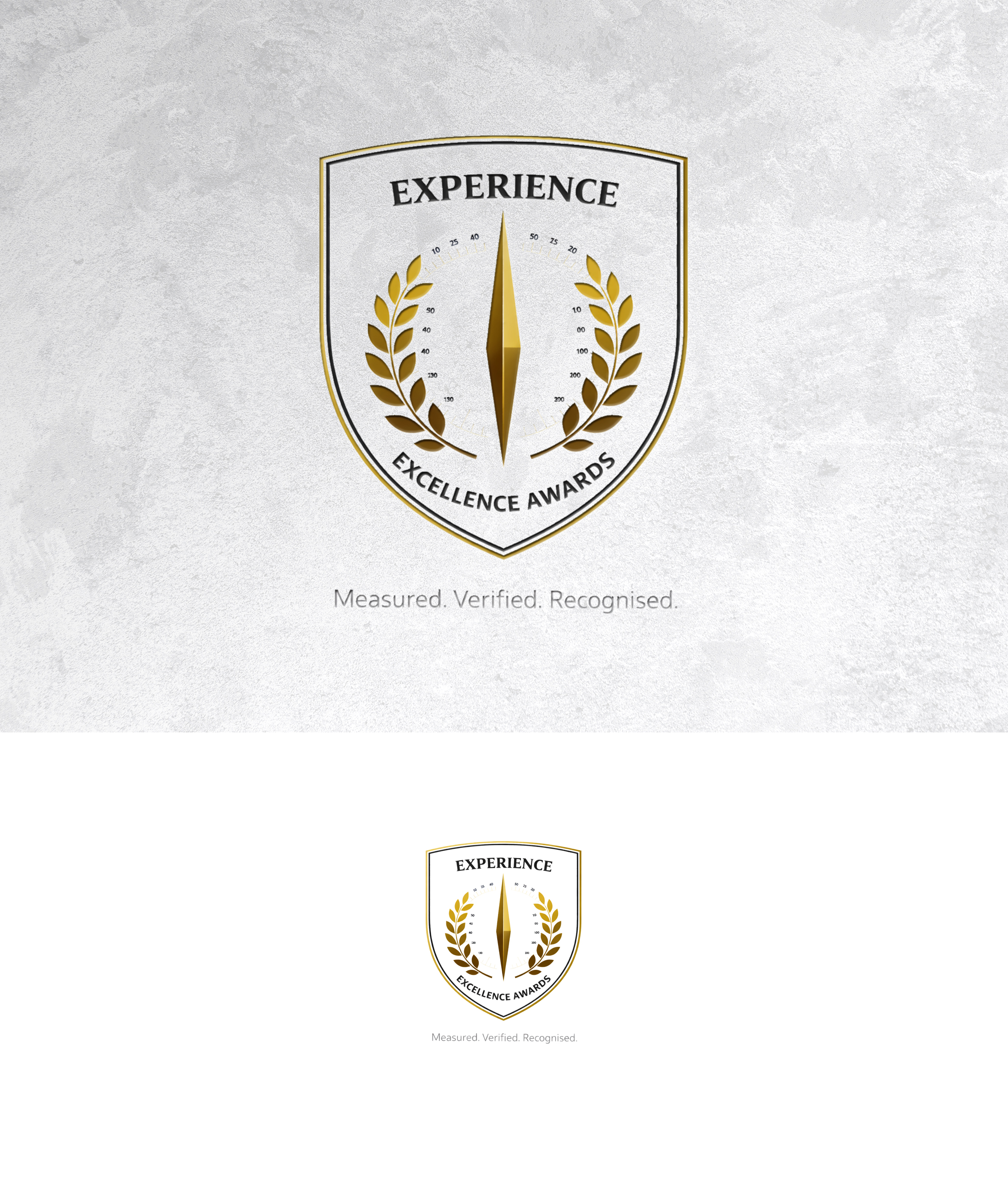
Experience Excellence Global Awards
¿Quieres ganar un trabajo como este?
Este cliente recibió 214 diseños de logo de 102 diseñadores. Eligieron este diseño de logo de zoyario como el diseño ganador.
Únete gratis Encuentra trabajos de diseño
- Garantía
-
 £190
£190
-
 214 diseños
-
 102 diseñadores
Resumen de Diseño de Logo
The Global Experience Excellence Awards exist to recognise organisations that can prove — through independent assessment and benchmarking — that they deliver outstanding experience performance.
The Global Experience Excellence Awards must visually communicate:
• Authority
• Independence
• Credibility
• Evidence-based recognition
• Global relevance
This is not a marketing awards brand.
It should feel closer to:
• A global index
• A trust mark
• A governance or quality seal
Than to:
• A conference logo
• A trophy shop
• A marketing awards night
⸻
2. Logo Design Description
2.1 Overall Logo Style
Tone
• Serious
• Confident
• Understated
• Timeless
Design philosophy
If this logo existed 20 years ago and still existed 20 years from now, it should feel correct.
⸻
2.2 Logo Form & Structure
Recommended formats:
• Wordmark + emblem
• Emblem-only version (for badges, certificates, digital use)
Preferred structure:
• Text-led (name matters)
• Symbol supports authority, not decoration
Avoid:
• Illustrative logos
• Abstract “swirls”
• Over-designed icons
• Trend-driven shapes
⸻
2.3 Symbol / Emblem Guidance
The emblem (if used) should subtly reference:
• Achievement
• Benchmarking
• Verification
• Global scope
Acceptable symbolic inspiration:
• Laurel-inspired geometry (modern, not classical)
• Shield / seal (minimal, flat, contemporary)
• Abstract globe geometry (lines, not continents)
• Precision marks (ticks, bars, levels)
Avoid:
• Trophies
• Stars
• Medals
• Ribbons
• Human figures
• “Celebration” visuals
⸻
2.4 Typography
Primary font style
• Serif or serif-inspired sans serif
• Corporate, authoritative
• High legibility
Examples of suitable styles:
• Modern serif
• Humanist sans serif
• Institutional typography
Avoid:
• Rounded fonts
• Playful fonts
• Handwritten styles
• Ultra-modern tech fonts
Capitalisation:
• Title Case or ALL CAPS
• Consistent spacing and kerning
⸻
2.5 Colour Palette
Primary palette:
• Black
• White
• Charcoal / Deep Grey
Accent (use sparingly):
• Gold / Champagne
• Platinum / Silver
• Deep bronze
The palette should work:
• In monochrome
• On certificates
• On digital badges
• On government or corporate documents
Avoid:
• Bright colours
• Gradients
• Multiple accent colours
• Anything “festival-like”
⸻
2.6 Logo Usage Rules (Critical)
The logo must:
• Always appear on clean space
• Never be crowded
• Never be co-branded aggressively
ICXI:
• Should not appear in the logo
• May appear separately as “governed by ICXI"

Actualizaciones
Need extra days to review
Texto del logo
THE GLOBAL EXPERIENCE EXCELLENCE AWARDS with STRAPLINE "Measured. Verified. Recognised"