Logo Upgrade for Judo Business
¿Quieres ganar un trabajo como este?
Este cliente recibió 124 diseños gráficos de 55 diseñadores. Eligieron este diseño gráfico de Le Yuan como el diseño ganador.
Únete gratis Encuentra trabajos de diseño-
 £130
£130
-
 124 diseños
-
 55 diseñadores
Resumen de Diseño Gráfico
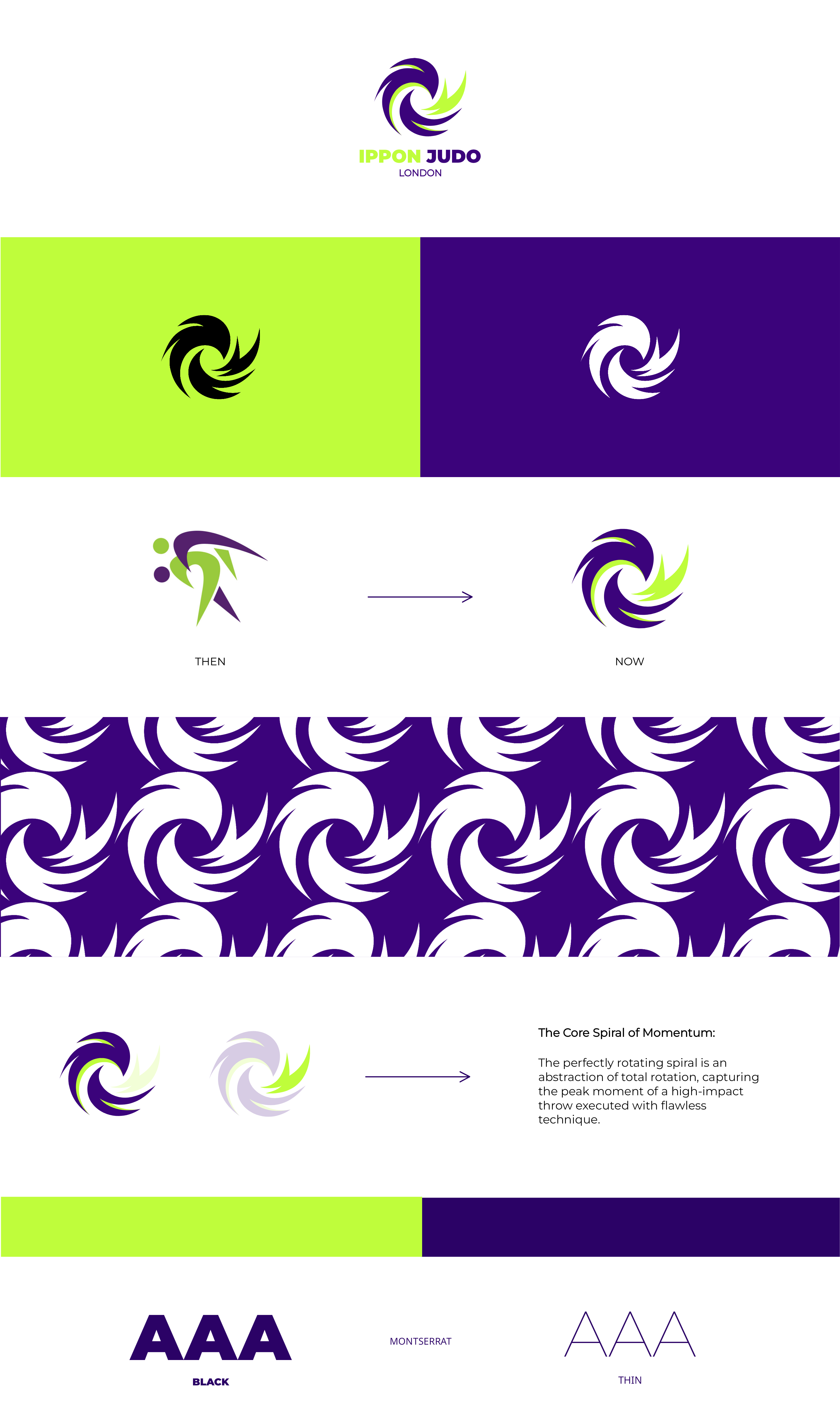
Ippon Judo London is a judo focused business rooted in performance and pathway development. Our current logo has strong foundations and brand recognition but we're looking to refine and elevate to make it more modern . This is more of an upgrade than rebrand.
Cons to logo: Our current logo has always looked like it was created on Microsoft and its never felt right.
Direction:
1. Abstract but judo figures recognisable: Keep the abstract style but logo should read immediately as a judo throw.
2. Avoid generic judo silhouettes: No stock-style throws, clip-art figures, or overly literal poses.
3. Strong sense of movement and control: The logo should feel dynamic, athletic, and powerful — capturing kuzushi, rotation, or off-balance.
4. Clean, modern, timeless: Bold shapes and confident line work.
I have attached some inspiration, our current pattern which will be useful on Merchandise and our mascot 'the panther'.
Our Brand Colours
Main colour: Bold Purple: #3B037B
Accent colour: Lime Green: #BAFF28
Accent colour: White
Accent colour: Lavender: #CAADE6 (small accent only)
Font: Gotham
Feel free to look at our website www.ipponjudolondon.com and Instagram @ipponjudolondon page if it helps.
Many thanks,
Charlotte
Head Coach of Ippon Judo London
Estilos de fuente para usar
Gustan otros estilos de fuente:
- Gotham
Mira y siente
Cada control deslizante ilustra las características de la marca del cliente y el estilo que debe comunicar el diseño de tu logotipo.