KwikMoto logo (PREFERABLY IN TWO LINES)
¿Quieres ganar un trabajo como este?
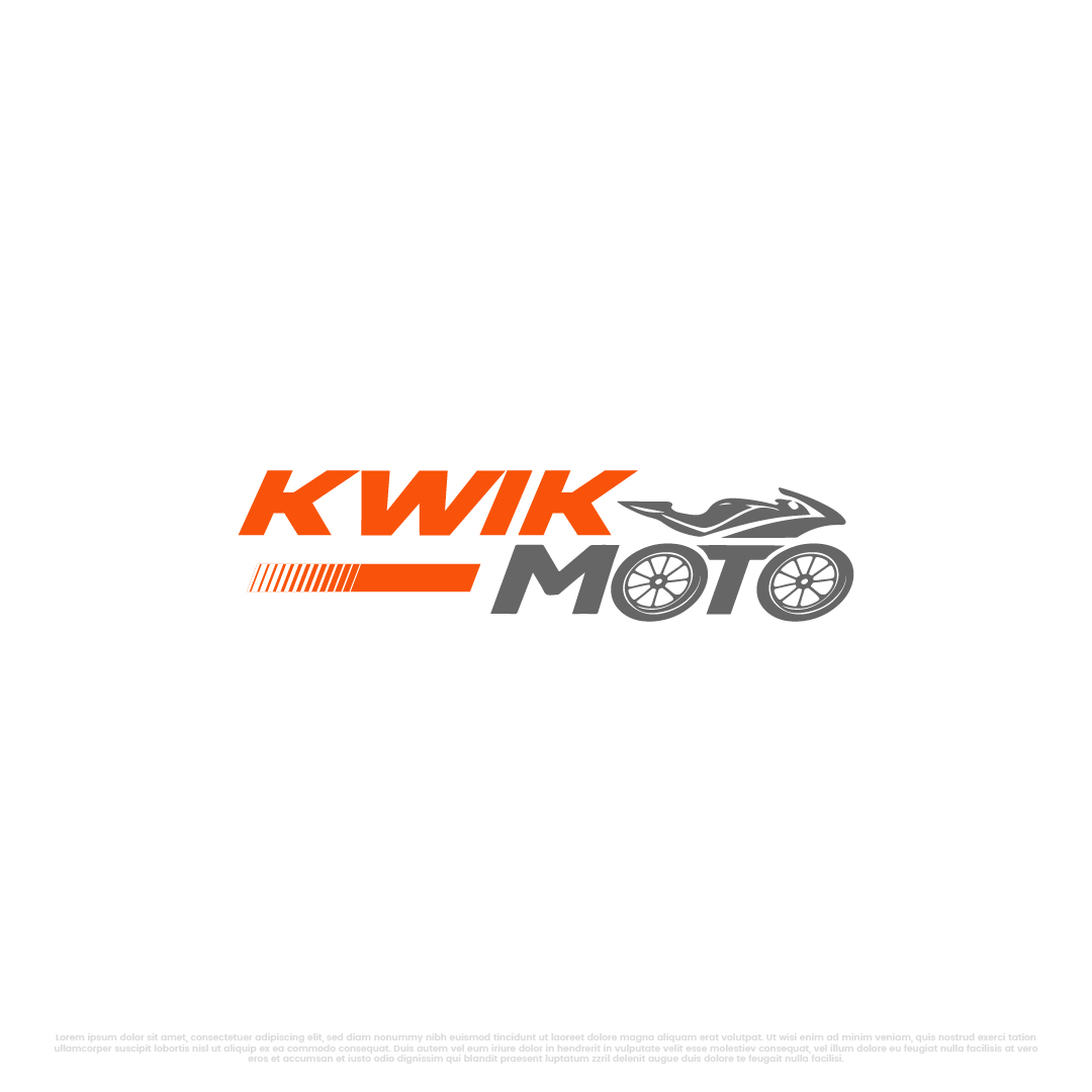
Este cliente recibió 242 diseños de logo de 121 diseñadores. Eligieron este diseño de logo de Kayla Studio como el diseño ganador.
Únete gratis Encuentra trabajos de diseño-
 US$150
-
 242 diseños
-
 121 diseñadores
Resumen de Diseño de Logo
The word is KwikMoto — one word, capital K and M.
There are two critical creative elements that MUST be in the logo:
1. The two O's in M-O-T-O must be designed as motorcycle wheels.
The letter O appears twice in "Moto" — next to the M and next to the T. Both O's should be stylized as motorcycle wheels with spokes or a hub design. They should feel like natural parts of the word — same visual weight, same baseline, same spacing as the other letters. NOT bolted-on circles that look out of place. The wheels should be clean, modern, and instantly recognizable as motorcycle wheels at any size.
2. The "KWIK" portion must incorporate an electricity/lightning element.
"Kwik" means FAST. The letters K-W-I-K should somehow convey speed and electric energy. This could be a lightning bolt integrated into the K, a spark between letters, a speed-line effect, an electric arc, or the dot of the "i" as a spark. Be creative — but it must feel electric and fast, not generic.
Additionally, the overall logo should subtly convey green energy and empowerment. This can come through color choice (green as an accent), a leaf-like element, a sun ray, or the overall feeling of the design. Don't overdo it — the primary story is "fast electric motorcycle." The green/empowerment feeling should be secondary.
COLOR REQUIREMENTS:
The logo must be bright, vibrant, and high-energy. No muted or corporate colors. Think African sun, electric energy, and open roads.
Required palette to work with (choose 2-3 as primary):
Electric Orange: #E85D04
Solar Yellow / Gold: #F59E0B or #FACC15
Energy Green: #22C55E or #10B981
Lime accent: #A3E635
Supporting (optional for contrast):
Deep Dark (for backgrounds): #0A0A0A or #1A1A2E
Clean White: #FFFFFF
The logo must work beautifully on both dark and light backgrounds. The orange and yellow should dominate. Green should appear as an accent — maybe in the wheel spokes, a leaf, or a subtle glow.
STYLE DIRECTION:
Modern, bold, and confident — not cute or playful
The font should be heavy/bold/black weight — this is a powerful brand, not a delicate one
Clean geometry — the wheel O's should feel precise, not hand-drawn
The logo should work at very small sizes (app icon, favicon) and very large sizes (vehicle wrap, billboard)
It should feel like a tech startup, not a traditional African brand — no tribal patterns, no safari imagery
Think Tesla meets M-Pesa — premium technology for the mass market
DO NOT:
Use clip art or stock icons
Make the wheels look like car wheels — they must be motorcycle/bicycle wheels (thin spokes radiating from a center hub)
Put a motorcycle illustration in the logo — the wheels-as-letters ARE the motorcycle reference
Use gradients in the primary mark (flat colors only — gradients OK for secondary/web versions)
Use more than 3 colors in the primary logo
Make the O-wheels different sizes — they must be identical
DELIVERABLES NEEDED:
Primary logo — Full "KwikMoto" wordmark with wheel-O's and electric-K elements
Dark background version — White/orange text on dark background
Light background version — Dark/orange text on white background
Icon mark only — A standalone square icon for app/favicon (could be the lightning bolt + one wheel, or the K with a spark + wheel, or creative interpretation)
Monochrome versions — All white, all black
File formats: AI (vector source), SVG, PNG (transparent, multiple sizes), EPS, PDF
WHAT A WINNING DESIGN LOOKS LIKE:
When someone sees this logo, they should instantly think: "fast," "electric," "motorcycle," and "bright energy." The O-wheels should make people smile when they notice the cleverness. The lightning/spark in KWIK should feel natural, not forced. The colors should pop off any surface. A boda boda rider in Kampala should feel proud to have this on their bike. An investor in Silicon Valley should feel this is a serious, well-branded company.
ABOUT OUR AUDIENCE:
Boda boda motorcycle taxi riders in East Africa (working-class, aspirational, proud)
Silicon Valley and climate-tech investors
UN agencies and development finance institutions
Government policymakers
The logo must resonate with ALL of these audiences — street-level credibility AND boardroom professionalism.
Texto del logo
KwikMoto
Mira y siente
Cada control deslizante ilustra las características de la marca del cliente y el estilo que debe comunicar el diseño de tu logotipo.