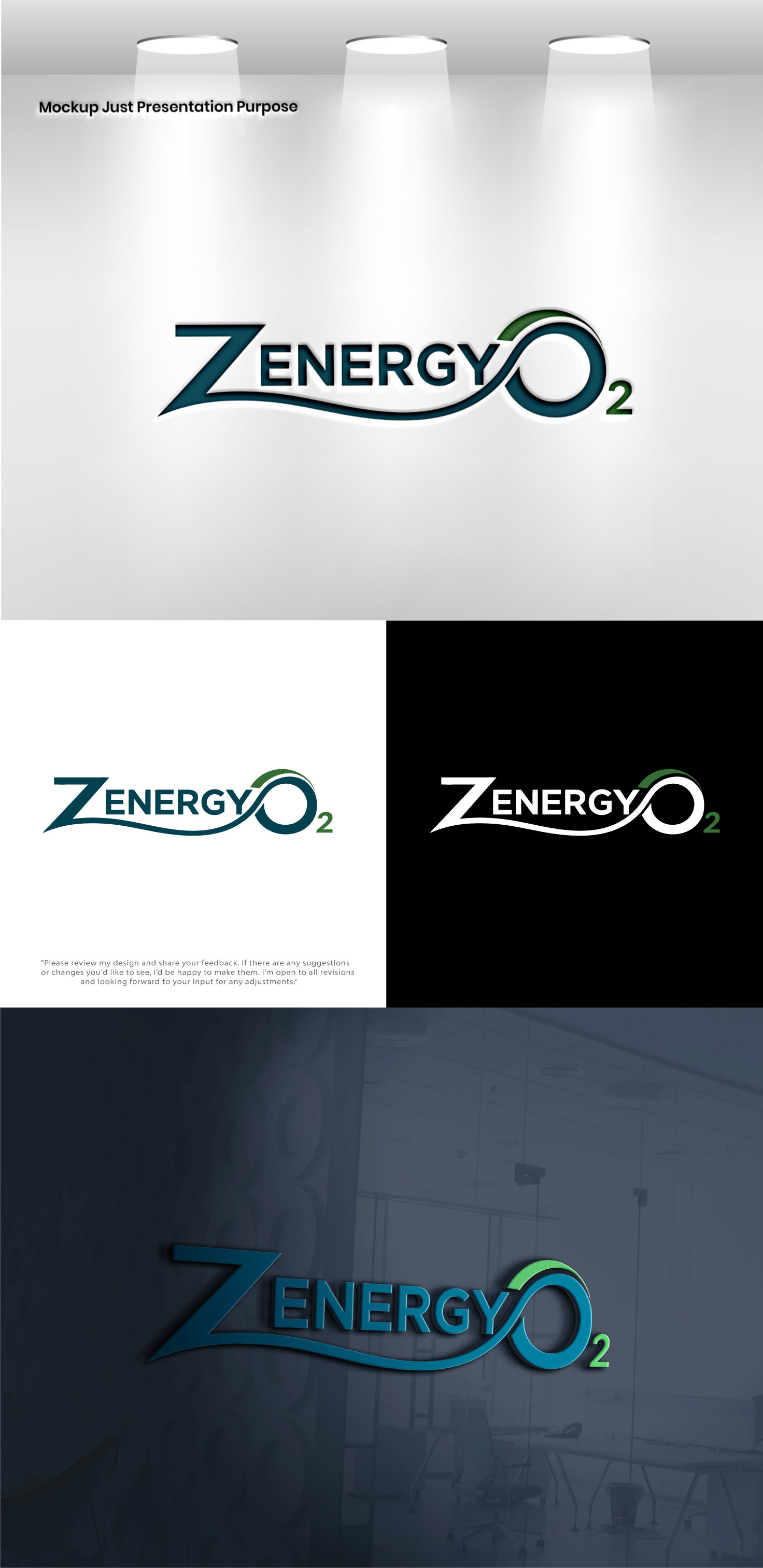
Zenergy O2 Logo Design - oxygen therapy wellness center logo
¿Quieres ganar un trabajo como este?
Este cliente recibió 329 diseños de logo de 150 diseñadores. Eligieron este diseño de logo de Pixel Signature como el diseño ganador.
Únete gratis Encuentra trabajos de diseño- Garantía
-
 US$500
-
 329 diseños
-
 150 diseñadores
Resumen de Diseño de Logo
**Zenergy O2 — Logo Design Brief**
**The Name**
Zenergy O2 is a fusion of three ideas living in one word: *Zen* (stillness, mindfulness, balance), *Energy* (vitality, power, performance), and *O2* (oxygen, science, breath). A great logo will make a person feel all three of those things simultaneously — calm yet charged, natural yet clinical, grounded yet elevated.
**The Feeling**
This is not a hospital. This is not a gym. It exists in the space between the two — where elite performance meets deep recovery. Think of the stillness inside a pressurized chamber. The clarity that comes from breathing pure oxygen. The moment after a hard workout when your body starts to heal. The logo should carry that duality: intensity and serenity existing together without tension.
**The O2**
The O2 is not just a suffix — it is the heart of the brand. Oxygen is invisible, essential, and life-giving. Consider whether the O2 can do visual work on its own — a circle that breathes, a molecule that doubles as a zen symbol, a subscript that feels like a signature rather than an afterthought. The O and the 2 have enormous creative potential. Do not waste them on plain typography alone.
**Typography Direction**
The wordmark should feel modern and confident without being aggressive. Avoid hard slab serifs or heavy gothic letterforms — they fight the zen half of the name. Equally, avoid anything too delicate or spa-like — this brand has backbone. The sweet spot is a clean geometric or humanist sans-serif where the letters have quiet authority. The *Z* is a gift — it is angular and energetic, a natural starting point for something distinctive. The *O* in O2 invites exploration — it can be opened, breathed into, subtly altered.
**Symbol / Icon Ideas**
Designers are encouraged to explore any of these directions — or combinations of them:
A *breath circle* — a perfect or imperfect circle suggesting a single inhale, a zen ensō, or an oxygen molecule viewed from above. Simple, timeless, infinitely scalable.
A *pressure vessel* — an abstracted, minimal silhouette of a hyperbaric chamber, stripped to its essential form. Oval, sealed, purposeful. Could double as a capsule or seed shape.
A *rising element* — something that moves upward: a bubble of oxygen ascending, a figure rising, a flame without the aggression. Suggests elevation, recovery, ascent.
An *integrated lettermark* — where the Z and O2 are designed as a single locked unit, the angular Z balanced against the round O, the 2 acting as a subscript anchor. No separate icon needed — the letters become the mark.
A *dual-ring* — two overlapping or concentric circles suggesting both the molecular structure of O2 and the concept of duality: zen and energy, pressure and release, rest and performance.
**Color Guidance**
Deep teal and forest green are the primary brand colors — the colors of oxygen-rich blood, deep water, ancient forests. These are not trendy colors. They are timeless. The logo should work in these tones, in pure black, and in pure white. Any color version should feel like it belongs in both a clinical setting and a luxury wellness spa.
**What to Avoid**
No lightning bolts or generic energy symbols — this is not a pre-workout brand. No lotus flowers or meditation clichés — this is not a yoga studio. No red or orange — those colors belong to exertion, not recovery. No busyness — the logo should work at 16 pixels on a mobile screen and at 6 feet on exterior signage. No gradients as a crutch — if the mark only works with a gradient, it is not strong enough yet.
**The Test**
A great Zenergy O2 logo should make someone think: *I want to know what that is.* And once they know — a hyperbaric oxygen wellness studio — they should think: *of course. That's exactly what it looks like.*
*One mark. Three ideas. Infinite breath.*
Objetivo del mercado(s)
Health and Wellness
Tipo de industria / entidad
Health
Texto del logo
Oxygen the original performance enhancer
Colores
Colores seleccionados por el cliente para ser utilizados en el diseño del logotipo:
Mira y siente
Cada control deslizante ilustra las características de la marca del cliente y el estilo que debe comunicar el diseño de tu logotipo.
Elegante
Atrevido
Juguetón
Serio
Tradicional
Moderno
Atractivo
Profesional
Femenino
Masculino
Vistoso
Conservador
Económico
De Alta Gama
Requisitos
No debería tener
- Any medical claim