Veil — Logo & Visual Identity Brief
¿Quieres ganar un trabajo como este?
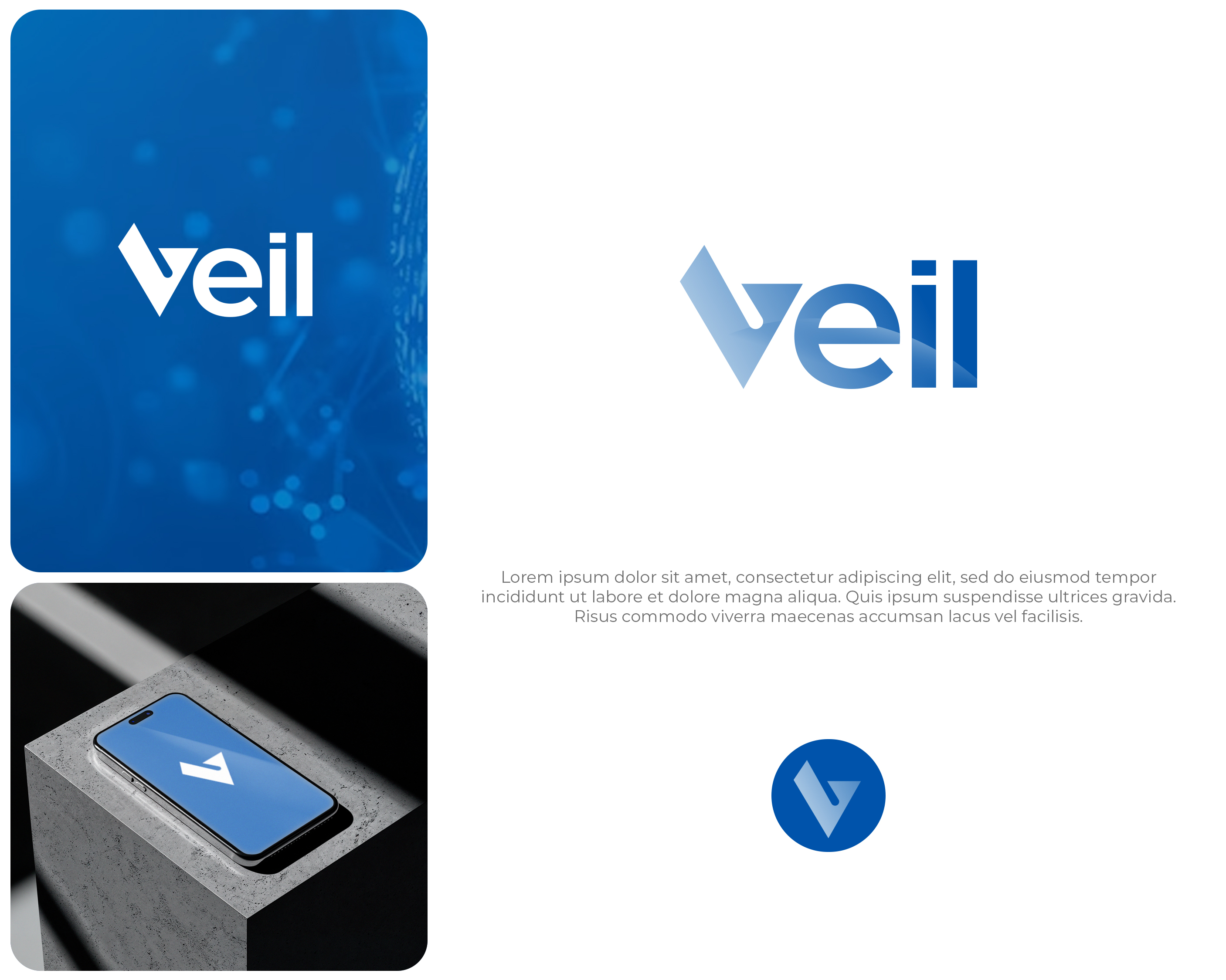
Este cliente recibió 153 diseños de logo de 59 diseñadores. Eligieron este diseño de logo de Interloop_Designs como el diseño ganador.
Únete gratis Encuentra trabajos de diseño- Garantía
-
 S$150
S$150
-
 153 diseños
-
 59 diseñadores
Resumen de Diseño de Logo
**About Veil**
Veil is a software verification tool that helps engineers mathematically prove their systems are correct before deployment. Think of it as a spell-checker for critical infrastructure — it catches bugs that testing alone cannot find. Our customers are engineering teams building systems where failure is not an option: financial platforms, cloud infrastructure, distributed databases.
**What we need**
A wordmark logo built around the name "Veil." Optionally, the design may include a standalone icon/symbol that works independently as an avatar or favicon.
**Brand family context**
Veil is one product in a planned suite of verification tools. Sibling products include **Velvet** and **Loom**, all under a parent company brand (name TBD). The naming convention follows a fabric/textile theme. While this brief is for the Veil logo only, please design with extensibility in mind — we will likely need a cohesive visual system across the family. Choices around typeface, icon grammar, and color logic should be reusable rather than one-off.
**Design direction**
- Simple, clean, instantly recognizable — no heavy or ornate visuals
- Modern and sleek, suited to a developer tools company
- Conveys safety, solidity, and precision — we are in the business of trust and correctness
- The wordmark should do most of the work — strong, confident typographic treatment
- Monochrome should work well (the logo will appear in docs, terminals, GitHub, slide decks)
- If a standalone symbol is included, it should be abstract/geometric rather than figurative
- Feel free to experiment with the design elements and stray away from the reference image, as long as the overall logo looks modern; we are open to your best suggestions; logos without a checkmark are great and much preferred
**What we don't want**
- Literal veil, fabric, or curtain imagery (although a flowy vibe for parts of the logo might be OK)
- Shields — an overused trope in the security/verification space
- Anything heavy, ornate
- Wobbly or twisted fonts; we want to convey solidity and trust
- Try to avoid checkmarks; we've seen a few designs, and those that look closest to checkmarks are not the best ones
**Color direction**
We prefer a blue palette — deep navy to teal/cyan range. Blue communicates trust, reliability, and technical depth. A gradient from dark blue to teal-green is appealing (see attached reference), but the logo must also work in flat single-color and monochrome versions.
**Tone references**
Think Linear, Vercel, Stripe, HashiCorp — technically sophisticated companies with restrained, typographic identities. Not playful, not corporate — precise.
**Deliverables**
- Primary wordmark (with optional symbol)
- Standalone symbol variant (if applicable)
- Monochrome and color versions
- Light-on-dark variant (the logo will frequently appear in dark-mode IDEs and documentation sites)
- Formats: SVG, PNG (various sizes), favicon
A reference image is attached showing a direction we like in terms of color palette and the V-as-checkmark concept.
Another potential design option is to incorporate some kind of visualisation of the concept of a "state transition system", which can be seen as a graph (https://en.wikipedia.org/wiki/Graph_theory) with nodes (usually represented as circles) and edges (arrows, usually directed). I've attached a version like this, but I think it's too heavy to work as a logo. This motif might not work, so if you feel it's too heavy, don't try it.
I have also attached the logos of similar tools: Lean, Viper, Rocq, and CVC5.
Objetivo del mercado(s)
Software developers
Tipo de industria / entidad
Technology, Software
Texto del logo
Veil
Estilos de logo de interés
Logo de marca de nombre
Logotipo basado en palabra o nombre (solo texto)
Colores
Colores seleccionados por el cliente para ser utilizados en el diseño del logotipo:
Mira y siente
Cada control deslizante ilustra las características de la marca del cliente y el estilo que debe comunicar el diseño de tu logotipo.
Elegante
Atrevido
Juguetón
Serio
Tradicional
Moderno
Atractivo
Profesional
Femenino
Masculino
Vistoso
Conservador
Económico
De Alta Gama
Requisitos
Debes tener
- Simple, clean, instantly recognizable. Modern and sleek. Conveys safety, solidity, precisionh.
Agradable de tener
- A distinctive visual mark that is not a squish type of checkmark.
No debería tener
- Literal veil, fabric, or curtain imagery. Shields. Anything heavy or ornate. Wobbly or twisted fonts.