Logo Design for CROVIAX Back Office Support
¿Quieres ganar un trabajo como este?
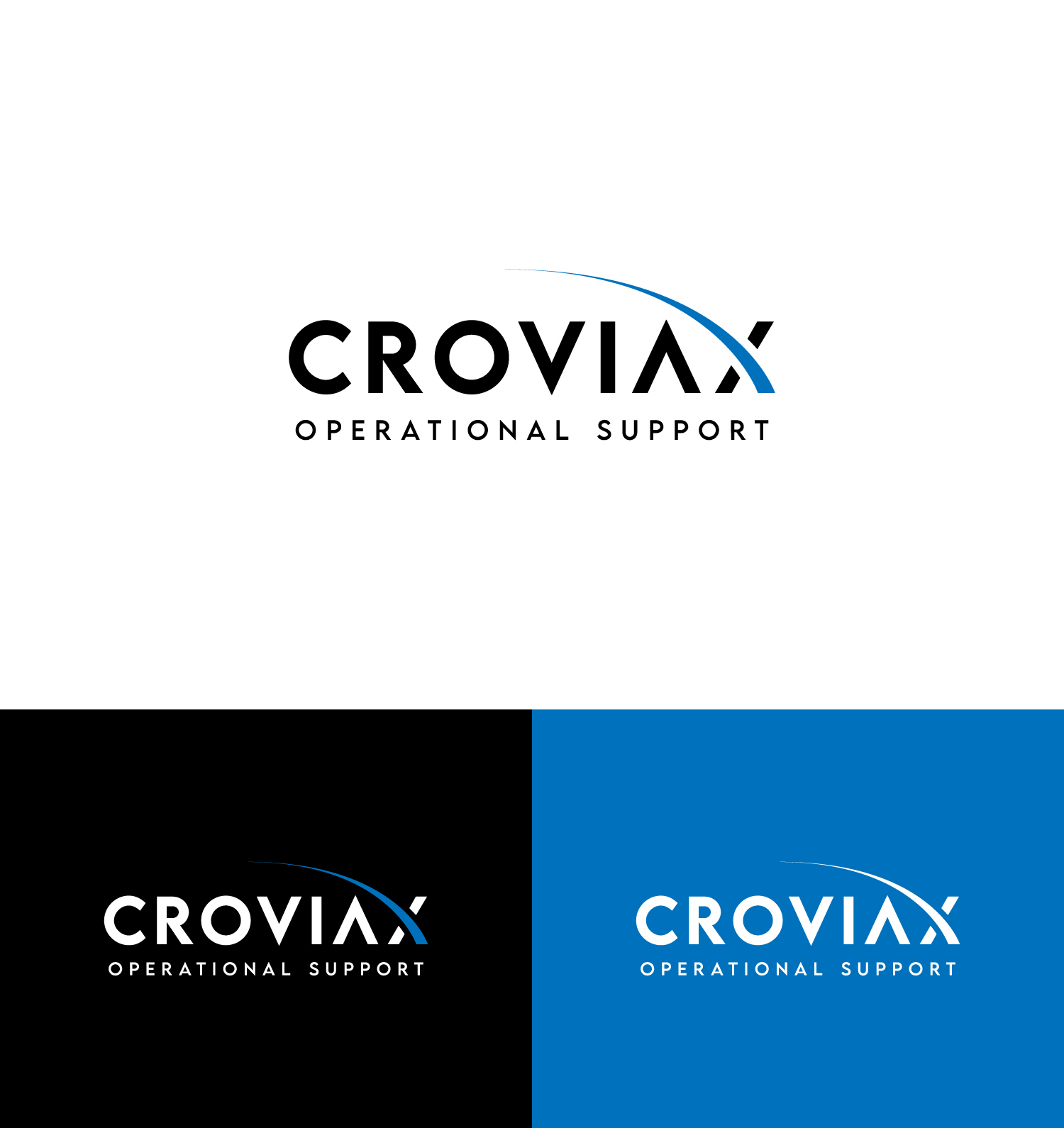
Este cliente recibió 385 diseños de logo de 157 diseñadores. Eligieron este diseño de logo de Haja_H2 como el diseño ganador.
Únete gratis Encuentra trabajos de diseño- Garantía
-
 €110
€110
-
 385 diseños
-
 157 diseñadores
Resumen de Diseño de Logo
We need a premium, minimalist and typography-focused logo for our company CROVIAX.
CROVIAX offers backoffice support for businesses, and the brand should feel refined, structured, trustworthy and highly professional.
We are looking for a strong wordmark with a clean, modern and elegant aesthetic.
The style should be similar to high-end agency or editorial branding: bold typography, generous spacing, minimal composition and a confident premium feel.
We prefer a black-on-white look with a timeless and sophisticated appearance.
The logo should feel design-driven, understated and visually powerful.
Objetivo del mercado(s)
Businesses, SMEs, professional service companies, administrative and business clients in Switzerland and the DACH region
Tipo de industria / entidad
Backoffice Support / Business Services / Administrative Support
Texto del logo
CROVIAX Backoffice Support
Estilos de fuente para usar
Colores
Diseñador para elegir solo colores en escala de grises para usar en el diseño.
Mira y siente
Cada control deslizante ilustra las características de la marca del cliente y el estilo que debe comunicar el diseño de tu logotipo.
Elegante
Atrevido
Juguetón
Serio
Tradicional
Moderno
Atractivo
Profesional
Femenino
Masculino
Vistoso
Conservador
Económico
De Alta Gama
Requisitos
Debes tener
- minimal, premium and typography-focused logo. Main focus on the word CROVIAX in a bold, modern and elegant style. Secondary line BACKOFFICE SUPPORT below the main name with wide letter spacing. Logo should feel very clean, refined, high-end and professional. Black on white preferred. The design should look strong in a very minimal website layout. A simple geometric symbol is welcome, but only if it feels distinctive and premium.
Agradable de tener
- A logo style similar to high-end creative or editorial agencies: clean typography, strong spacing, modern proportions, understated confidence. Could include a minimal icon next to the wordmark, but the typography should remain the hero. Would be great if the logo feels timeless, elegant and visually balanced.
No debería tener
- No colorful concepts. No gradients. No cheap startup look. No playful logo styles. No mascots, no office icons, no headsets, no chat bubbles, no generic tech symbols. No complicated effects, shadows or busy layouts. No cliché corporate stock logo feeling.