

 Refresh
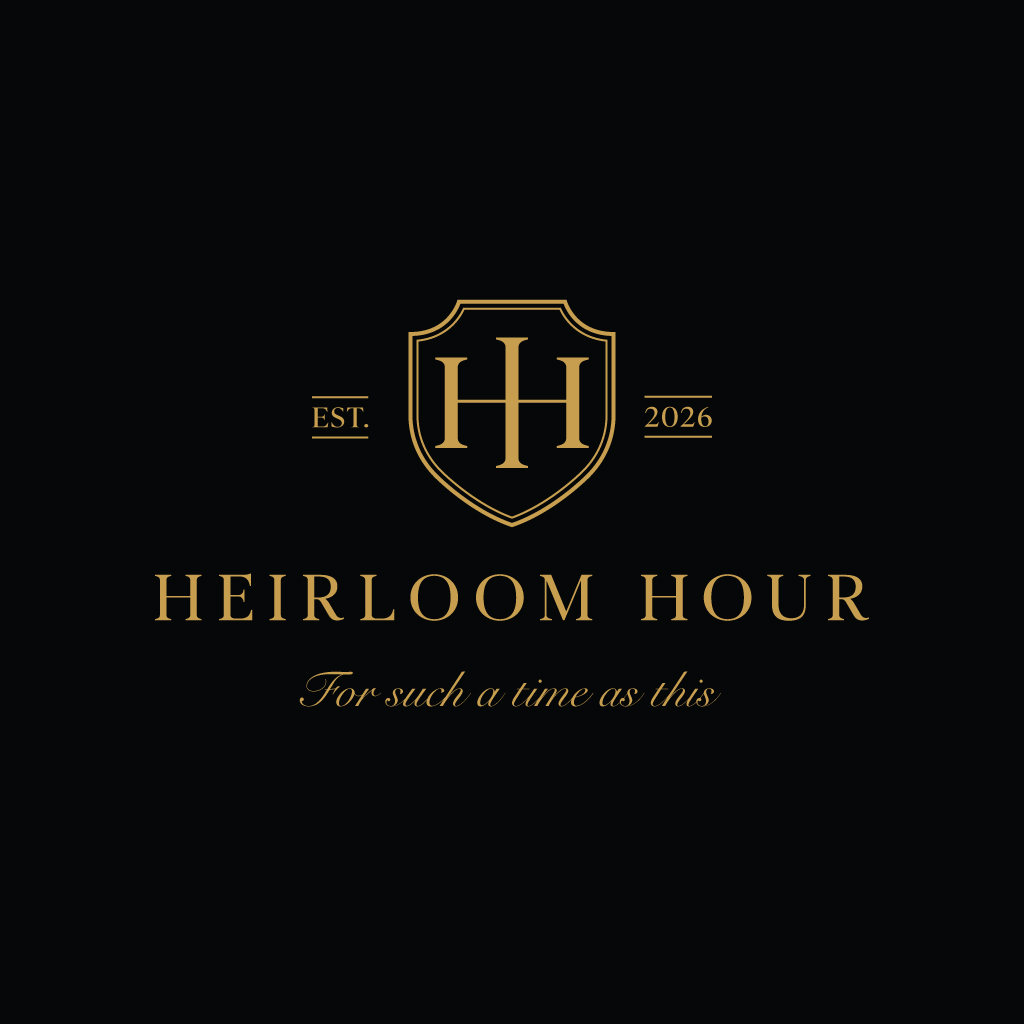
Heirloom Hour logo
¿Quieres ganar un trabajo como este?
Este cliente recibió 10 diseños de logo de 3 diseñadores. Eligieron este diseño de logo de JohnnyCactus como el diseño ganador.
Únete gratis Encuentra trabajos de diseño
- Garantía
-
 US$110
-
 10 diseños
-
 3 diseñadores
Resumen de Diseño de Logo
HEIRLOOM HOUR – LOGO DESIGN BRIEF
I added an additional photo for inspiration. Please make the logo look like the photo with the bride and groom. It has the three lines on either side of the crest.
1. Brand Overview
Brand Name:
Heirloom Hour
Tagline:
“For such a time as this”
Established Date (if used):
EST. 2026
Location (optional lockup):
Fredericksburg, Texas
⸻
2. Brand Essence
Heirloom Hour represents timeless, sacred, legacy-driven experiences. This brand is not trendy or modern-minimal in a cold way. It is:
* Rooted in heritage and permanence
* Inspired by romance, covenant, and meaningful moments
* Reflective of luxury without being flashy
* Emotionally warm, reverent, and elevated
This should feel like something that could exist 50–100 years ago and still feel relevant today.
⸻
3. Visual Direction (Based on References Provided)
Core Aesthetic
* Vintage luxury
* Old-world European influence
* Editorial wedding style
* Rolls-Royce level prestige
* Fredericksburg Texas Hill Country warmth
Mood Keywords
Timeless
Refined
Romantic
Sacred
Heritage
Elegant
Understated wealth
Golden hour warmth
⸻
4. Logo Structure
The logo should have multiple usable variations, not just one design.
Primary Logo (Full Lockup)
Should include:
* Crest or monogram symbol
* “HEIRLOOM HOUR” (main focus)
* Tagline beneath
* Optional location or EST line
⸻
Secondary Logo
* Simplified version (no tagline or extra text)
* Used for smaller applications
⸻
Monogram Mark (Critical)
This is the most important element.
Direction:
* “HH” monogram OR a single highly stylized “H”
* Must feel regal and iconic
* Inspired by Hermès-level typography
* Balanced
* Structured
* Slightly ornamental but restrained
* Should work inside a:
* Shield / crest (preferred)
* Circular emblem (secondary option)
⸻
5. Crest / Emblem Direction
From your references, here’s what to lean toward and what to avoid:
Lean Toward
* Shield shape (refined, not bulky)
* Minimal linework
* Thin elegant borders
* Subtle symmetry
* Optional very light flourishes
Avoid
* Overly busy crests
* Cheap “stock logo” crown + wreath combinations
* Clip-art style elements
* Anything that feels mass-produced
Important:
The crest should feel custom, restrained, and high-end, not decorative for decoration’s sake.
⸻
6. Typography
Main Title: HEIRLOOM HOUR
* Serif font only
* High-end editorial style (fashion-house level)
* All caps
* Wide letter spacing
* Clean and commanding
Style references:
* Luxury fashion brands
* Fine print editorial typography
⸻
Tagline: “For such a time as this”
* This is VERY important:
Must be:
* Noticeably lighter weight
* Airy and delicate
* Either:
* Elegant script OR
* Soft, thin serif
Must NOT be:
* Bold
* Heavy
* Competing with the main title
This should feel like a whisper under a declaration.
⸻
Supporting Text (Location / EST)
* Small caps or spaced serif
* Minimal presence
* Clean and understated
⸻
7. Color Direction
Primary Palette
* Deep black (primary background)
* Warm gold (primary accent)
* Soft ivory / champagne (secondary)
Gold Tone Direction
* Not yellow gold
* Not overly shiny
* Slightly muted, warm, elegant gold
⸻
Must Work In
* Full black
* Full white
* Gold foil (very important for print)
⸻
8. Composition & Layout Preferences
Based on your inspiration images:
Preferred Layout
* Crest or monogram centered above text
* HEIRLOOM HOUR centered and dominant
* Tagline beneath in lighter script
* Optional divider lines or micro flourishes
Spacing
* Generous breathing room
* Nothing crowded
* Clean hierarchy
⸻
9. What We Like From Your References
From the crest examples:
* The shield concept (strong direction)
* Clean gold-on-black execution
* Centered, symmetrical composition
From the wedding imagery:
* Golden hour warmth
* Romantic storytelling
* Vintage luxury feel
* Emotional intimacy
From the Heirloom Hour mock:
* Elegant typography hierarchy
* Script tagline treatment
* Editorial composition
⸻
10. What to Avoid
* Overly trendy fonts
* Modern sans-serif dominant logos
* Busy or cluttered crests
* Stock-looking icons (crowns, laurels, etc. unless highly refined)
* Harsh or cold minimalism
* Cheap-looking gold gradients
⸻
11. Deliverables Required
Designer must provide:
* Primary logo (full lockup)
* Secondary logo
* Monogram (standalone)
* Black version
* White version
* Gold version
* Transparent background files
* Vector files (AI, EPS, SVG)
* High-resolution PNGs
⸻
12. Final Brand Feeling
When someone sees this logo, it should communicate:
“This is rare. This is intentional. This matters.”
It should feel like:
* A legacy brand
* A sacred moment captured in time
* Something worthy of being passed down
Texto del logo
Heirloom Hour
Mira y siente
Cada control deslizante ilustra las características de la marca del cliente y el estilo que debe comunicar el diseño de tu logotipo.


