

 Refresh
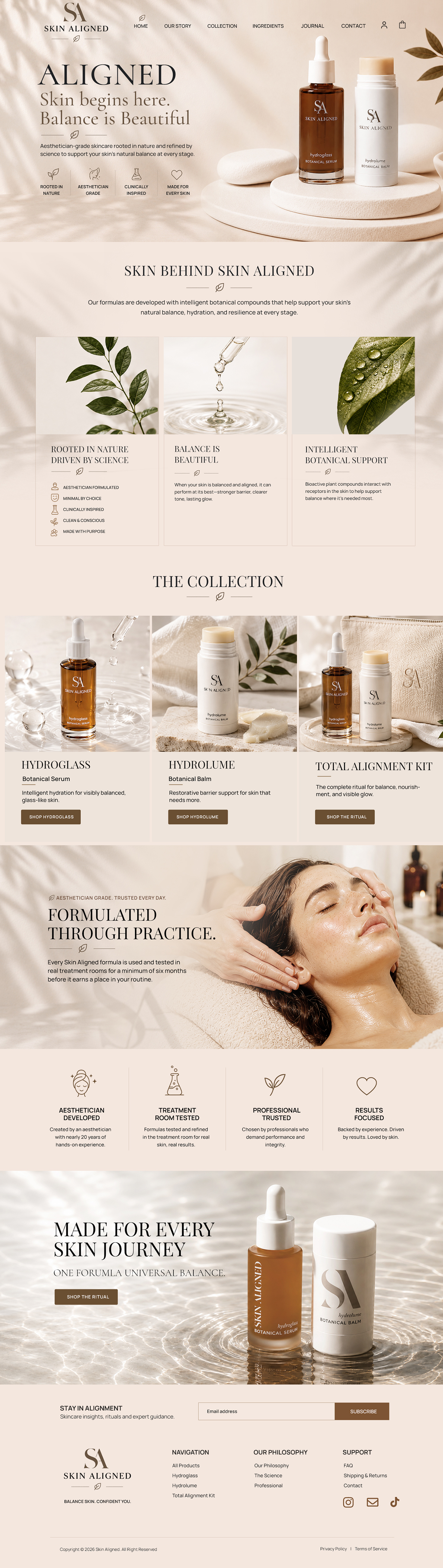
Skin Aligned Luxury Website Refresh
¿Quieres ganar un trabajo como este?
Este cliente recibió 101 diseños web de 25 diseñadores. Eligieron este diseño web de Blue Sparrow como el diseño ganador.
Únete gratis Encuentra trabajos de diseño
- Garantía
-
 US$230
-
 101 diseños
-
 25 diseñadores
Resumen de Diseño Web
Please make sure to use white “greige” and light steel colors throughout the entire website in no way should there be a yellow beige orange queue at all. Please use the logo the SA logos attached in the brief and use those colors throughout the website. I love the shadowing for the homepage. It should have all white stones texture a very grounded earthy feel. The Hydro glass can have more liquid and fluid and drops and water and movement.
PLEASE USE ATTACHED BOARDS WITH THE EXACT PRODUCTS AND VERBIAGE FOR EACH PAGE
The homepage should first introduce the overall Skin Aligned brand philosophy before focusing heavily on the products themselves. The goal is for the website to feel elevated, minimal, calm, and cohesive — like the attached boards came to life online.
Please Use Attached Brand Boards as Primary Creative Direction
We are NOT looking for a complete rebrand or entirely new website concept.
The goal is to refine and elevate the current website by closely following the attached Hydroglass and Hydrolume brand boards. These boards should serve as the MAIN visual and creative inspiration for the entire website refresh.
The aesthetic, layout direction, colors, typography, imagery style, spacing, mood, and overall brand feel should remain highly aligned with these boards.
We want:
* soft luxury minimalism
* clean editorial skincare aesthetic
* warm neutral tones
* elevated spa/clinical feel
* intentional whitespace
* calm botanical imagery
* stone textures
* serum/oil reflections
* modern luxury typography
* simple visual storytelling
We are simply looking to have the following pages formatted:
Please make the site feel more premium and cohesive
* integrate the attached visual direction throughout the website
* improve product storytelling using the attached boards as inspiration
VERY IMPORTANT
Please use the attached boards as the PRIMARY creative guide.
We especially love:
* the soft cream/beige palette
* editorial product photography
* scientific/botanical imagery
* minimal luxury layout
* clean typography
* skincare texture imagery
* ingredient tile layouts
* calm spa-like atmosphere
* modern scientific elegance
WEBSITE CONTENT
Please use the content and wording shown throughout the attached boards as inspiration for:
* homepage sections
* product pages
* ingredient callouts
* professional use sections
* brand philosophy
* educational visuals
You do NOT need to reinvent the copy or completely redesign the brand.
The attached boards already represent the desired direction.
Número de páginas requeridas
4 page
Mira y siente
Cada control deslizante ilustra las características de la marca del cliente y el estilo que debe comunicar el diseño de tu logotipo.
Elegante
Atrevido
Juguetón
Serio
Tradicional
Moderno
Atractivo
Profesional
Femenino
Masculino
Vistoso
Conservador
Económico
De Alta Gama
Requisitos
Debes tener
- The overall luxury vibe that is included in the vision board attached
No debería tener
- Any yellow beige orange hues at all!! NEEDS TO BE WHITE GREIGE STEEL GRAY SCHEME


