

 Refresh
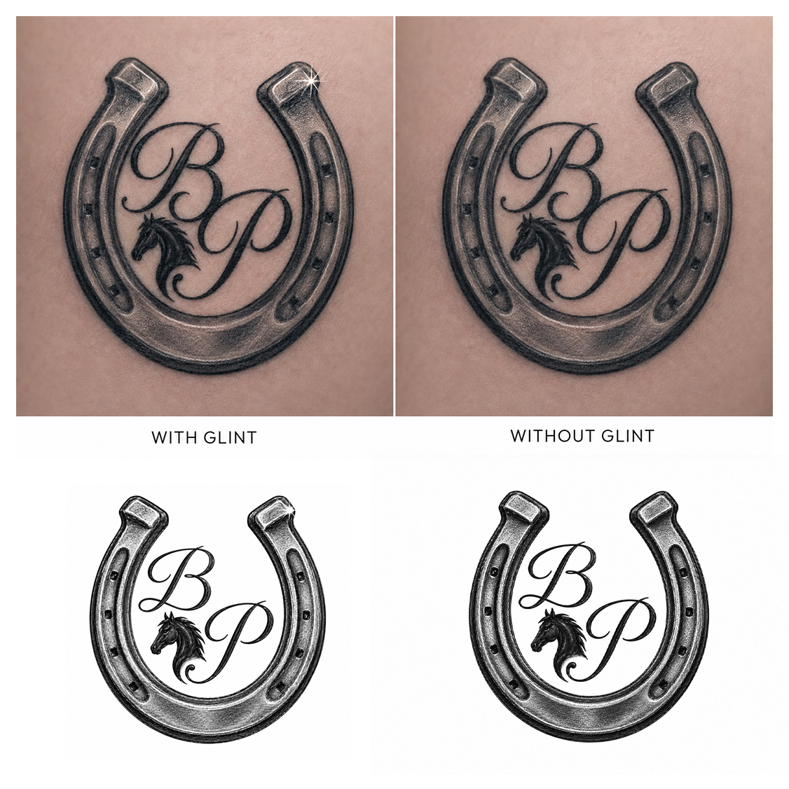
Taking my wives tattoo and incorporating new ideas for myself
¿Quieres ganar un trabajo como este?
Este cliente recibió 91 diseños de tatuaje de 45 diseñadores. Eligieron este diseño de tatuaje de Jerry Abraham como el diseño ganador.
Únete gratis Encuentra trabajos de diseño
- Garantía
-
 US$280
-
 91 diseños
-
 45 diseñadores
Resumen de Diseño de Tatuaje
My wife currently has this tattoo that she had done in honor of her favorite horse when he died 8 years ago. I would like something for myself that incorporates many of her design elements but with a spin.
Elements I would like to keep:
Realistic and detailed horse shoe
Sun glint on top of the shoe (if possible). I'm looking for something very subtle (see uploaded photos). If its going to be to overpowering kindly omit it.
Some type of horse head 1 or 2 (looking for something that is more of the all black silhouette side view (not looking for a full face realistic). If you look at the photos you will notice two, one on each top of the H. I'm looking for something similar to this so its not too overpowering.
Elements I would like to change:
In the center there are two horse heads that surround the letter H
*Houdini was her horses name so that is what the H stands for and of course the horse heads were part of the design. This is the part of the design I would like to change/remove
I would like to have her Initials (B P) in its place. I would like initials on a slant with the "B" being in the top left and the "P" being diagonal (below) and slanted to the right toward the bottom.
As far as script goes, she rides in the English discipline so I was thinking of a font/script that was more elegant and formal. With that in mind not so fancy that you couldn't read them or determine what the letters were.
Finally I would like to incorporate a profile horse head similar to the current design. My thought were any of the following: A single head that would incorporated into the script of the B initial, a second head that would be incorporated in the P initial, or finally a single head that was incorporated in between the (B P) initials. I would like to keep the horse head a little smaller and not too overpowering. The shoe is the largest part of the design, the initials are the 2nd largest, and the head or heads should be the smallest part
I have provided several high quality photos and sizes for comparison purposes. I would like to keep the size similar but understand if it needs to be slightly bigger for detail purposes
I'm open to suggestions and ideas. I am definitely looking for something professional in quality and great detail work. I have revised this brief because many of the designs I have been receiving are very unrealistic and clip art style design, especially when it comes to the shoe. I certainly don't want to waste anyone's time so if that's your design concept, please don't submit one (really looking for some great realism). Thanks for the opportunity to help me with this very important design

Actualizaciones
Designs look the same
Objetivo del mercado(s)
Myself
Colores
Diseñador para elegir solo colores en escala de grises para usar en el diseño.
Mira y siente
Cada control deslizante ilustra las características de la marca del cliente y el estilo que debe comunicar el diseño de tu logotipo.
Elegante
Atrevido
Juguetón
Serio
Tradicional
Moderno
Atractivo
Profesional
Femenino
Masculino
Vistoso
Conservador
Económico
De Alta Gama
Requisitos
Debes tener
- See project description
Agradable de tener
- See project description
No debería tener
- See project description


