

 Refresh
Menu Board that is editable in Canva (NO AI).
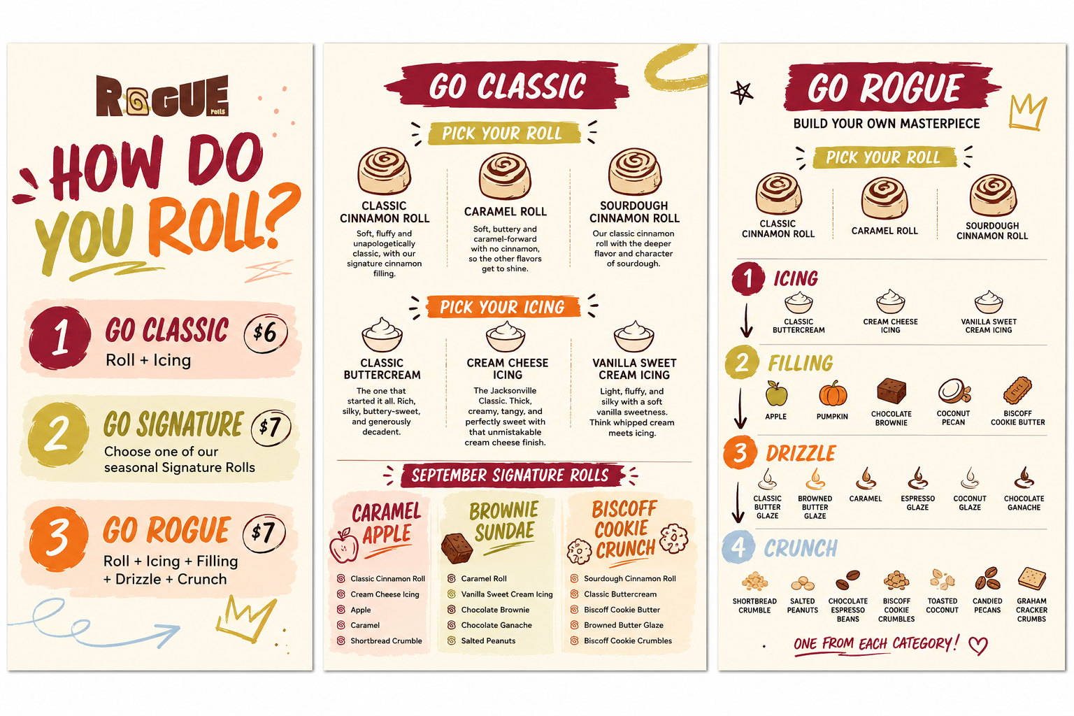
¿Quieres ganar un trabajo como este?
Este cliente recibió 44 diseños de menú de 16 diseñadores. Eligieron este diseño de menú de Tanvir Ahmed Siddique como el diseño ganador.
Únete gratis Encuentra trabajos de diseño
- Garantía
-
 US$110
-
 44 diseños
-
 16 diseñadores
Resumen de Diseño de Menú
I am looking for help creating a simple, highly readable menu system for **Rogue Rolls**, a scratch-made bakery concept centered around large rolls that customers can order simply or customize.
The overall design should feel **playful, unexpected, slightly quirky, and full of personality without feeling juvenile, chaotic, or difficult to read**.
I want the menu to be fun and memorable, but the ordering system itself needs to be extremely easy to understand at a glance.
## Brand Personality
Rogue Rolls balances two sides:
**Rogue** = playful, imperfect, unexpected, expressive, slightly weird, and willing to break the rules.
**Rolls** = familiar, dependable, scratch-made, comforting, and approachable.
The food is taken seriously, but the brand should not take itself too seriously.
The menu should reflect that balance. I would like personality to come through in typography, graphic elements, shapes, illustrations, imperfect details, and subtle graffiti or hand-drawn influences rather than making the information itself chaotic.
## Typography
The two primary fonts will be:
**Oleo Ugly**
Used selectively for personality, large headlines, category names, featured words, or graphic accents.
**Montserrat**
Used for descriptions, prices, ingredients, instructions, and anything that needs to be read quickly.
Oleo Ugly should provide the playful, slightly unpredictable **Rogue** element, while Montserrat keeps the menu grounded, organized, and functional.
## Brand Color Palette
The Rogue Rolls color palette is:
**Crimson Ink**
#8B162B
**Dusty Rose**
#F9B6B8
**Cosmic Latte**
#F6F3CF
**Neon Pear**
#C6B63B
**Burnt Sienna**
#F37521
**Arctic Blue**
#BAD2E8
These colors are intended to work as a flexible brand system rather than all being used equally on every piece.
For the **Harvest Collection**, I envision leaning primarily into:
* Crimson Ink
* Cosmic Latte
* Burnt Sienna
* Neon Pear
The overall Rogue Rolls palette should remain recognizable, while seasonal menus can emphasize different combinations of colors.
I would like the colors to feel bold and slightly unexpected rather than traditionally rustic or “fall farmhouse.” The Harvest menu can feel warm and seasonal without relying heavily on brown, muted orange, wood grain, or other conventional autumn design elements.
## Menu Structure
The ordering system has three primary categories:
### GO CLASSIC — $6
Customers choose:
* One roll
* One icing
### GO SIGNATURE — $7
Customers choose one of our pre-designed seasonal Signature Rolls.
These are curated seasonal combinations created by us and will change throughout the year.
### GO ROGUE — $7
Customers build their own roll by choosing:
* One roll
* One icing
* One filling
* One drizzle
* One crunch
The most important design goal is that a customer should be able to look at the menu and understand these three ordering options almost immediately.
## Pick Your Roll
The three Rogue Rolls bases are:
### CLASSIC CINNAMON ROLL
Soft, fluffy and unapologetically classic, with our signature cinnamon filling.
### CARAMEL ROLL
Soft, buttery and caramel-forward with no cinnamon, so the other flavors get to shine.
### SOURDOUGH CINNAMON ROLL
Our classic cinnamon roll with the deeper flavor and character of sourdough.
These descriptions should be visible but secondary to the roll names. The customer should first see the three choices, then be able to quickly understand what makes each one different.
## Pick Your Icing
### CLASSIC BUTTERCREAM
The one that started it all. Rich, silky, buttery-sweet, and generously decadent.
### CREAM CHEESE ICING
The Jacksonville Classic. Thick, creamy, tangy, and perfectly sweet with that unmistakable cream cheese finish.
### VANILLA SWEET CREAM ICING
Light, fluffy, and silky with a soft vanilla sweetness. Think whipped cream meets icing: airy, creamy, and made to melt right into your roll.
The icing names should remain easy to scan, with the descriptions present as supporting information rather than dominating the layout.
## Harvest Collection
The first seasonal menu will be the **Harvest Collection**, running September through November.
The available finishes will remain mostly consistent throughout the Harvest season, while the featured Signature Rolls can change monthly.
## September Signature Rolls
### CARAMEL APPLE
Classic Cinnamon Roll
Cream Cheese Icing
Apple
Caramel
Shortbread Crumble
### BROWNIE SUNDAE
Caramel Roll
Vanilla Sweet Cream Icing
Chocolate Brownie
Chocolate Ganache
Salted Peanuts
### BISCOFF COOKIE CRUNCH
Sourdough Cinnamon Roll
Classic Buttercream
Biscoff Cookie Butter
Browned Butter Glaze
Biscoff Cookie Crumbles
The Signature Rolls should be one of the most visually appealing parts of the menu. These are combinations we have already designed for the customer, so they should feel easy to order and tempting at a glance.
## Go Rogue Finish Categories
Customers choosing **Go Rogue** select one option from each finishing category.
### ICING
* Classic Buttercream
* Cream Cheese Icing
* Vanilla Sweet Cream Icing
### FILLING
* Apple
* Pumpkin
* Chocolate Brownie
* Coconut Pecan
* Biscoff Cookie Butter
### DRIZZLE
* Classic Butter Glaze
* Browned Butter Glaze
* Caramel
* Espresso Glaze
* Coconut Glaze
* Chocolate Ganache
### CRUNCH
* Shortbread Crumble
* Salted Peanuts
* Chocolate Espresso Beans
* Biscoff Cookie Crumbles
* Toasted Coconut
* Candied Pecans
* Graham Cracker Crumbs
The four finishing categories should be visually distinct and easy to follow in order:
**Icing → Filling → Drizzle → Crunch**
The customer should immediately understand that they choose **one from each category**.
## Physical Menu Format
Space is limited and the menu will be suspended from the ceiling behind the counter.
The individual menu pieces will be approximately **8.5 × 11 landscape**, mounted to a lightweight rigid backing and hung as coordinated signs.
I currently envision approximately three menu boards:
### Board 1 — How Do You Roll?
A simple introduction to the three ways to order:
**Go Classic — $6**
Roll + Icing
**Go Signature — $7**
Choose one of our seasonal Signature Rolls
**Go Rogue — $7**
Roll + Icing + Filling + Drizzle + Crunch
This board should be extremely simple and readable from a distance.
### Board 2 — Go Classic + September Signatures
One portion of the board should show the three roll choices and three icing choices, including their short descriptions.
The other portion should feature the current September Signature Rolls.
### Board 3 — Go Rogue
This board should show:
**Pick Your Roll**
followed by four clearly organized finishing categories:
**Icing | Filling | Drizzle | Crunch**
This board contains the most information and should therefore have the strongest visual organization and the least unnecessary decoration.
## Design Direction
I would like the finished menu to feel:
* Playful
* Slightly unconventional
* Modern with handmade personality
* Bold
* Fun
* Friendly
* Approachable
* Easy to scan quickly
* Organized
* Adult and intentional rather than childish
I am interested in selective influences from **graffiti, hand-drawn graphics, paint marks, arrows, stars, doodles, imperfect lines, unexpected shapes, and layered typography**.
However, these elements should support the menu rather than interfere with readability.
I do not want the design to feel like a children's menu, overly rustic, overly polished or corporate, or visually chaotic.
Because the menu will hang overhead and customers will often read it from several feet away, **clarity and hierarchy are more important than fitting in extra decoration**.
The overall philosophy for the design is:
**The branding gets to misbehave.
The information does not.**
A customer should quickly understand:
**Go Classic** = keep it simple.
**Go Signature** = choose one of ours.
**Go Rogue** = build your own.
The final result should feel distinctive enough that someone immediately recognizes Rogue Rolls has personality, while being simple enough that ordering requires almost no explanation from staff.
Objetivo del mercado(s)
People who enjoy treats
Tipo de industria / entidad
Bakery
Mira y siente
Cada control deslizante ilustra las características de la marca del cliente y el estilo que debe comunicar el diseño de tu logotipo.
Elegante
Atrevido
Juguetón
Serio
Tradicional
Moderno
Atractivo
Profesional
Femenino
Masculino
Vistoso
Conservador
Económico
De Alta Gama
Requisitos
Debes tener
- Simplicity to understand
No debería tener
- No AI, No stock photos.


