

 Refresh
3rd Alarm Coffee Co. Coffee Bag Label Design
¿Quieres ganar un trabajo como este?
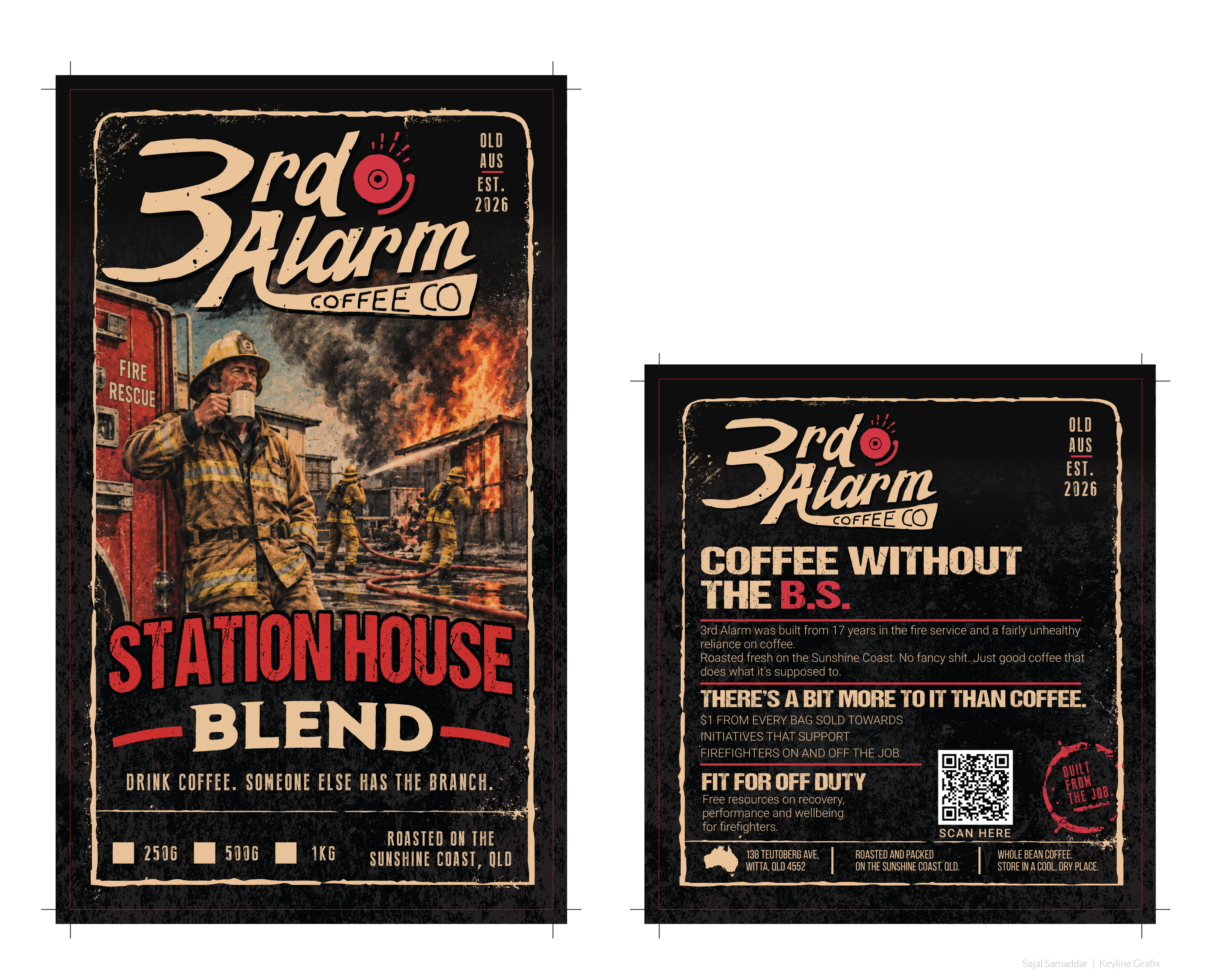
Este cliente recibió 191 diseños de viñeta de 54 diseñadores. Eligieron este diseño de etiqueta de Sajal Samaddar como el diseño ganador.
Únete gratis Encuentra trabajos de diseño
- Garantía
-
 A$340
A$340
-
 191 diseños
-
 54 diseñadores
Resumen de Diseño de Etiqueta
AABOUT THE PROJECT
3rd Alarm is an Australian firefighter-founded coffee and apparel brand.
We’re looking for a new label for our Station House Blend coffee.
3rd Alarm has a lot of dry humour and doesn't take itself too seriously. It's not about heroism or making firefighters look tough. It's about the culture of the job — the characters, station life, humour and the ridiculous things that become completely normal when you've spent enough time around a fire station.
The packaging needs to feel unmistakably connected to that world while still looking genuinely good as a piece of retail coffee packaging.
We want to be able to put this coffee into selected shops and have the bag catch someone's eye even if they've never been in the fire service.
The goal is simple: make us a really cool bag of firefighter coffee that doesn't look like generic firefighter merchandise.
UPDATED CREATIVE DIRECTION
We have now developed a much clearer visual direction for the label and have attached three new high-resolution illustrations for designers to work with.
Please choose ONE of the supplied illustrations to use as the hero image on the front label.
These illustrations represent the visual direction we're looking for:
Genuine old-school commercial advertising artwork depicting ridiculous everyday firefighter situations with complete seriousness.
The humour is important, but it shouldn't look like comedy artwork.
Nobody needs exaggerated expressions. Nobody needs to be winking at the viewer. The joke is that the artwork treats a completely stupid situation as though it's perfectly normal.
Think beautiful old advertising illustration first; ridiculous firefighter situation second.
The supplied illustrations already provide the personality and humour. Your job is to turn one of them into a strong, professional coffee label through typography, hierarchy, framing, borders, layout and supporting graphic elements.
The illustration should remain the hero.
We're particularly interested in the visual language of old coffee tins, food packaging, magazine advertisements and printed product labels — strong typography, limited colours, slightly imperfect printing and plenty of character.
It should feel vintage without looking like generic fake-antique packaging.
Most importantly, it still needs to look like a proper coffee brand on a retail shelf.
PLEASE AVOID
Please do not add generic firefighter imagery such as Maltese crosses, axes, skulls, unnecessary flames, heroic firefighter poses or dramatic structure fires.
No tactical/grunge firefighter-merch styling.
No government fire-service logos, insignia or identifiable official branding.
Please don't substantially redraw or change the style of the supplied hero illustrations.
The artwork already tells the firefighter story. The rest of the label doesn't need to shout it.
LABEL SIZES
Front: 100mm W × 170mm H
Back: 100mm W × 110mm H
Please design at these finished dimensions with appropriate bleed and safe margins for professional printing.
The supplied hero illustrations have been prepared specifically for the 100mm × 170mm front-label proportion.
Minor cropping or repositioning is fine where required to make the design work.
FRONT LABEL
Please include:
Attached 3rd Alarm Coffee Co. logo
QLD AUS / EST. 2026
STATION HOUSE BLEND
250G / 500G / 1KG
ROASTED ON THE SUNSHINE COAST, QLD
STATION HOUSE BLEND should have a strong presence on the front of the bag.
The 250G / 500G / 1KG options must all appear on the same label, with a simple way of marking the appropriate bag size during production — for example, individual boxes or circles beside each weight.
We do not require separate labels for the three bag sizes.
IMPORTANT CHANGE
The previously requested line:
“DRINK COFFEE. SOMEONE ELSE HAS THE BRANCH.”
is no longer required and should not appear on the new design.
The illustration already provides the humour, so we want to keep the remaining front copy relatively restrained.
BACK LABEL
The back label is 100mm W × 110mm H.
There is no requirement to repeat the 3rd Alarm logo on the back.
Please include the following copy:
COFFEE WITHOUT THE B.S.
3rd Alarm was built from 17 years in the fire service and a fairly unhealthy reliance on coffee.
Roasted fresh on the Sunshine Coast. No fancy shit. Just good coffee that does what it’s supposed to.
THERE’S A BIT MORE TO IT THAN COFFEE.
EVERY PURCHASE HELPS US KEEP BUILDING RESOURCES, SHARING STORIES AND SUPPORTING INITIATIVES FOR FIREFIGHTERS ON AND OFF THE JOB.
FIT FOR OFF DUTY
Free resources on recovery, performance and wellbeing for firefighters.
SCAN HERE
Attached QR code
BUILT FROM THE JOB.
138 TEUTOBERG AVE, WITTA, QLD 4552
ROASTED AND PACKED ON THE SUNSHINE COAST, QLD.
WHOLE BEAN COFFEE. STORE IN A COOL, DRY PLACE.
The back should visually belong to the same packaging system as the front.
We're also open to a small secondary illustration or continuation of the front-label joke on the back, provided it doesn't interfere with the required information.
For example, if using the bin-fire artwork on the front, a small illustration of the smouldering remains of the bin could work well on the back.
Likewise, a small possum element could accompany the possum design.
Keep this secondary artwork subtle. The back needs to remain functional and readable.
QR CODE
The supplied QR code must be incorporated into the back label.
Please use the QR code exactly as supplied.
Do not redraw, recreate, distort or alter it.
It must remain large enough to scan reliably when printed, with sufficient clear space around it.
SUPPLIED FILES
The project includes:
3rd Alarm Coffee Co. logo
QR code
Three high-resolution hero illustrations
Designers may choose one of the three supplied illustrations as the hero artwork for their design.
The supplied artwork may be cropped or repositioned slightly as required, but please don't substantially redraw it, alter the illustration style or replace the scene with another concept.
Please use the supplied 3rd Alarm logo rather than recreating it.
OVERALL DESIGN DIRECTION
The combination we're looking for is:
Vintage advertising + firefighter station culture + dry Australian humour + genuinely good retail coffee packaging.
We want someone to see the bag from across a shop and think it looks interesting before they've even noticed what is happening in the illustration.
Then they look closer and realise the firefighters are dealing with a burning wheelie bin, a possum stealing someone's lunch, or another equally ridiculous situation.
That second look is important.
The humour should feel incidental rather than forced.
The illustrations are colourful and detailed, so the typography and supporting design don't need to compete with them.
A relatively restrained cream / red / black vintage product-label treatment is one direction we think could work particularly well, but designers still have freedom to explore the typography, framing and composition.
The finished label will be applied to a matte black coffee bag, so please take that into consideration when designing the label and presenting mock-ups.
Strong contrast and shelf presence are important.
REFERENCE IMAGES
The existing reference images are included to demonstrate the kind of personality and shelf presence we're attracted to.
We like the coffee packaging references for their typography, hierarchy and ability to work as genuine retail products.
We like the SnackaChangi references for their use of old advertising language combined with unexpected humour.
Please don't copy their branding, layouts, illustrations or colours.
The three newly supplied 3rd Alarm illustrations are now the primary visual reference for this project.
We want to build our own recognisable visual world around them.
FINAL FILES
Final artwork must be supplied as professional print-ready artwork, including appropriate bleed and safe margins.
Typography, borders, logos and other graphic elements should remain vector wherever appropriate.
The supplied hero illustrations are raster artwork and do not need to be converted or traced into vector artwork. Please retain them at sufficient resolution for professional printing.
Please also supply editable source files for future production requirements.
All required copy above should be used exactly as supplied. Please do not rewrite or substitute wording.

Actualizaciones
Need extra days to review
We've updated the brief and added some new references that better show what we're looking for. We've also increased the top prize and extended the deadline to give everyone a bit more time to explore the new direction and come up with something original.
Still need to work on the right direction
Mira y siente
Cada control deslizante ilustra las características de la marca del cliente y el estilo que debe comunicar el diseño de tu logotipo.


