

 Refresh
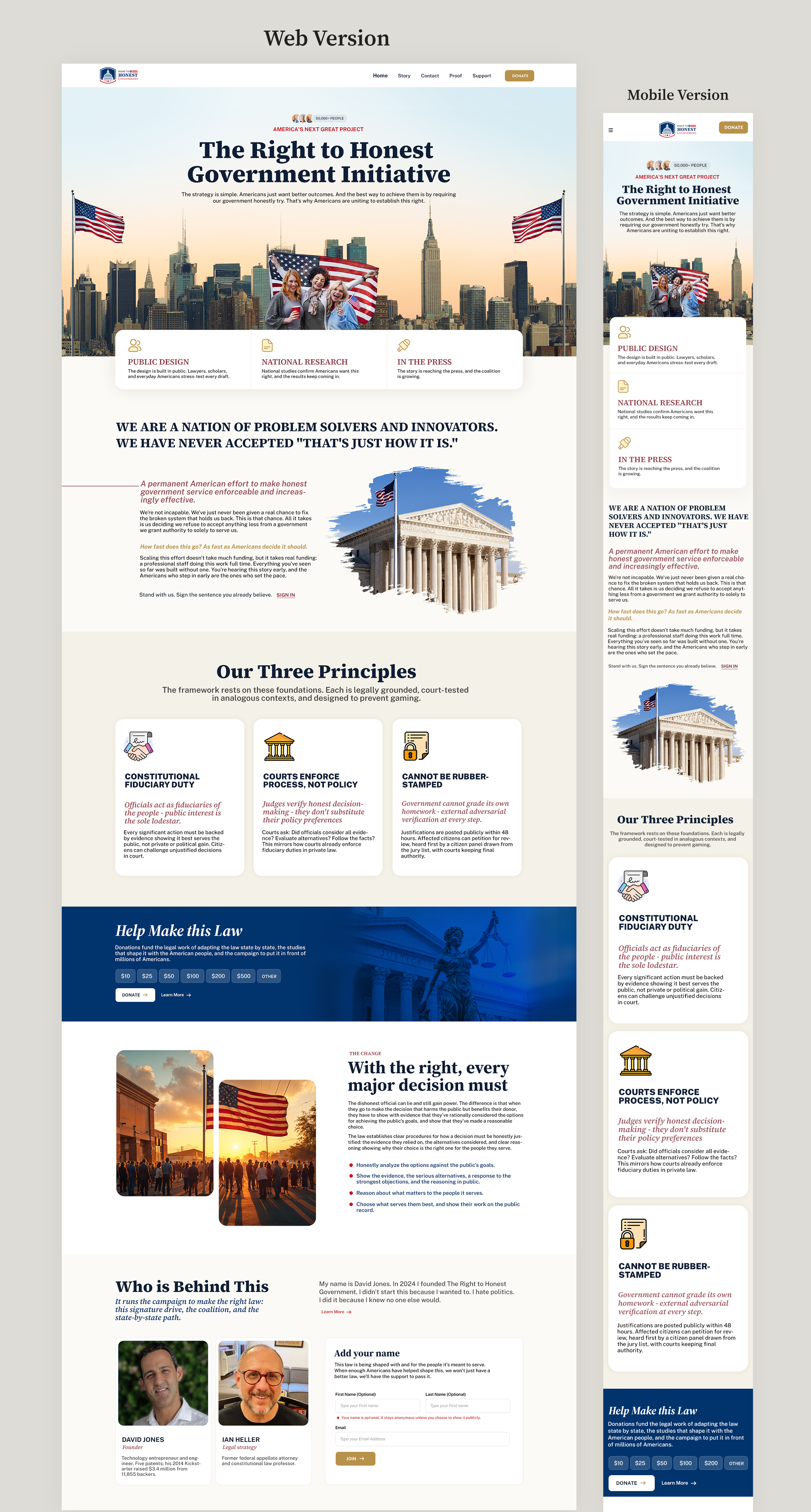
Website visual direction for a nonpartisan American civic initiative - serious, modern, human
¿Quieres ganar un trabajo como este?
Este cliente recibió 139 diseños web de 38 diseñadores. Eligieron este diseño web de Suby R como el diseño ganador.
Únete gratis Encuentra trabajos de diseño
- Garantía
- Proyecto agrupado 1
-
 US$370
-
 139 diseños
-
 38 diseñadores
Resumen de Diseño Web
We are building a nonpartisan campaign that is uniting Americans to establish a legal right to honest government service.
Live site: https://righttohonestgovernment.org/
It is a story you walk, one screen at a time, on your phone or a
computer. It asks Americans to sign one sentence: "The American
people have a right to honest government service." It is
nonpartisan. A national study conducted through Verasight found 73% said they would vote yes, 19% were undecided, and 8% were opposed.
But, 95.5% agreed with the principle behind it: "The American people have a right to honest government service."
Our design problem is trust, credibility, embody that our plan is succeeding and they feel excited to help us move faster and raise the funds to scale it. A first-time visitor who is skeptical
of politics and of new organizations should leave thinking: "That's a
beautiful vision. It seems hard, but these people are serious. I'd put
my name on it, and I might chip in to help build it."
We call the direction civic modernism with American archival warmth.
Picture an important American institution that citizens are still
building. Closer to a national museum, a presidential library, a
university research center, or a great newspaper than to a campaign
site or a startup.
Here's how we're thinking about it:
The goal is to give visitors the information they need on one page before diving deeper into the website. We want the homepage to quickly communicate what the project is, why it matters to them, show that it has legs (such as through the public agreement stats), and create social proof (people look to see that others like them and people they can trust are behind the project). People want to support only when they think it's already succeeding. The homepage should make them feel like this is moving along successfully. We also want to peak their curiosity to continue the story as we do with today's front page. We don't want it to be so busy that people can't quickly absorb the ideas and feel increasingly confident this speaks to them and they want to support it because the ideas resonate effectively.
### What to design
A visual direction, not a whole website.
1. Homepage, desktop and mobile. Show the opening statement, the
sentence itself, the research, the people behind it, the signature
ask, and a place to donate.
2. One content-heavy story page, desktop and mobile. Show how the same
look carries a lot of serious information without getting dull.
Please use our existing words. You can shorten text for the mockup.
Spend your time on hierarchy, type, imagery, spacing, data
presentation, and mobile layout rather than rewriting the campaign.
### Colors
- Constitutional ink #0E1E36
- Civic navy #1B2A4A
- Paper #FBFAF6
- Warm paper #F4F1E8
- Heritage gold #B8924A
- Action gold #D8B45C
- Oxblood accent #8C3440
Strong guidance, not a rule. Getting the feel right matters more than
using every color.
### Type
A classical editorial serif for the big ideas and a plain sans for
body and interface. Source Serif 4 and Public Sans are good references.
### Photography
Documentary and recognizably American: ordinary people, public spaces,
small towns and cities, courthouses, the places where government meets
daily life. It should feel like it belongs to citizens. Please list
any stock photos or assets that would need a license.
### American, not partisan
We want this to feel proudly American. Red, white, and blue are
welcome in deep, historical tones like the navy, cream, and oxblood in
our palette. What we want to avoid is anything that reads as one party
or as an election ad:
- Bright campaign red or campaign blue, or a page that leans heavily
toward either one. To most Americans those colors now mean
Republican and Democrat, and a strong lean tells half our visitors
this isn't for them.
- Yard-sign and political-ad styling: bold slab type, starbursts,
"VOTE" energy, anything that looks like a Super PAC.
- Patriotism as decoration: giant flags, eagles, fake seals,
stars-and-stripes patterns, parchment. A flag that simply appears in
a real photo of a courthouse or a Main Street is fine.
- Tech-startup styling: SaaS gradients, glass effects, endless rounded
cards, generic illustrations.
- Staged stock photos (handshakes, people pointing at laptops) and
"democracy is collapsing" drama. This campaign is about confidence in
self-government.
### How we'll judge
| Criterion | Weight |
|---|---|
| Trust, seriousness, and political neutrality | 30% |
| Emotional pull and sense of possibility | 30% |
| Clear information hierarchy | 25% |
| Mobile design | 15% |
One test: cover the word "nonpartisan" with your thumb. Would the page
look equally at home to a conservative Republican, a progressive
Democrat, and an independent? If not, it's the wrong direction.
A beautiful design that looks partisan will lose. So will a serious one
that feels lifeless.
### Files we want
Desktop and mobile mockups, Figma or high-res PNG, plus the working
file. We will not ask you to code the site.
Número de páginas requeridas
1 page
Mira y siente
Cada control deslizante ilustra las características de la marca del cliente y el estilo que debe comunicar el diseño de tu logotipo.
Elegante
Atrevido
Juguetón
Serio
Tradicional
Moderno
Atractivo
Profesional
Femenino
Masculino
Vistoso
Conservador
Económico
De Alta Gama
Pagos
Total
US$370
Fecha límite del proyecto
02 oct. 2026 19:45:05 UTCUpgrades del proyecto
Proyecto(s) incluido(s)
- ofreciendo US$69 por el diseño de logo al ganador
