

 Refresh
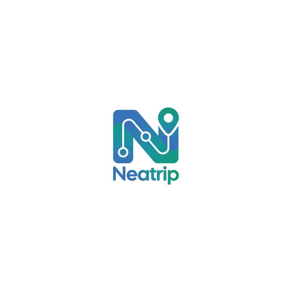
Neatrip Logo
¿Quieres ganar un trabajo como este?
Este cliente recibió 1 diseños de logo de 1 diseñadores. Eligieron este diseño de logo de Jerwin Intac como el diseño ganador.
Únete gratis Encuentra trabajos de diseño
- Garantía
-
 £80
-
 1 diseño
-
 1 diseñador
Resumen de Diseño de Logo
I have an AI designed logo for an Android/iOS app. I really like the logo but it was created as a PNG and I need a freshly drawn SVG file. Conversion doesn't work without adding artefacts or messing with the original design. AI also added some flaws to the original that I do not like.
I've attached the original for inspiration. It does not need to be a 1:1 replica, I'm open to improvements.
Here is the spec of what I need:
-I need two SVGs, one of the full logo and another 1:1 ratio one of just the 'N'
- I need to adjust the colours The gradient needs to start at #0B78E8, pass through #0E9696 and end on #109570. Every stop of the gradient must reach at least 3:1 contrast against both #F4F6FB and #070B14.
- The background must be transparent
- The word Neatrip mut be in alignment with the left hand and the right hand of the N,
- I'm not worried about which fonts you use.
- The right hand tip of the N is meant to represent a tear drop style place marker. It needs to transition smoothly from the N with some space separating the edges just like the sample file. The sample file has some smoky colour between the N and the place marker, this isn't necessary, clean space is fine. The transition from the N to the place marker in the sample file is not symmetrical, it looks odd, please rectify this.
- The logo needs to have the line and circles running through it similar to the design, this is mean to represent stops on a journey similar to a train line map. Placement does not need to mimic the logo, place them wherever makes sense to your design eye. The line and dots can follow the N precisely if you want
- the logo needs to be boxy, meaning all sides are in alignment, nothing protruding above,.below, left or right including the word below. The current sample shows this
-Text converted to outlines, so the "Neatrip" wordmark doesn't depend on a font being installed.
-No embedded pictures (bitmaps) inside the SVG, only drawn shapes, so it stays sharp at any size.
-The gradient defined in the SVG itself
Objetivo del mercado(s)
Consumer app
Tipo de industria / entidad
Travel planning app
Texto del logo
See brief
Estilos de fuente para usar
Gustan otros estilos de fuente:
- Designer choice but modern
Mira y siente
Cada control deslizante ilustra las características de la marca del cliente y el estilo que debe comunicar el diseño de tu logotipo.
Elegante
Atrevido
Juguetón
Serio
Tradicional
Moderno
Atractivo
Profesional
Femenino
Masculino
Vistoso
Conservador
Económico
De Alta Gama
Requisitos
Debes tener
- See brief
Agradable de tener
- See brief
No debería tener
- See brief
