Ex-Military Careers
¿Quieres ganar un trabajo como este?
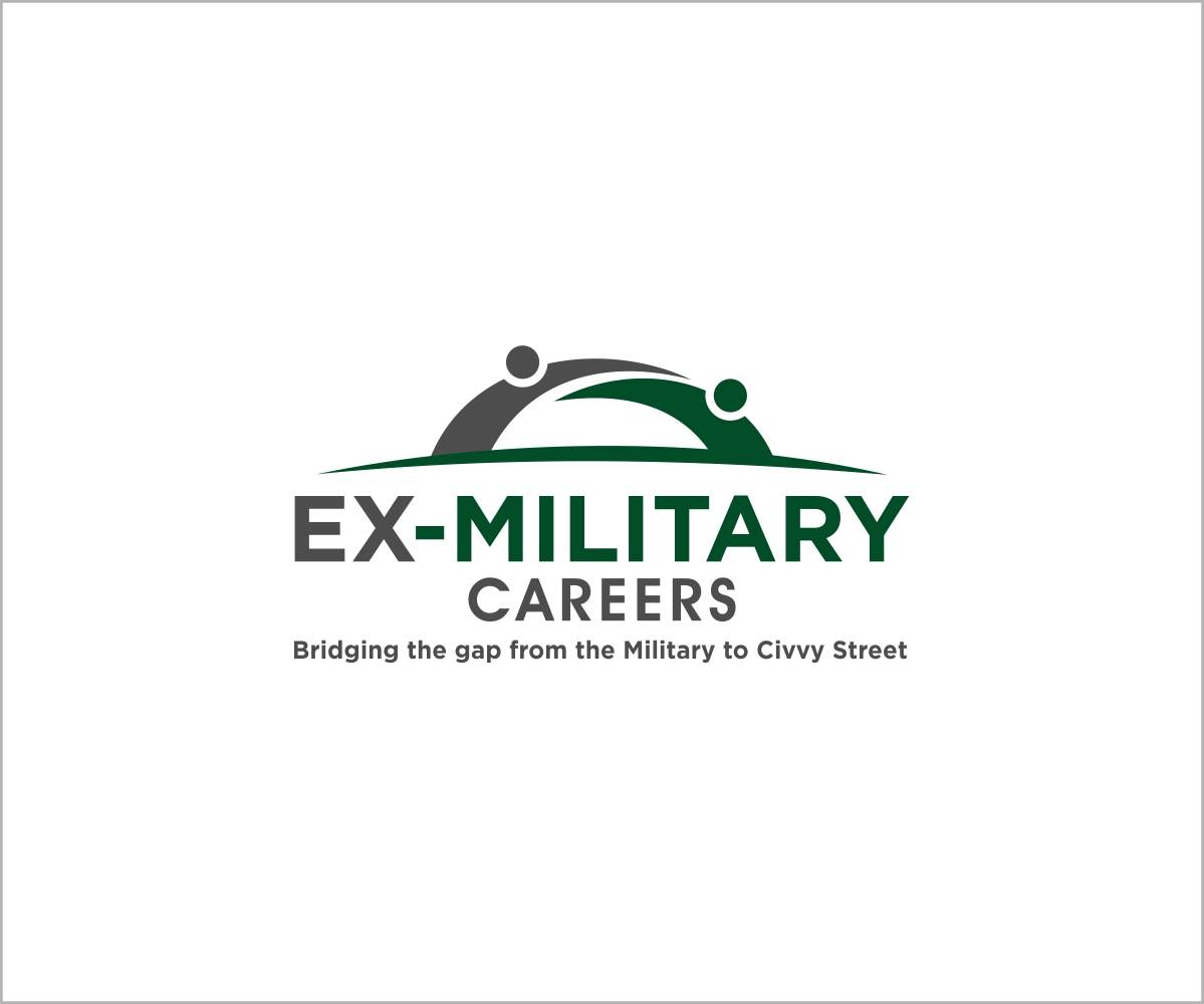
Este cliente recibió 80 diseños de logo de 19 diseñadores. Eligieron este diseño de logo de avantgarde-designs como el diseño ganador.
Únete gratis Encuentra trabajos de diseño- Garantía
-
 £300
£300
-
 80 diseños
-
 19 diseñadores
Resumen de Diseño de Logo
My brother and I are setting up a company that helps Ex-Military personnel find employment once they return for service. Our business, Ex-Military Careers, will function as a job board where candidates look for new jobs and businesses post suitable roles.
Important things to note:
Ex-Military Careers has a hyphen
From this logo we need to use 2/3 cores colours (e.g. red,navy,royal blue,black) we can build some guidelines for that can carry the brand on other comms e.g. letter headed paper, business cards, pop up stands for careers conventions and newsletters etc
We have a great company name so the logo need to represent this
It would be good to see a Wordmark logo with a Lettermark accompaniment for flexibility
Actualizaciones
Project Deadline Extended
Reason: We have now included a marketing strap line which must be included.
'Bridging the gap from the Military to Civvy Street'
Added Monday, March 03, 2014
Objetivo del mercado(s)
Ex-Military personnel looking for a need job and corporate companies looking to fill vacancies.
Tipo de industria / entidad
Business
Texto del logo
Ex-Military Careers
Estilos de logo de interés
Logo con emblema
Logo contenido dentro una forma / figura
Logo de marca de nombre
Logotipo basado en palabra o nombre (solo texto)
Logo con siglas
Acrónimo o logo tipográfico (solo texto)
Estilos de fuente para usar
Colores
Colores seleccionados por el cliente para ser utilizados en el diseño del logotipo:
Mira y siente
Cada control deslizante ilustra las características de la marca del cliente y el estilo que debe comunicar el diseño de tu logotipo.
Elegante
Atrevido
Juguetón
Serio
Tradicional
Moderno
Atractivo
Profesional
Femenino
Masculino
Vistoso
Conservador
Económico
De Alta Gama
Requisitos
Debes tener
- Clean and clear typeface that makes the logo instantly recognisable
Agradable de tener
- Using the M to represent the 'bridging the gap' but not at the expense of losing the corporate look and feel
No debería tener
- Gimmicky characters