New Technology Nonprofit Seeking Creative Logo!

¿Quieres ganar un trabajo como este?
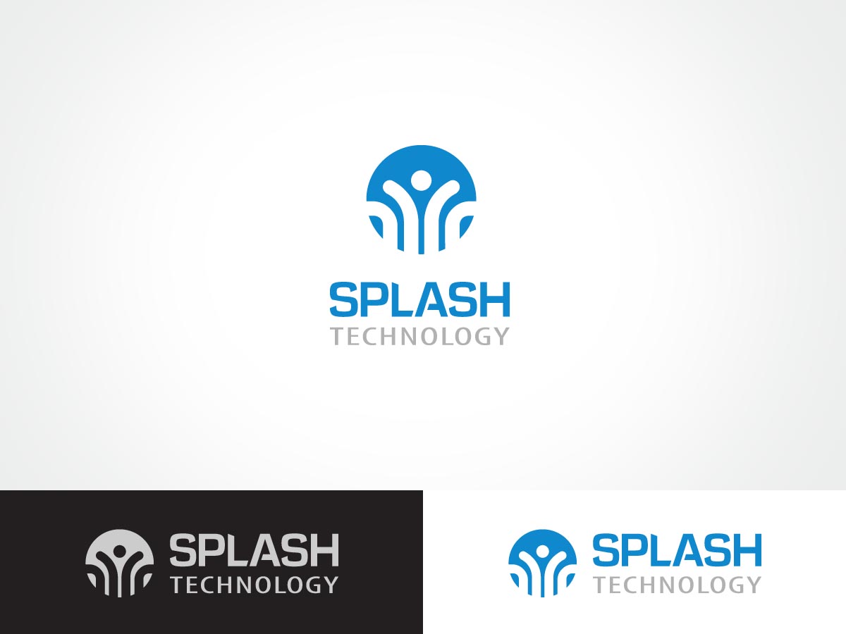
Este cliente recibió 65 diseños de logo de 22 diseñadores. Eligieron este diseño de logo de ArtTank como el diseño ganador.
Únete gratis Encuentra trabajos de diseño- Garantía
Resumen de Diseño de Logo
Splash Technology is a new nonprofit that increases access to technology for U.S. based non-profits working towards social change through simple, fair and honest technology services and leasing programs.
Ultimately, we are curious to see what ideas people have- our name definitely invokes some water/ripple based logo ideas- but we also would like to demonstrate that we are a creative, young and modern nonprofit working in the technology sector(specifically computer hardware).
Why are we called Splash?
We believe one way people passionate about supporting social change organizations is by donating used technology. By donating to Splash Technology, each donation, or splash, also creates "ripples of impact" by sustaining a new market for nonprofits that breaks down barriers around technology and puts focus back on the their missions.
Some values we hope to express through our branding:
Honesty
Simplicity
Fairness
Technology
Professionalism
Openness/Transparency
Current
Trustworthiness
Some words that we would like to describe our future website style:
Crisp, Clear, Clean, Bright, Light, Smooth, Refreshing, Concise
There is the possibility of expanded work for the winner of the contest.
Actualizaciones
Thank you all designers for your submissions- I will be reviewing and giving every design feedback and making some initial eliminations in the coming day. The creativity has been wonderful and I am very grateful for all the contributions.
Added Monday, May 28, 2012
Project Deadline Extended
Reason: Hey Everyone,
I'm extending the deadline to allow for designers to make any final revisions before we take the finalists to a vote. Shortly after that vote, we will make a decision. We are not considering any submissions from new designers at this point- a testament to the quality of your submissions. Thank you so much for your creativity and quality work- it has made this process very difficult.
Best,
George
Added Saturday, June 02, 2012
Objetivo del mercado(s)
Clients, Donors (Businesses and Individuals), General Public- Likely 18-64 years old, Likely well-educated
Tipo de industria / entidad
Computer
Texto del logo
Splash Technology
Estilos de logo de interés
Logo pictórico / combinado
Un objeto del mundo real (texto opcional)
Logo con personaje
Logo con ilustración o personaje
Logo de marca de nombre
Logotipo basado en palabra o nombre (solo texto)
Mira y siente
Cada control deslizante ilustra las características de la marca del cliente y el estilo que debe comunicar el diseño de tu logotipo.
Elegante
Atrevido
Juguetón
Serio
Tradicional
Moderno
Atractivo
Profesional
Femenino
Masculino
Vistoso
Conservador
Económico
De Alta Gama
Requisitos
Debes tener
- The full name: Splash Technology
Must have some illustrative properties: We don't want a boring old Splash Technology in text form, one word italicized or bolded and one not- we have Photoshop! We want something that can be the face of our creative and current nonprofit.
No more than 4 colors- and 4 is probably pushing it already.
Thanks designers! You are helping a nonprofit build a brand and make a difference.
Agradable de tener
- Technology is a long word, so it would be great if that was subset or smaller text, and did not overwhelm the word Splash. Emphasis should be on the word Splash.
My preference is with the following main color ranges: blue (whole spectrum), white, grey, black
The truth is we have looked over what the world "Splash" looks like on the internet in other logos and nothing really stuck out as a good conceptual fit. So just be creative.
No debería tener
- Loudness: It can make a statement, but it shouldn't be loaded with unusual colors, such as bright pink or green-brown.
We like water/splash/ripple themes and color schemes- but please do not overdo it. We are a technology based nonprofit- and even though that'l like hard to express in a logo- we want to have that professional, sleek, technology edge to match with a more playful side. It can't look like a logo for a water amusement park (sadly).