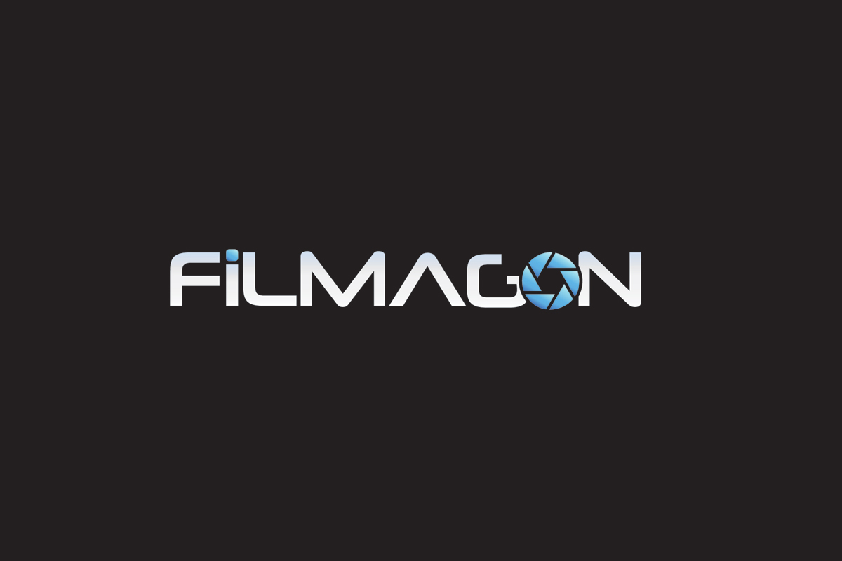
Logo Design for 'FiLMAGON.com'
¿Quieres ganar un trabajo como este?
Este cliente recibió 126 diseños de logo de 66 diseñadores. Eligieron este diseño de logo de craiger64 como el diseño ganador.
Únete gratis Encuentra trabajos de diseño- Garantía
-
 US$400
-
 126 diseños
-
 66 diseñadores
Resumen de Diseño de Logo
We're looking for a LOGO for a new website. The site will be for various Film Crew to find film crew jobs.
Basically anyone who has anything to do with the entertainment world will use this site to find work and network with other film industry people.
Such as:
Film Directors
Film Producers
Cameramen
Writers
ect.
I would like to see a bold design to that people will remember the name. No preference on colors yet, but it should go with the site template already chosen. You can see at:
www.filmagon.com (generic template)
This site is geared to be national then international.
Generally a techy type crowd.
The name Film-a-gon to me sounds like a BIG place. that's is a deep as it goes, it just sounds BIG and important!
I wouldn't mind seeing a camera shutter worked into the letter O. I like all caps except for the letter i.
Actualizaciones
Project Deadline Extended
Added Wednesday, June 20, 2012
Hi all,
My project is now guaranteed! Please send your best.
Added Wednesday, June 20, 2012
Objetivo del mercado(s)
Film Industry crowd. Tech. Business.
Tipo de industria / entidad
Entertainment
Texto del logo
FiLMAGON
Estilos de logo de interés
Logo con emblema
Logo contenido dentro una forma / figura
Logo pictórico / combinado
Un objeto del mundo real (texto opcional)
Logo abstracto
Conceptual / simbólico (texto opcional)
Logo con siglas
Acrónimo o logo tipográfico (solo texto)
Mira y siente
Cada control deslizante ilustra las características de la marca del cliente y el estilo que debe comunicar el diseño de tu logotipo.
Elegante
Atrevido
Juguetón
Serio
Tradicional
Moderno
Atractivo
Profesional
Femenino
Masculino
Vistoso
Conservador
Económico
De Alta Gama
Requisitos
Debes tener
- Should be a thick type font. must match the site template we are using. see www.filmagon.com for sample.
If a color was used it should probably be a blue.
Agradable de tener
- I was thinking of Doing the letters in all caps except for the Letter i, and I thought of making the i like an antenna. That's just one idea.
Can include the .com or leave out.
I like the idea of working a camera shutter into the letter O.
No debería tener
- Can't be to tall. must fit into the site header.
see www.filmagon.com for sample.