

 Refresh
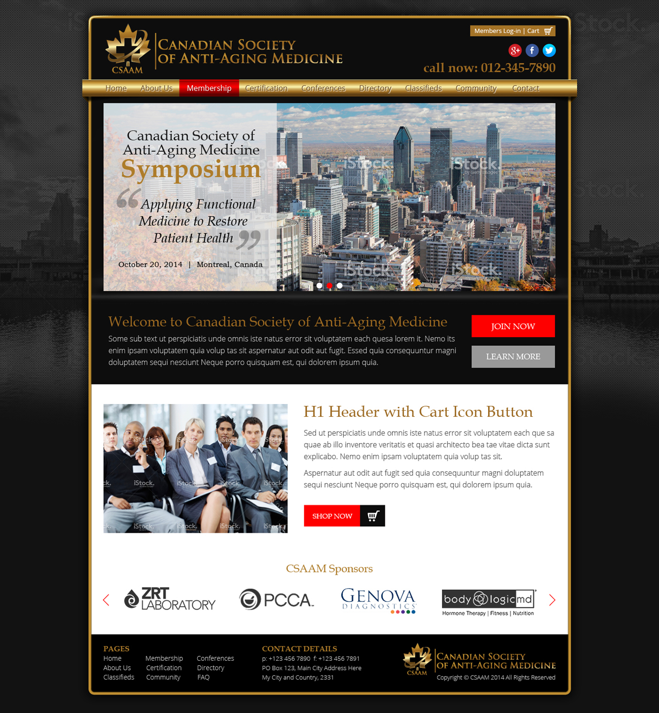
Website for New Medical Professional Organization Anti-Aging
¿Quieres ganar un trabajo como este?
Este cliente recibió 27 diseños web de 4 diseñadores. Eligieron este diseño web de Nelsur como el diseño ganador.
Únete gratis Encuentra trabajos de diseño
-
 C$500
C$500
-
 27 diseños
-
 4 diseñadores
Resumen de Diseño Web
Thanks to all who participated in my logo design project! We had several very good options to choose from, but we decided to go with the project attached by Dito.
Now, we need to develop the same idea into a web page. Our membership will be professionals involved in anti-aging medicine including doctors, naturopaths, chiropractors, nurses, nurse practioners, etc and also the corporations that have an interest eg. testing facilities, pharmacies, etc.
The sections will be :\
About Us
Membership
Certification
Conferences
Directory
Classifieds
Community
We need at least 2 areas for pictures that change content. One large one smaller.
1. Banner for the top, which includes the Logo, social media contacts, phone number, website address www.csaam.ca. We are thinking of using the black backround for the banner, then white backround with black and gold headings for the body.
2. Banner for footer: black again with small logo and contact information
3. The corporate sponsor banner can go across the bottom just above the footer banner. This one can be moving right to left to reveal the corporate sponsor names.
We need a section for "Join Now" where they are lead to a place to enter name, profession, address, email, phone, etc.
We need a nice looking "cart" for purchases on the webpage...
Our competition (and leader in the field is www.a4m.com. We like some of their ideas, but it looks disorganized and too commercial. We want to look professional but friendly and interesting.

Actualizaciones
I am hoping that you all can "see" the logo on the black backround ... I can't see it on mine because I don't have editing software... I really like the gold logo on black as the designer provided.
Thanks and good luck!
Added Saturday, April 19, 2014
I chose a gold colour from the colour wheel, but what I really want is for the logo colour to be present in the website design and become a prominent part of the design. Thanks for your work so far!
Debbie
Added Sunday, April 20, 2014
Hello designers!
I really like the ones that have more black in them. I would like to see more use of the Logo - make it bigger and a more integral pat of the website design. Since we are Canadian, we probably should have some red somewhere too :) So, now I am thinking Gold, Black, White and Red. I am not liking the silver I have seen so far. Please try to make the gold more regal and glowing. Thanks!
Debbie
Added Sunday, April 20, 2014
Objetivo del mercado(s)
professionals - doctors, chiropractors, naturopaths, nurses
commercial health providers - pharmacy, testing facilities, etc
Tipo de industria / entidad
Nurse
Colores
Colores seleccionados por el cliente para ser utilizados en el diseño del logotipo:
Mira y siente
Cada control deslizante ilustra las características de la marca del cliente y el estilo que debe comunicar el diseño de tu logotipo.
Elegante
Atrevido
Juguetón
Serio
Tradicional
Moderno
Atractivo
Profesional
Femenino
Masculino
Vistoso
Conservador
Económico
De Alta Gama
Requisitos
Debes tener
- social media
contact info
e commerce

