

 Refresh
13 year old Broadway theater & entertainment Website Needs A New Logo & WebMasthead Design
¿Quieres ganar un trabajo como este?
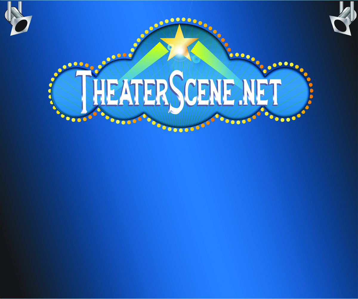
Este cliente recibió 77 diseños de logo de 18 diseñadores. Eligieron este diseño de logo de fontasdesign como el diseño ganador.
Únete gratis Encuentra trabajos de diseño
- Garantía
-
 US$200
-
 77 diseños
-
 18 diseñadores
Resumen de Diseño de Logo
Our website posts full length reviews of musicals, plays, cabaret, concerts, and dance, plus Interviews. The website has been online since Sept 2001. The logo we have now is very old-fashioned, you can see it at www.theaterscene.net. I want a new logo that can be used as a masthead on the top of the page for the entertainment reviews that communicates freshness, authority for reviews, and can be seen as glamorous and contemporary. I'd also like a smaller version of the Masthead be made into a Logo for a business card. I'd like the main masthead to be about 660 pixels wide. The smaller version can have less details but be recognizable as the same name. This smaller version should be sized for Twitter and facebook profiles. We've historically used light blue and yellow colors and I'd like to keep those. I'm also rebranding the site from TheaterScene.net to TheaterScenes.com so the logo should prominently feature that new url.
I have tried to upload the existing logo but I can't seem to attach files to this project.
go to: http://www.theaterscene.net to see the existing masthead
BroadwayWorld.com and Theatermania.com are competitors you can look at for inspiration. It should not look like theirs at all.

Actualizaciones
Remember - I want this logo to be recognizable for someone that knows our current website - http://www.theaterscene.net- but to represent a freshening up - a modernizing of what we currently have. the new logo doesn''t have to be as busy as the current one but it should convey to the viewer that it naturally fits for a site that does reviews of theater, musicals, cabaret, dance, etc. We are not a theater or film company, we are the theater press - we post reviews of other people's performances. The logo must look good on the web and also printed out since it will be on the top of every review and will be printed out and put in each press agent's kit of clips.
Added Monday, April 28, 2014
Project Deadline Extended
Reason: originally started this on a Saturday morning and I want to have enough time for the designers to really think about what i'm trying to achieve with this new logo. Also originally i thought i would use this logo in a new ad campaign for early May but now plan on holding it back to go with a site redesign over the summer thus the May 2nd original date isn't as important. I'm extending the contest a week.
Added Monday, April 28, 2014
I wish to thank all the designers in this contest. While I could only pick one design, the decision was very tough as there were so many quality designs submitted. I relie on my friends votes, our voting poll was voted on over 120 times. The file that was chosen was the design that was the clear winner in the voting poll with the most positive comments from the public. I appreciate the thought and creative design that most of you put into your work. There were very few designs that I eliminated at first glance. Thank you again for all your work.
Added Saturday, May 10, 2014
Objetivo del mercado(s)
sophisticated adults who attend theater and cultural events in New York City
Tipo de industria / entidad
Entertainment
Texto del logo
TheaterScenes.com
Estilos de logo de interés
Logo pictórico / combinado
Un objeto del mundo real (texto opcional)



Logo abstracto
Conceptual / simbólico (texto opcional)



Estilos de fuente para usar


Mira y siente
Cada control deslizante ilustra las características de la marca del cliente y el estilo que debe comunicar el diseño de tu logotipo.
Elegante
Atrevido
Juguetón
Serio
Tradicional
Moderno
Atractivo
Profesional
Femenino
Masculino
Vistoso
Conservador
Económico
De Alta Gama
Requisitos
Debes tener
- should convey at a glance that it is related to theater and performance. Trying to freshen up what is already very recognizeable (since it's 13 years old). Plus trying to rebrand the website to slight variation on url from TheaterScene.net to TheaterScenes.com -
so plural and the .com.
Agradable de tener
- Maybe an old fashioned floor microphone between the Theaters and the Scenes.com words. Our current logo has a conductor between the words Theater and Scene.net. We're trying to modernize the existing logo but not lose the existing vibe.