New design for HowToHR
¿Quieres ganar un trabajo como este?
Este cliente recibió 20 diseños web de 7 diseñadores. Eligieron este diseño web de pb como el diseño ganador.
Únete gratis Encuentra trabajos de diseño- Garantía
-
 A$500
A$500
-
 20 diseños
-
 7 diseñadores
Resumen de Diseño Web
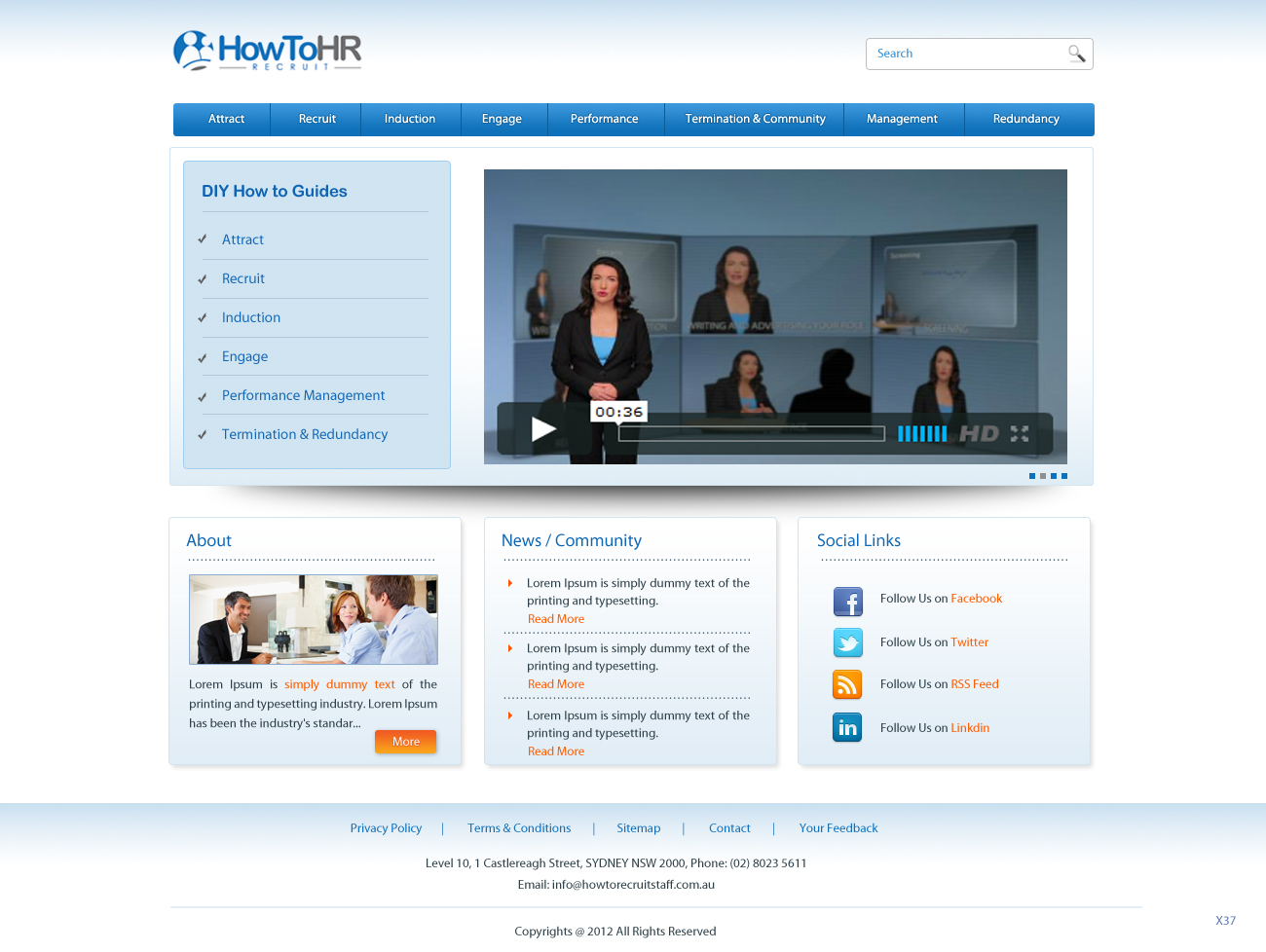
We are at the start of the process of evolving an existing business, and have just developed a new logo that will guide the look and feel of the rest of the site.
HowToHR.com.au will be the place to go for small business owners that need guidance and tools on how to look after HR functions such as recruitment and performance management amongst other aspects.
The existing site that is going to be evolved in www.howtorecruitstaff.com.au - while some of the content will remain, the entire look of the site needs to change, and a new homepage and other pages need to be developed.
For this project, we'd like the new homepage to be designed to lead the way for how the rest of the pages will look moving forward.
We're looking for a clean, clear and modern design. It should not feel cluttered or busy
The wireframe for the new homepage, and another landing page are attached.
Objetivo del mercado(s)
Small and medium business owners - slightly male skew
Tipo de industria / entidad
Small Business
Mira y siente
Cada control deslizante ilustra las características de la marca del cliente y el estilo que debe comunicar el diseño de tu logotipo.
Elegante
Atrevido
Juguetón
Serio
Tradicional
Moderno
Atractivo
Profesional
Femenino
Masculino
Vistoso
Conservador
Económico
De Alta Gama
Requisitos
Debes tener
- - Should be clean and simple
- The overall feel from the new logo (attached to the project) should be integrated into all elements of the site
- Should communicate that the site is easy to navigate
- Should communicate that the site is friendly and approachable
- Should communicate that the site is professional (for small businesses)
Agradable de tener
- This homepage for this site is quite a good design reference in terms of clean design.
http://www.taskrabbit.com/
For HowToHR though, the 3 boxes under the main image should appear above the fold though.
Also, happy for one other colour to be introduced to highlight call to action buttons etc.
No debería tener
- Must not be cluttered
Should not introduce more than one additional colour to the existing colours from the logo