Boochies Logo design
¿Quieres ganar un trabajo como este?
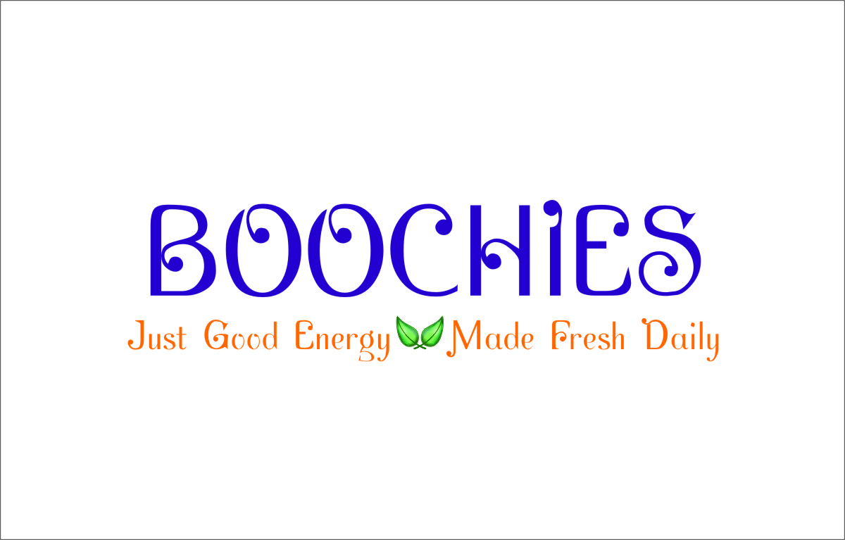
Este cliente recibió 41 diseños de logo de 18 diseñadores. Eligieron este diseño de logo de dexplorar como el diseño ganador.
Únete gratis Encuentra trabajos de diseño-
 US$200
-
 41 diseños
-
 18 diseñadores
Resumen de Diseño de Logo
BOOCHIES is a local family daytime restaurant located in Santa Barbara, California. We need a logo design that can be converted to our sign outside our cafe. The designer who wins this job will also get a subsequent job to redesign our company logo for a separate, but connected contest.
This logo should feel like a fun family location, but the design also needs to represent the innovative foods and beverages we sell. We are selling all original natural, organic foods and healthy beverages like juices, smoothies, shakes, and hot and cold tea drinks.
The three colors we want to use are Indigo, Orange, and Yellow. You can refer to this website for our color scheme: www.justgoodenergy.co
BOOCHIES (all caps)
naturally delicious (lower caps, justified left, right, or centered, whatever's clever)
The design + font(s) also need to have a level of sophistication and be flexible enough to use for other marketing materials such as business cards, flyers, and our website. We are hoping to have fonts that can be used through all of our brand ID materials.
Have fun with it and reach out with any questions!
-The Boochies
Actualizaciones
Hello All,
We have updated the brief to give you much better direction, specifically regarding the color and style.
Added Wednesday, April 30, 2014
Objetivo del mercado(s)
Women and Mothers, and thirty+ men and women who want to live, feel, and eat better.
Tipo de industria / entidad
Restaurant
Texto del logo
BOOCHIES naturally delicious
Estilos de logo de interés
Logo pictórico / combinado
Un objeto del mundo real (texto opcional)
Logo de marca de nombre
Logotipo basado en palabra o nombre (solo texto)
Estilos de fuente para usar
Gustan otros estilos de fuente:
- Parishish, Andalus, gouldy old style, book antiqua, perpetua (something elegant, light, and fun, but not pretentious)
Colores
Colores seleccionados por el cliente para ser utilizados en el diseño del logotipo:
Mira y siente
Cada control deslizante ilustra las características de la marca del cliente y el estilo que debe comunicar el diseño de tu logotipo.
Elegante
Atrevido
Juguetón
Serio
Tradicional
Moderno
Atractivo
Profesional
Femenino
Masculino
Vistoso
Conservador
Económico
De Alta Gama
Requisitos
Debes tener
- We need a BOOCHIES logo that works with and without the 'naturally delicious' locked under it. The font for 'naturally delicious' would also be used for other product names and subsequent branding, including labels and website. The logo will also be converted into a store-front sign, so the lettering will need to be legible enough to be seen from afar. That is not to say that the lettering cannot be stylized or characterized. It just needs to be able to look good on a relatively big sign scale.
Agradable de tener
- Logo would use indigo as the color for BOOCHIES and an orange/yellow for 'naturally delicious'. our color scheme is more obvious at our developing site: www.justgoodenergy.co. We would like to somehow communicate that the foods are more natural, organic, and veggie/fruit based, and more on the specialty/gourmet side.
No debería tener
- we are selling desserts, but we don't want to look like a dessert company selling ice cream. There is an irony to Boochies. While it reads kind of childish, it is representing very sophisticated gourmet healthy foods. We are not selling coffee, tea rather, so please do not focus on hot beverages.