NUFIT Logo Redesign
¿Quieres ganar un trabajo como este?
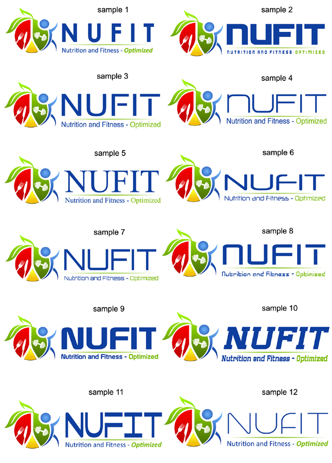
Este cliente recibió 21 diseños de logo de 11 diseñadores. Eligieron este diseño de logo de DDR_design como el diseño ganador.
Únete gratis Encuentra trabajos de diseño-
 A$200
A$200
-
 21 diseños
-
 11 diseñadores
Resumen de Diseño de Logo
Hello. Im looking to redesign my business logo and what my business stands for. My business name is NUFIT and I run a Modern Sports Nutrition consultation business however i have now moved into small group training additionally. Please have the design a little more focused on Nutritional aspects but still have the training aspect there too, if that makes sense.
My website for more info is here: www.nufit.com.au
Basically I want my design to be CLEAN, SIMPLE, FUN, PROFESSIONAL and represent what NUFIT stands for. The design must be universal, appealing to all age groups.
I want the writing of NUFIT to be CLEAN and CLEAR please.
Additionally id also like the sub heading to read "Nutrition and Fitness. Optimized"
I have uploaded my rough design. I do like my concept however you guys are the professionals and know what looks good!
Thanks in advance for your creative and hard work!
Actualizaciones
Just to clarify; In the design I have drawn, the "circle" with the red,yellow and green represents a PLATE.
The RED represents animal protein or MEATS
The YELLOW represents FATS
The GREEN represents VEGETABLES
The BLUE circle which is the "Head" actually doubles as a glass of water.
The designs are awesome so far!
Added Saturday, May 03, 2014
Tipo de industria / entidad
Training
Texto del logo
NUFIT Nutrition and Fitness. Optimized.
_brief012200.png?AWSAccessKeyId=ASIARQT47ZIUXY6XV5VK&Expires=1761431161&response-content-disposition=attachment%3Bfilename%3D%22Screenshot%20%285%29%20Thursday%2C%2001%20May%202014%2003_22_00.png%22&x-amz-security-token=IQoJb3JpZ2luX2VjEKz%2F%2F%2F%2F%2F%2F%2F%2F%2F%2FwEaCXVzLWVhc3QtMSJHMEUCIDPPCsdDsIvlBkPhPivURKdjvd1oYL1qwaiTG3qdwFeRAiEAxJAiF3w45%2Fn5JQjUN3kC1rOAhkGOShJmaeAcgAn6Ny8q6wMIZRAAGgwxMDQ0MTUwODcxNDUiDGOuJQpq8Fvb1hWLRCrIA6zPHdj46NPP1WZA8TAPIBHMJusWsltGoNNCv0T%2F1Ty7yiPvmLMOLBHQy4eqNPxaSIpTtaRqXWzXhZaXUbC%2F0LdD1ekmhqYR%2FpaKSEO2BlwsOi6%2BkPj3rSGqbsBVv96GzhARmLWEzf8Ab%2BuJGN2mTHjfqwPhj9olxSlPhfzjKXcMyR1VJOc%2BdXtAR8bG0ZGe%2FjdxghIX9Rb1WXQwaoFjgnXdWKzpkzDBIYHsuHnx1NwWGjsBI%2FB4m8jfP48mY6x23aQu1WGqNNXluWvAjxzzvARjTSwq3UTDAr9qufGj%2BbUxAz1LYvqCvOYHehxqfMIQdWwLLVHlFVdhD3GSEY3BMwZIv7YDKSpQcuIb5oqU1Bbmcyq3EX5WJvJW%2FTKoFQzANgilNZEolik5EDKiof%2FnqthuAAwFw%2FjzlpqL4in7DBwthtXYJ%2FnRP418T55hB%2FVjbL6qieVMkqrM%2FYbqKpemd35WKepC4pixAGPUl5XhKb%2BpiErxATLQX0JGntF4FfCZyEOgAWXynSIw9VLmmmvsDI3Hwh8EaAet2R8VdoxhO4U5n96AiAmIxWzr2kGkIarjGCzPLAGrlNulWU43alOV2hC4myDgQ1s8%2BjDRp%2B%2FHBjqlAcK3Jj21aXKpEkwb0yMdpuWw%2B6jp5UiceTNGNIFazxMbtOuvBUDhIzHEHm3%2ByCZeQLubsfROGWfaQCHCIQlUozRmJYzHXmzDT4ln7zgWP3ZlPAPLF%2BoIJAgJiNHTgu8YnRkFJ8UV26X1iJqX9DyHc2YaQ1Ks4lYuIyUcAgQblNSuJrWcPb4KIoKPUjp%2BsyJM7YEN8vD0qUy3qa6QnUnvnhCu%2BVVcHA%3D%3D&Signature=p04JIqMuVw%2BhHTYd2AWHx7VTpfQ%3D)