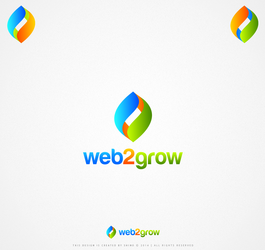
Logo Design

¿Quieres ganar un trabajo como este?
Este cliente recibió 315 diseños de logo de 106 diseñadores. Eligieron este diseño de logo de Bujar Lubovci como el diseño ganador.
Únete gratis Encuentra trabajos de diseño- Garantía
Resumen de Diseño de Logo
The Business Improvement Partners Brand
“Business Improvement Partners” is a small business advisory and coaching firm in Australia. We help businesses improve profit, create efficiencies, and grow. Our market is all sorts of small businesses, from micro (under $500K) to established ($20M), across all industries (tradespeople, retailers, manufacturers, logistics and professional services). We need to appeal to all these people.
We want a brand that conveys trust, authority, dependability, size and security. Our marketing is about growth and efficiency, so we want an image that is bold and allows us to look innovative and strong as a company. We don’t want a style that appears too conservative, or too flashy/bright/cheesy, or a small outfit that is untrustworthy.
Our Ideal Style
- Combination graphic and word logo
- Bold and with colour (ie, not a single colour, but a compliment of colours)
- Simple clean style, artwork that is clean without too much heavy detail – the graphic shouldn’t overpower the text and the text should be at least the same size or larger than the graphic
- No preference on colours so long as it keeps with the brand
- Abstract design preferred over a motif or real picture
- No cliché images - ie, no spinning globes, up arrows, etc which have been overdone
- Must have a distinctive look, bold feeling with curved lines rather than straight edges and corporate feeling without being conservative. Must say “trusted partner”
- We may want to product a version with just “improvement partners” so an option that works for two words as well as 3 would be good
Competitors / Similar Styles
See www.dstrategy.com.au or www.nbc.com.au or www.ptpartners.net.au for rough approximations. These are not ideal and we should be able to do much better.
Things We Don’t Like
- Overused/cliché graphics/styles that might appear cheesy to our client base
- Overly bold or colourful schemes that look tacky
- Cheap graphics that look like bad clipart
Actualizaciones
Project Deadline Extended
Reason: This project has been extended.
Added Sunday, November 16, 2014
Hi all - this project has been extended. Apologies for the change - we are closing this off and awarding this 21/Nov.
Thanks
Added Sunday, November 16, 2014
Objetivo del mercado(s)
Small business owners, some micro-businesses and some established businesses
Tipo de industria / entidad
Small Business
Texto del logo
web2grow
Estilos de logo de interés
Logo con emblema
Logo contenido dentro una forma / figura
Logo abstracto
Conceptual / simbólico (texto opcional)
Estilos de fuente para usar
Colores
Colores seleccionados por el cliente para ser utilizados en el diseño del logotipo:
Mira y siente
Cada control deslizante ilustra las características de la marca del cliente y el estilo que debe comunicar el diseño de tu logotipo.
Elegante
Atrevido
Juguetón
Serio
Tradicional
Moderno
Atractivo
Profesional
Femenino
Masculino
Vistoso
Conservador
Económico
De Alta Gama
Requisitos
Debes tener
- Abstract design focussed on improvement or growth
No debería tener
- Overused dull "globes" "arrows" or other cliched company symbols