Logo Design for a Telecom Company Product
¿Quieres ganar un trabajo como este?
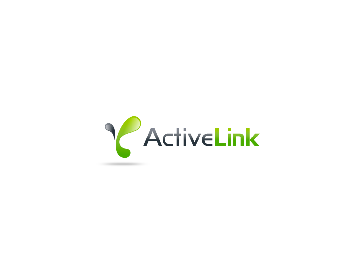
Este cliente recibió 79 diseños de logo de 27 diseñadores. Eligieron este diseño de logo de Omee como el diseño ganador.
Únete gratis Encuentra trabajos de diseño- Garantía
-
 US$200
-
 79 diseños
-
 27 diseñadores
Resumen de Diseño de Logo
We are an ISP in Brasil providing broadband internet for corporate customers.
Currently we are developing a new product in the market for companies that already have another internet service provider (from our competitors). Our strategy is to focus on being their redundancy internet provider, their backup link, in which they will rely when their main or primary internet connection is faulty.
Developed only for redundancy purposes, this product is called ActiveLink and needs to be white / green as the green color is related to "online" or "connected".
The logo design should communicate a safe, reliable, stable, steady, always On, always available, uninterrupted, constant, alternative internet connection.
Actualizaciones
please check updated brief with 2 images to clear up the ideas of what we are searching for.. thanks!
Added Tuesday, September 04, 2012
Objetivo del mercado(s)
focused only on corporate customers all industries
Tipo de industria / entidad
Internet
Texto del logo
Active Link
Estilos de logo de interés
Logo abstracto
Conceptual / simbólico (texto opcional)
Logo con personaje
Logo con ilustración o personaje
Mira y siente
Cada control deslizante ilustra las características de la marca del cliente y el estilo que debe comunicar el diseño de tu logotipo.
Elegante
Atrevido
Juguetón
Serio
Tradicional
Moderno
Atractivo
Profesional
Femenino
Masculino
Vistoso
Conservador
Económico
De Alta Gama
Requisitos
Agradable de tener
- would be nice if the logo image refer to a secondary / alternative path or route for internet service for the customer.
================= UPDATED TEXT BELOW ==================
In order to help you to understand better what we are looking for, be aware that when you have a secondary internet service provider you may have an alternative path or route as we call. This idea is very well symbolized by the image of the letter "Y" as it reminds a bifurcation in which the company may have a second / alternate way that will keep them online and connected.
Please see attached, images of a poor design we have made only to help you understand better the idea. We know you can do much better.. please feel free to find another symbol that indicates the same, it's just a suggestion to help you understand better what we would like to have.