***NEED FONT*** for my new company - Soul eXpression Designs
¿Quieres ganar un trabajo como este?
Este cliente recibió 146 diseños de señalización de 45 diseñadores. Eligieron este diseño de señalética de Luis Arriola como el diseño ganador.
Únete gratis Encuentra trabajos de diseño- Garantía
-
 US$300
-
 146 diseños
-
 45 diseñadores
Resumen de Diseño de Señalética
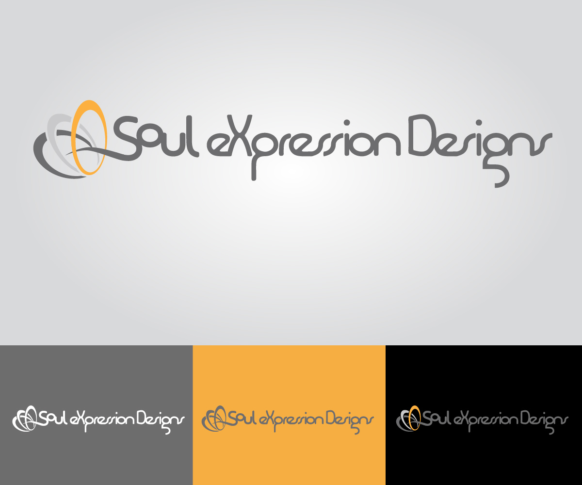
I am starting an inspirational silver ring design company. It used to be called 'Type Ag', but I'm changing the name to 'Soul-eX' or 'Soul eXpression Designs'. My website is TypeAg.com. The overall theme is 'Classy meets Edgy'. Therefore, a very modern font fits perfect. I really liked my 'Type Ag' logo (you can see on my website or in the attachment here. Since I am changing names, I just want to change the lettering of my name (keeping the ring logo though). ***Sharp angles don't work as well for my modern theme.
So I need 2 different designs, one for 'Soul-eX' AND 'Soul eXpression Designs'(make sure to do same caitalization). The attachment is from my last designer. There are a few different versions that she submitted. I thought all of them had a modern theme. I want this font to catch peoples attention. *******Please read the updates. I am interested in seeing the 'Type Ag' font into 'Soul eXpression Designs'****** Let me know if you have any questions.
Actualizaciones
thank you everybody for your interest in my project. I am noticing I am leaning towards having the font not too hard with sharp corners. More rounded corners seem more modern and classy for my theme.wanted to let you know. Thanks again
Added Tuesday, June 03, 2014
Thank you everyone for your designs! There have been some great ideas. I apologize that I haven't been able to critique everyone so far. I will do my best to get to it. I would like to request one thing. As a bonus credit, I am curious if you can do one more design that is your interpretation of the same exact font that I had for my original logo for 'Type Ag'. For instance, keeping the look of the 'g' and others in 'Type Ag'. This is NOT to say any of the designs are bad. I am curious if I would want to keep with the same font direction. Hope I'm not being a pain. This is just really important to me. Thanks ahead of time to all that are willing!
Added Friday, June 06, 2014
Project Deadline Extended
Reason: I would still like to see interpretations of the font used for 'Type Ag' turned into 'Soul eXpression Designs'
Added Tuesday, June 10, 2014
Project Deadline Extended
Reason: still receiving designs and waiting for a few more
Added Monday, June 16, 2014
Project Deadline Extended
Reason: Been too busy to sit and look through the designs. Sorry
Added Thursday, June 26, 2014
Project Deadline Extended
Added Wednesday, August 06, 2014
Project Deadline Extended
Added Wednesday, August 20, 2014
Project Deadline Extended
Added Wednesday, September 03, 2014
Project Deadline Extended
Reason: No time to look at this yet
Added Tuesday, September 30, 2014
Tipo de industria / entidad
It Company
Mira y siente
Cada control deslizante ilustra las características de la marca del cliente y el estilo que debe comunicar el diseño de tu logotipo.