

 Refresh
Fuel Coffee Bar
¿Quieres ganar un trabajo como este?
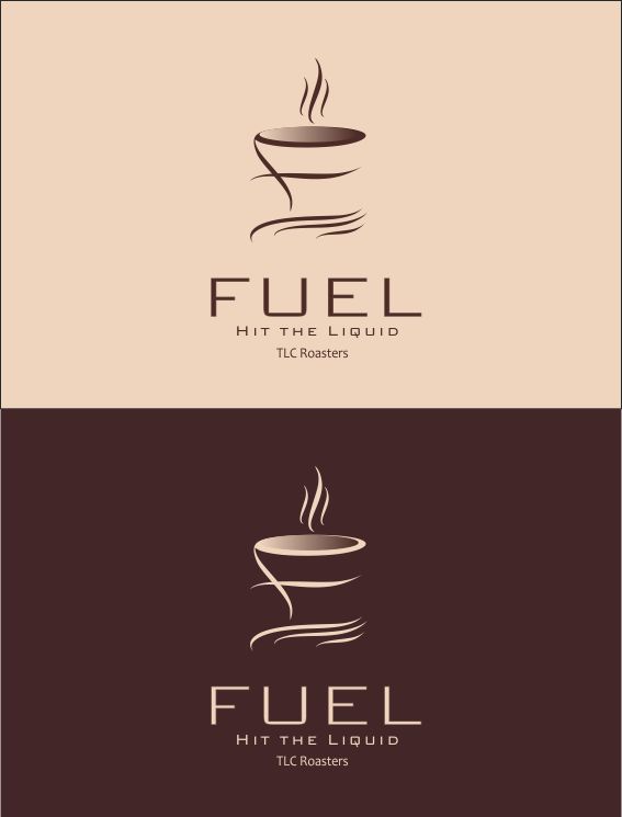
Este cliente recibió 229 diseños de logo de 71 diseñadores. Eligieron este diseño de logo de ciolena como el diseño ganador.
Únete gratis Encuentra trabajos de diseño
- Garantía
-
 US$600
-
 229 diseños
-
 71 diseñadores
Resumen de Diseño de Logo
Okay, we are rebooting the logo equation, given the results to date. We have increased the fee by $200 and made our money nonrefundable. We want to thank everyone who has submitted thus far. It has been very helpful.
We have eliminated the original artwork (coffee cup with swirling steam/wave) that we wanted to use as a premise for the logo. It is not working: too busy, a bit spooky, etc. You can read below for the history, but we are trying to simplify and clean up the logo: tall thin lettering for name "Fuel," eliminate reference to Taylor's Landing Coffee Roaster unless it is simply appended in a straight line at the bottom of the logo. Keep "Hit the LIquid" in logo.
We still want a coffee cup as a focus and to indentify what is being sold, but light and airy, elegant. The cup can also be somewhat undefined. We want to maintain the ocean side surfer references with a wave[s]. We have a downloaded example of a less defined cup below and we have received some from certain of our submitters. We are making good progress with a few of our designers.
Below is the original submittal and some descriptive information that may be of interest, but we have deleted the downloaded cup that we referenced and substituted another.
We already have a very roughly fleshed out logo as a start that is attached. This is a re-branding of an existing coffee bar, currently known as TLC..The new owner will continue to sell TLC Coffee Roasters coffee, and make that known to its patrons, but intends to substantially renovate the premises and raise the bar considerably in terms of customer service, food, aesthetics, etc.
This logo will also be used for the main pole sign at the street.
The coffee cup is considered essential so that passersby know it is a coffee bar named, "fuel." The word "fuel" should be lower case tall, thin contemporary font, and the largest font on the sign. I think maybe it should probably be larger than it is in the attachment. Keeping the name within the confines of the cup limits the size. Note that there are visibility issues with the current mock up because you can't read the bottom of the "f." In that instance, bottom of f should be a brown shade
Whites, browns, caramel, beiges, are the desired colors.with the possible addition seafoam, green and turquoise as discussed below. In other words coffee colors plus ocean water colors.
"Hit the liquid" is the motto for the coffee shop, which also relates to its location on the ocean in a surfer community. "Hit the Liquid," as in "drink the coffee," or "hit the surf." Get it??
"TLC Roasters" is, as noted above, important for current customers who crave this brand of privately roasted coffee.
We realize this is a fair amount of wording for a sign and that is part of the challenge.
I would not say we are wholly wedded to the current coffee cup design, but we are definitely looking for something incorporating this cup or another design that is an innovative looking cup. In any event, think contemporary and modern.
Important Note!!! The steam coming off the top of the cup is an ocean surf wave. The saucer also resembles flowing water. It may be a good idea to color the steam/wave and the saucer/water in a seafoam/light turquoise color so it appears more surf/water like. Think about it.
The fonts as drawn should not guide you re style, but, again, contemporary: lower case "fuel," upper case "Hit the liquid" and "TLC Roasters." Fuel should probably be white, unless there are visibility problems with part of the lettering and so, too, "Hit the LIquid." TLC Roasters should be a different color.
Whatever you do, make this a cool, memorable logo!!
Thanks.
Lynn

Actualizaciones
please see our amended brief and additional downloaded photo. thanks for submissions so far
Added Tuesday, June 10, 2014
We have redefined our submission parameters because we are still looking for something we can run with. Thanks.
Added Tuesday, June 10, 2014
Project Deadline Extended
Reason: Getting closer but not quite there
Added Tuesday, June 17, 2014
Objetivo del mercado(s)
age 20-50 coffee drinkers caffeine addicts beach dudes
Tipo de industria / entidad
Coffee Shop
Texto del logo
"fuel" which is the name of the coffee bar. "Hit the Liquid" which is the coffee bar's motto and a dual reference to coffee and surfing. "Taylor's Landing Coffee Roasters" which is the coffee brand we serve, but we only want these words in a straight line along the bottom of the logo so it can be deleted if we stop serving their coffee in the future
Estilos de logo de interés
Logo pictórico / combinado
Un objeto del mundo real (texto opcional)



Logo abstracto
Conceptual / simbólico (texto opcional)



Estilos de fuente para usar

Mira y siente
Cada control deslizante ilustra las características de la marca del cliente y el estilo que debe comunicar el diseño de tu logotipo.

