Non-Profit Organization Needs WordPress websiteTo Empower Women
¿Quieres ganar un trabajo como este?
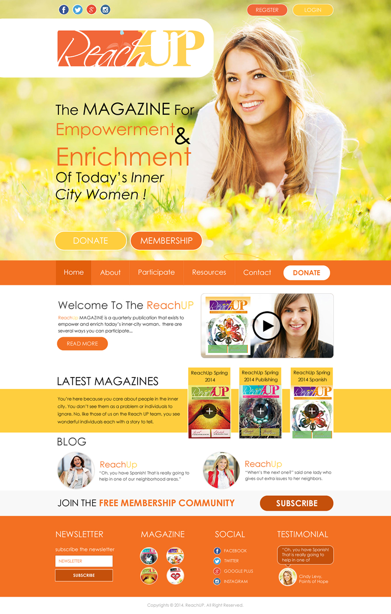
Este cliente recibió 20 diseños de Wordpress de 5 diseñadores. Eligieron este Diseño Wordpress de Behriatech como el diseño ganador.
Únete gratis Encuentra trabajos de diseño- Garantía
-
 US$300
-
 20 diseños
-
 5 diseñadores
Resumen de Diseño Wordpress
Our client is a Non-profit organization that requires a responsively-designed WordPress website to help publish their online magazine. This website will also feature their magazine publication that they publish quarterly. The design will need to be mobile-friendly, so it looks great on all devices.
The main purpose of this site is the following, in order of importance:
1. Educate economically-challenged women to improve their lives with blog content and their online Magazine.
2. Create a Membership community for these women to help one another. THE MAIN CALL-TO-ACTION ON THE SITE IS TO MOTIVATE THE READERS TO JOIN THE FREE MEMBERSHIP COMMUNITY.
3. Recognize and Identify the contributing Organizations, and to motivate the organizations to donate money to the non-profit organization.
Here is information from the client about what they want for their website:
*********************************************************************************************
It needs to have two entrances to content: Organizations & Readers; Don't like cluttered which some magazine formats seem to be. Like edgy, yet feminine. Not sweet. Easy to navigate and find what one comes to find. Colorful.
We need: A Resources area, a Donation button prominently placed on the site, section for archived magazine articles; Place for translated issues. We will want to have a private Membership section on the site. (NOTE: These requests should be used to help create the site's navigation menu.)
Here are example websites the client likes and why. Please use them as inspiration.
http:://www.hyperakt.com color, simple design w cool buttons, uncluttered
http:://www.winshape.com emotion with the color, ease of getting around
http:://www.burnformule1.com the second page has the color sections that take you to next page
http:://www.shelovesmagazine.com not sweetly feminine, perhaps community style
http:://www.onehope.net use of clear symbols, newer design/graphics look
Actualizaciones
Hey Super Designers!!
Please note that we finally got some graphics uploaded to the Brief.
Please be sure that you incorporate the logo for your mockups.
The other graphics can be used for inspiration and example of what the client
currently uses on their site.
If you have already submitted a design, PLEASE be sure to re-submit your
designs after having incorporated these graphics and logo.
THANK YOU FOR YOUR HARD WORK! It is greatly appreciated!
Added Wednesday, June 18, 2014
Hey everyone! I sincerely apologize for the length of this process, but the client has been fairly indecisive about what they prefer. So the good news is that everyone still has a chance to win the contest. The bad news is it has taken longer than I thought to complete this contest. So THANK YOU for your patience and good luck to everyone! Our client intends to announce the winner shortly...
Added Tuesday, July 15, 2014
Objetivo del mercado(s)
The website targets 2 different audiences: Organizations that help to provide services and help to the website readers, and the Readers themselves. The Readers are mostly economically-challenged females that need inspiration and help. The Readers should be considered the Primary Target Audience, with the Organizations being secondary.
Tipo de industria / entidad
Non-Profit
Estilos de fuente para usar
Colores
Colores seleccionados por el cliente para ser utilizados en el diseño del logotipo:
Mira y siente
Cada control deslizante ilustra las características de la marca del cliente y el estilo que debe comunicar el diseño de tu logotipo.
Elegante
Atrevido
Juguetón
Serio
Tradicional
Moderno
Atractivo
Profesional
Femenino
Masculino
Vistoso
Conservador
Económico
De Alta Gama
Requisitos
Debes tener
- The final design MUST, MUST, MUST be created using Separate PSD layers for each element and graphic! PLEASE create a professional layer structure within your design, so we can code it properly.
Please do NOT use Graphics/Images where Text should be used. Examples of this are the business address, phone number, etc.
The website home page design should identify its two main audiences, the Organizations and the Readers. The main call to action is to invite the Readers to become free members of their membership community.
There MUST be an area on the home page where their online magazine can be embedded onto their site OR an image button etc that leads to the magazine. They use the http://issuu.com/ system to create the magazine and then embed the issues on their site. Alternatively, you could create a button, image, area, etc, where the user can click the image and then go to the magazine.
A membership login field OR a button that leads to a Members login area.
A small area on the website that either Adsense or advertising can be used, and this MUST be BELOW the FOLD.
The site must project a sense of hope and/or empowerment for its Readers. The imagery should resonate with females who want to be inspired.
Agradable de tener
- There should be links or buttons to identify Spanish-speaking Readers and Portuguese-speaking Readers.
No debería tener
- NO Gallery Sliders or Photo Sliders