Content resides here
¿Quieres ganar un trabajo como este?
Este cliente recibió 55 diseños de logo de 31 diseñadores. Eligieron este diseño de logo de Eseefo como el diseño ganador.
Únete gratis Encuentra trabajos de diseño- Garantía
-
 A$200
A$200
-
 55 diseños
-
 31 diseñadores
Resumen de Diseño de Logo
A logo to identify our annual 2 day conference. This is to be used in our online and printed documentation.
The theme is above. I know it's not very exciting.
The conference is to promote the change, amongst technical writers, of producing their work (user guides, business plans, etc) not only on paper but also for online display on small devices or PC screen - using HTML rather than just PDF.
Actualizaciones
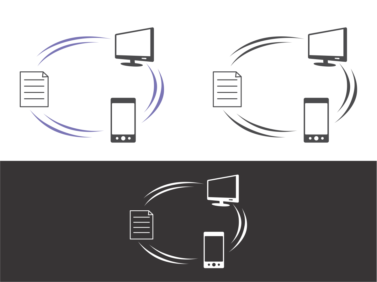
The conference theme is moving documents from paper to online viewing. Therefore at it's simplest, it could be a swishy arrow starting off with a piece of paper (on the left) and a handheld device on the right end of it. Or an unclosed swishy circle with paper, then PC screen the handheld device along the circle.
By swishy I mean not a solid colour: stripes or shaded. It's going to be used in colour as well as black and white and I'd like it to be reasonably scalable. It won't need to go too large though.
Added Friday, July 18, 2014
Objetivo del mercado(s)
Technical communicators. Age range is likely to be 30 to 70. This is a relatively conservative bunch who will try to persuade their employers to pay for their attendance at the conference. Therefore it does not need to be jokey.
Tipo de industria / entidad
Business
Texto del logo
None preferably
Estilos de logo de interés
Logo abstracto
Conceptual / simbólico (texto opcional)
Estilos de fuente para usar
Colores
Diseñador para elegir los colores que se utilizarán en el diseño.
Mira y siente
Cada control deslizante ilustra las características de la marca del cliente y el estilo que debe comunicar el diseño de tu logotipo.
Elegante
Atrevido
Juguetón
Serio
Tradicional
Moderno
Atractivo
Profesional
Femenino
Masculino
Vistoso
Conservador
Económico
De Alta Gama
Requisitos
Debes tener
- None really. Just a way of using something (less than words) as short-hand for conference material in a newsletter, program, delegate notes (which will also have the words if they aren't in the logo).
Agradable de tener
- None really.
No debería tener
- No hand writing implements.