Logo for a new company
¿Quieres ganar un trabajo como este?
Este cliente recibió 106 diseños de logo de 41 diseñadores. Eligieron este diseño de logo de hoch2wo como el diseño ganador.
Únete gratis Encuentra trabajos de diseño- Garantía
-
 £290
£290
-
 106 diseños
-
 41 diseñadores
Resumen de Diseño de Logo
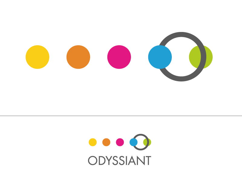
Odyssiant is a new software company. The software will allow the user to map audience journeys and then manage them for content marketing. The company name can be used in the logo, but we would like a symbol that represents the following: journey, odyssey, plan, engagement, trust.
Our corporate colours are the following RGB codes:
Grey: 91,91,91
Yellow: 251,206,0
Pink: 227,9,129
Green: 175,203,30
Light Blue: 0,161,226
Brown: 231,133,42
Our current fonts are Nexa & Nexa Bold, but it is not mandatory to stick to this. The font should be clear and bold. No shadows, underscores or other "treatment" of the text itself. The symbol should not overlap the text and vice versa, but can be joined to the text.
Actualizaciones
Project Deadline Extended
Reason: Haven't quiet seen what we are looking for yet.
Added Saturday, July 05, 2014
We use the font Nexa and Nexa Bold with our other brands. We are not stuck on this, but please try this font with your designs. Thanks.
Added Saturday, July 05, 2014
The brief now has some further detail. We haven't seen what we are looking for yet so have provided so more description to help refine or develop the designs.
Added Monday, July 07, 2014
Tipo de industria / entidad
Software
Estilos de logo de interés
Logo pictórico / combinado
Un objeto del mundo real (texto opcional)
Logo abstracto
Conceptual / simbólico (texto opcional)
Estilos de fuente para usar
Gustan otros estilos de fuente:
- nexa, nexa bold
Mira y siente
Cada control deslizante ilustra las características de la marca del cliente y el estilo que debe comunicar el diseño de tu logotipo.
Elegante
Atrevido
Juguetón
Serio
Tradicional
Moderno
Atractivo
Profesional
Femenino
Masculino
Vistoso
Conservador
Económico
De Alta Gama
Requisitos
Debes tener
- Strong colours, use as many of the colours as makes sense for your design and use them to make the design "pop"
We need the ability to reuse logo in different formats within presentations etc – i.e. flexibility of design
There needs to be a strategic sense of joining things together; interconnection and removal of silos
A sense of journey and movement
Professionalism, maturity and not .com
Shapes should be simple, elegant and connected with the brand name and not just a random stamp alongside and certainly not symbols that can be see anywhere else.