Red Bees Logo
¿Quieres ganar un trabajo como este?
Este cliente recibió 156 diseños de logo de 44 diseñadores. Eligieron este diseño de logo de EELINGDESIGN como el diseño ganador.
Únete gratis Encuentra trabajos de diseño- Garantía
-
 A$380
A$380
-
 156 diseños
-
 44 diseñadores
Resumen de Diseño de Logo
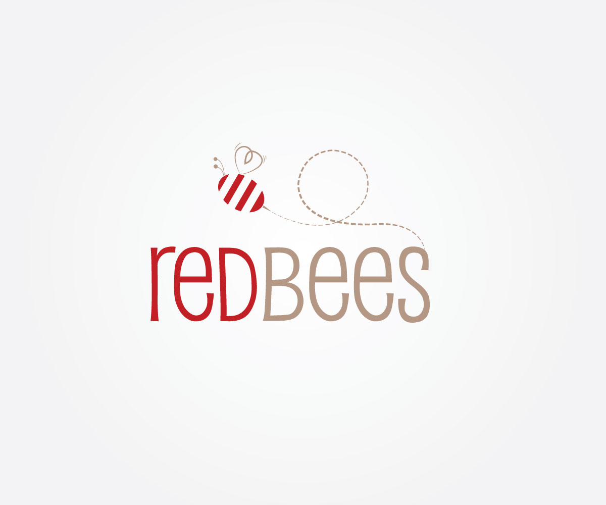
Red Bees is a new business. It will provide high end personal and professional business journals with striking colourful eye catching designs in its eclectic range and more natural and raw in the earth range (handmade fair-trade paper for example). The journals provides the starting point for the real point of the business and that is to offer ways in which people can connect with one another and will provide both products and services to help individuals or groups express words and thoughts of meaning.
The market audience will be mostly female but there is a product range designed for males and we are looking for market avenues which will attract the male market. So for the logo there should be a leaning towards the feminine but not so it turns off the male.
The 'Red' in the business name is motivated by the heart and emotion but not just love so it shouldn't be too romantic as the business products will provide options for expressing a range of emotions e.g. respect and gratitude so the logo shouldn't be one that is visually immediately associated with valentine/romance.
The 'Bee' has been included because they are a species of community and special communication and because they represent a link to nature which the business owners have a strong affinity.
Objetivo del mercado(s)
Female middle to high income earner 25+
Tipo de industria / entidad
Communication
Texto del logo
Red Bees
Estilos de logo de interés
Logo pictórico / combinado
Un objeto del mundo real (texto opcional)
Logo abstracto
Conceptual / simbólico (texto opcional)
Mira y siente
Cada control deslizante ilustra las características de la marca del cliente y el estilo que debe comunicar el diseño de tu logotipo.
Elegante
Atrevido
Juguetón
Serio
Tradicional
Moderno
Atractivo
Profesional
Femenino
Masculino
Vistoso
Conservador
Económico
De Alta Gama
Requisitos
Agradable de tener
- A heavy concentration or large image focus on an actual Bee is not necessary although happy to see designs if designers think they work. Am giving the option though of having a stylised bee, or hint of a bee.
It would be good if the logo could convey some form of connection and journey.
Clearly red would be useful in the logo but it shouldn't dominate and should be used sparingly. The other brand colour selected is a taupe. Hard to describe a colour but not a yellow hay colour but a neutral earthy colour.
No debería tener
- I am adding this para to the design brief after seeing a few designs come through. I am finding that a lot of the designs very corporate (simple and conservative, bold plain text, something you would expect to see in if one worked with government) and am thinking I need to update this brief to ask for something that ups the playfulness and quirky perhaps whimsy (although not too far) and upping the femininity scale. After all the business is about expressing emotions and we would like a logo that people feel something for when they see it. So I will amend the scale ratings now to reflect this update (ie increase rating for playfulness and femininity). There is also a preponderance in the designs to draw out as a separate feature the letter B or R. There is no need to do that they will have no connection with people and those letters of themselves don't mean anything for the business or logo (apart from the literal link to the letter B and Bee).